
Table of Contents
- Why workspace décor with neutral colors works
- How workspace décor with neutral colors enhances productivity
- Choosing the right neutral palette for your workspace
- Steps to select a cohesive neutral palette
- Furniture and fixtures: pairing neutrals with texture
- Key furniture pieces for workspace décor with neutral colors
- Adding personality without breaking the neutral scheme
- Creative ways to personalize a neutral workspace
- Lighting and accessories that enhance neutral workspace décor
- Choosing the right lighting for neutral office spaces
- Quick Home Décor Tips for a Neutral Workspace
- Common Mistakes to Avoid When Styling Neutral Workspaces
- Over‑reliance on a single shade
- Ignoring scale and proportion
- Neglecting personal touches
- Frequently Asked Questions
- Can I use bright colors in a workspace décor with neutral colors?
- Is it okay to have a fully white office?
- How do I choose the right rug for a neutral office?
- What’s the best way to incorporate greenery?
- Do neutral colors affect acoustics?
- How often should I update my neutral workspace décor?
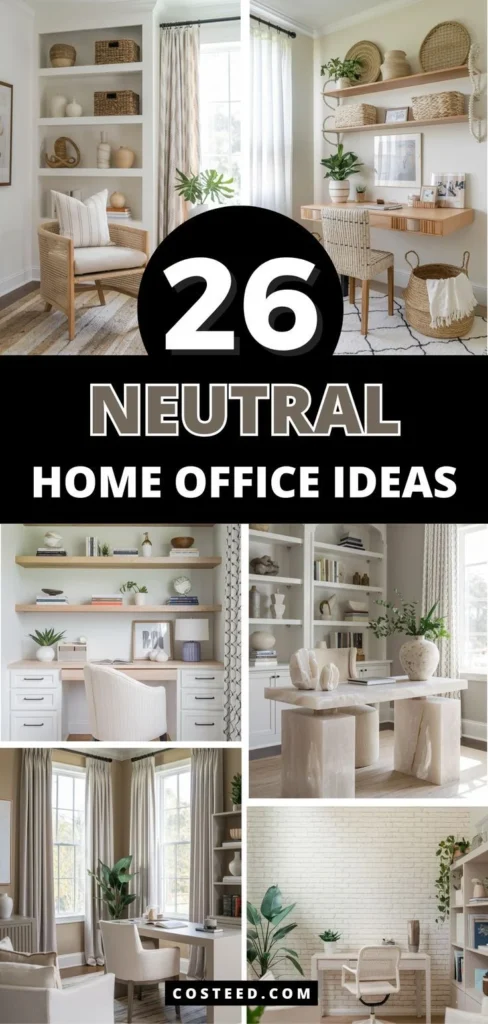
Transform Your Office: workspace décor with neutral colors
Creating a productive and aesthetically pleasing home office is no longer a luxury—it’s a necessity for many professionals, freelancers, and students. One of the most reliable ways to achieve both calm and sophistication is through workspace décor with neutral colors. By opting for a palette that ranges from soft ivory to deep charcoal, you set a tone that encourages concentration while allowing flexibility in styling. This approach works equally well in compact apartments, spacious lofts, or shared co‑working spaces.
In this article, we’ll explore why neutral hues are a smart foundation for any work environment, how to select the right shades, and which textures and accessories can add depth without overwhelming the senses. You’ll also learn practical tips for small spaces, avoid common pitfalls, and find answers to the most frequently asked questions about neutral workspace design. Whether you’re revamping an existing room or starting from scratch, these insights will help you build a workspace that feels both modern and timeless.
Why workspace décor with neutral colors works
The psychological impact of color on productivity is well‑documented. Neutral tones—such as greys, beiges, taupes, and off‑whites—are known for their calming effect, reducing visual clutter and helping the mind focus on tasks at hand. Unlike bold hues that can become distracting, neutrals create a subtle backdrop that lets your work shine through.
Beyond the mental benefits, neutrals also offer unmatched versatility. A neutral base makes it easy to incorporate seasonal accessories, artwork, or even a splash of color without the need for a full redesign. This adaptability is especially valuable for those who enjoy updating their space regularly but don’t want to replace major furniture pieces each time.
How workspace décor with neutral colors enhances productivity
- Reduces visual noise, allowing the brain to concentrate.
- Creates a cohesive look that feels organized and professional.
- Provides a flexible canvas for adding personal touches.
Choosing the right neutral palette for your workspace

Not all neutrals are created equal. While a cool, almost‑white shade can brighten a small room, a warm greige might add coziness to a larger, sun‑filled office. Start by assessing the natural light in your space. Rooms with abundant daylight can handle cooler tones like slate grey or dove white, whereas darker rooms benefit from warm beiges and soft taupes that reflect light.
Consider the overall style you aim to achieve. A minimalist aesthetic often relies on crisp whites and light greys, while a more industrial vibe may incorporate charcoal, concrete‑like finishes, and metal accents. Mixing multiple neutrals—known as a monochromatic scheme—adds depth while maintaining a unified appearance.
Steps to select a cohesive neutral palette
- Identify the dominant natural light direction (north, south, east, west).
- Choose a primary neutral (e.g., warm beige) as the wall color.
- Select two complementary neutrals for furniture and accent pieces.
- Test paint swatches in the actual space before committing.
Furniture and fixtures: pairing neutrals with texture
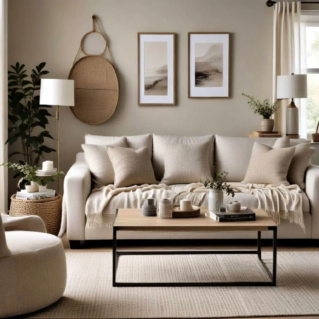
When the walls are painted in a muted shade, furniture becomes the focal point. To avoid a flat, lifeless look, incorporate varied textures. A sleek white desk paired with a charcoal fabric chair creates visual interest without breaking the neutral harmony. Wood finishes—such as light oak or walnut—add warmth and natural texture, blending seamlessly with a neutral color scheme.
Metalic fixtures, like brushed brass lamp bases or matte black hardware, can introduce subtle contrast. The key is to balance smooth surfaces with textured elements, ensuring the workspace feels inviting and tactile.
Key furniture pieces for workspace décor with neutral colors
- Ergonomic desk in light wood or matte white.
- Task chair upholstered in neutral linen or leather.
- Floating shelves in soft grey or natural oak.
- Storage units with clean lines and matte finishes.
Adding personality without breaking the neutral scheme
Even the most refined neutral office needs a touch of personality. This is where accessories, artwork, and greenery play a vital role. A single piece of abstract art featuring muted blues or soft greens can add a focal point without overwhelming the space. Similarly, a patterned rug in neutral tones introduces subtle visual intrigue underfoot.
Plants are a natural choice for enhancing a neutral environment. The greenery provides a gentle pop of color, improves air quality, and contributes to a healthier work atmosphere. Choose low‑maintenance varieties such as snake plants, pothos, or ZZ plants to keep maintenance simple.
Creative ways to personalize a neutral workspace
- Hang framed prints with soft pastel accents.
- Use a textured throw pillow on a neutral chair.
- Display a curated collection of books or decorative boxes.
For further inspiration on wall styling, check out our guide on neutral wall décor styling ideas. The article offers timeless approaches that complement any neutral palette.
Lighting and accessories that enhance neutral workspace décor
Lighting is a critical component of any office design. In a neutral setting, lighting can either reinforce the calm aesthetic or add a layer of sophistication. Natural light should be maximized; sheer curtains in off‑white allow sunlight to filter gently while maintaining privacy.
Artificial lighting options include LED desk lamps with matte metal finishes, pendant lights with frosted glass, and floor lamps that emit a warm glow. Choose fixtures in brushed nickel or oil‑rubbed bronze to add a subtle metallic sheen that complements neutral tones.
Choosing the right lighting for neutral office spaces
- Prioritize adjustable task lighting for work surfaces.
- Incorporate ambient lighting to reduce eye strain.
- Use accent lighting to highlight artwork or shelves.
- Opt for bulbs with a color temperature of 4000‑5000K for a balanced daylight feel.
Quick Home Décor Tips for a Neutral Workspace
- Start with a single neutral shade on the walls and layer other tones gradually.
- Mix textures—like a smooth desk surface with a woven rug—to avoid flatness.
- Introduce one or two statement pieces (art, plant, lamp) for personality.
- Keep cable management tidy to maintain the clean look that neutrals demand.
- Refresh the space seasonally with small accessories in complementary muted colors.
Common Mistakes to Avoid When Styling Neutral Workspaces
Even seasoned decorators can slip up when working with neutral palettes. Below are common pitfalls and how to sidestep them.
Over‑reliance on a single shade
Using only one neutral tone can make the room feel bland. Introduce depth by combining at least three shades—light, medium, and dark—to create a layered effect.
Ignoring scale and proportion
Large, bulky furniture can dominate a neutral room, making it feel cramped. Choose pieces with slender profiles and consider modular options that can be reconfigured as needs change.
Neglecting personal touches
While the aim is a cohesive neutral look, a workspace that feels sterile can reduce motivation. Add personal items like a favorite mug, a small sculpture, or a photo frame to make the area feel yours.
Frequently Asked Questions
Can I use bright colors in a workspace décor with neutral colors?
Absolutely. Bright accents work best when used sparingly—think a teal desk lamp, a mustard‑yellow throw pillow, or a bold piece of art. These pops of color add energy without overwhelming the neutral foundation.
Is it okay to have a fully white office?
A completely white office can look pristine but may feel cold or clinical. Introducing subtle variations—like a light grey rug or a soft beige chair—adds warmth and prevents the space from feeling sterile.
How do I choose the right rug for a neutral office?
Select a rug that incorporates several neutral tones and offers texture, such as a low‑pile wool or a natural fiber jute. This adds visual interest underfoot while staying true to the overall palette.
What’s the best way to incorporate greenery?
Place plants on a side table, a floating shelf, or hang them in wall planters. Choose varieties that thrive in low‑light conditions if your office lacks direct sunlight. The greenery will soften the neutral backdrop and improve air quality.
Do neutral colors affect acoustics?
While color itself doesn’t impact sound, the materials you choose alongside neutrals do. Soft fabrics, upholstered chairs, and carpeted floors can absorb sound, creating a quieter work environment.
How often should I update my neutral workspace décor?
Because neutrals are timeless, you can refresh the look as often as you like—typically every season—by swapping out accessories, pillows, or artwork. The core palette remains stable, reducing the need for major renovations.
By thoughtfully applying workspace décor with neutral colors, you’ll create an environment that supports focus, encourages creativity, and adapts to evolving tastes. The balance of calm tones, varied textures, and strategic accents results in a professional yet welcoming setting that can boost both productivity and well‑being. Ready to start your transformation? Explore more ideas, such as small home design inspiration for compact office setups, and let your neutral canvas become the foundation for limitless style.
[INTERIOR DESIGN]: Interior Design