
Table of Contents
- Understanding Soft Color Palettes for Living Rooms
- Soft Color Living Room Décor Inspiration: How to Test Paint Samples
- Choosing the Right Soft Hues for Walls and Ceilings
- Furniture Selections That Complement Soft Colors
- Soft Color Accents: Textiles, Rugs, and Artwork
- Lighting Strategies to Enhance a Soft Color Scheme
- Styling Small Living Spaces with Soft Color Décor
- Quick Soft Color Living Room Décor Tips
- Common Mistakes to Avoid When Using Soft Colors
- Frequently Asked Questions
- Conclusion
Soft Color Living Room Décor Inspiration: Calm, Chic & Timeless Ideas
Creating a space that feels both inviting and effortlessly elegant often starts with the right color palette. Soft color living room décor inspiration leans on muted hues—think whispers of pastel blues, gentle sage greens, and warm blush pinks—to establish a calm backdrop that encourages relaxation while still making a subtle style statement. Whether you’re a homeowner looking to refresh an older space or a renter eager to add personality without permanent changes, the principles of soft color décor can be applied to any size or layout.
In this guide we’ll walk through the essential steps for selecting the perfect soft shades, pairing them with furniture, textiles, lighting, and accessories, and avoiding common pitfalls that can dilute the serene effect. By the end, you’ll have a toolbox of practical ideas, from paint choices to DIY accents, that let you transform your living room into a soothing sanctuary that still feels contemporary and thoughtfully designed.
Understanding Soft Color Palettes for Living Rooms
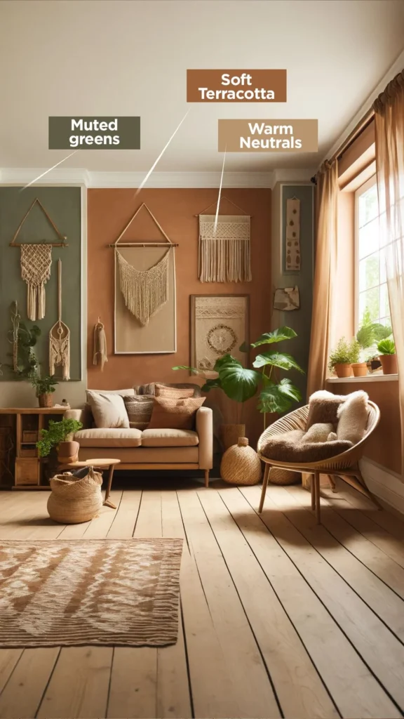
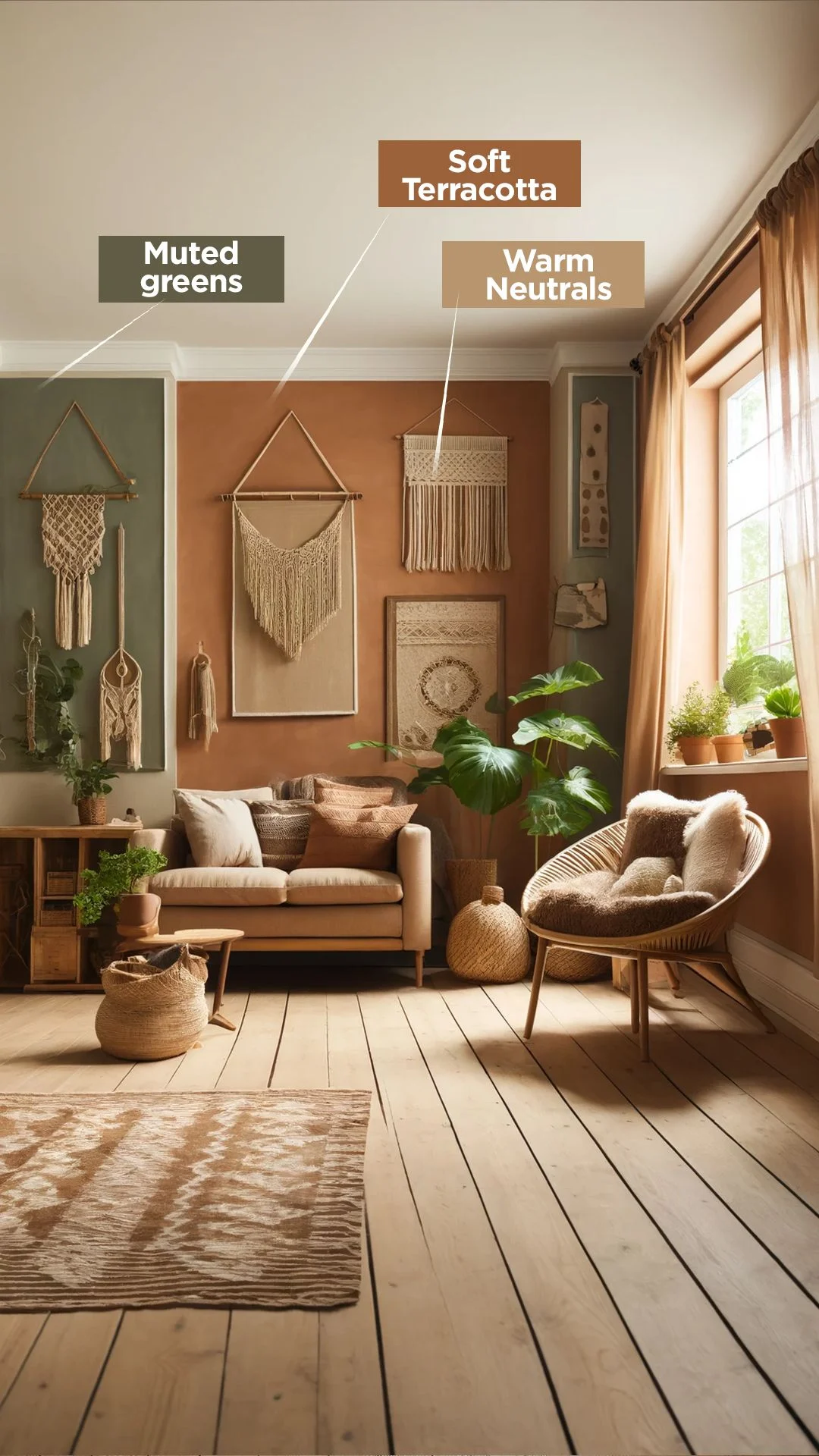
The foundation of soft color living room décor inspiration is a well‑thought‑out palette. Soft hues are not just “light” colors; they possess depth and undertones that create visual interest without overwhelming the eye. A successful palette typically includes a primary soft shade for the walls, a secondary muted tone for larger furniture pieces, and an accent hue for accessories.
When choosing your primary soft color, consider the natural light the room receives. East‑facing rooms benefit from cooler pastels like pale lavender or icy mint, while west‑facing spaces glow best with warm neutrals such as creamy beige or dusty rose. The goal is to let the light enhance the softness rather than wash it out.
Soft Color Living Room Décor Inspiration: How to Test Paint Samples
- Paint large swatches (12×12 in) on opposite walls to compare light interaction.
- Observe the colors at different times of day—morning, noon, and evening.
- Use a matte finish for a more subtle, velvety look that reduces glare.
Choosing the Right Soft Hues for Walls and Ceilings

Walls and ceilings are the largest visual surfaces in a room, so they set the tone for the entire design. Opt for soft, low‑saturation paints that act like a neutral canvas. A popular approach is to paint the ceiling a shade a tone lighter than the walls; this creates a gentle lift and adds an airy quality that aligns perfectly with soft color living room décor inspiration.
For a layered effect, consider a “tone‑on‑tone” approach—using two shades of the same color family. For example, a muted sage wall paired with a slightly lighter mint ceiling can add depth while maintaining harmony. If you love texture, a subtle linen or silk finish can give the walls a tactile softness that complements the visual softness.
Furniture Selections That Complement Soft Colors
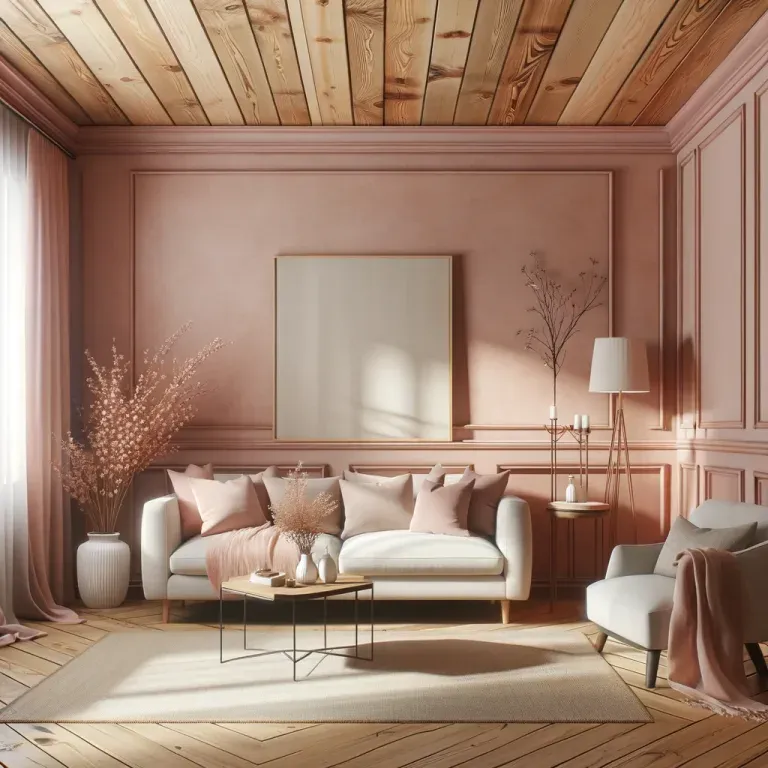
When the walls are already whispering in soft tones, furniture becomes the opportunity to introduce gentle contrast. Choose pieces upholstered in fabrics that echo the room’s palette but in slightly richer hues. A soft gray sofa paired with a blush armchair can create a balanced conversation between cool and warm tones.
Materials matter as much as color. Light‑colored woods—such as white‑washed oak or maple—reinforce the airy feel, while brushed brass or matte black legs add a modern edge without stealing the spotlight. If space allows, a low‑profile sectional in a muted teal or dusty lavender can serve as a statement piece while staying within the soft color realm.
For renters, slipcovers and modular furniture are excellent ways to experiment. You can easily switch out a slipcover in a soft peach or dove gray to refresh the look without repainting walls or buying new pieces.
Soft Color Accents: Textiles, Rugs, and Artwork
Accents are where personality shines through while still adhering to the soft color living room décor inspiration framework. Textiles—cushions, throws, and curtains—offer the most flexible way to introduce new shades and patterns. Choose fabrics with subtle textures like boucle, linen, or brushed cotton to keep the overall feel gentle.
Rugs can anchor the space and add a layer of comfort underfoot. A large, low‑pile rug in a soft taupe with a delicate geometric pattern adds interest without clashing. When selecting wall art, look for pieces that incorporate the same muted palette or bring in a single pop of color, like a muted coral abstract.
For more ideas on curating art, see our living room wall art set ideas – curated inspiration for every style. Additionally, explore creative wall art arrangement ideas for every home to learn how to balance scale and placement without overwhelming the soft aesthetic.
Lighting Strategies to Enhance a Soft Color Scheme
Lighting is the invisible hand that shapes how soft colors are perceived throughout the day. A layered lighting plan—ambient, task, and accent—ensures the room feels balanced and welcoming at any hour. Soft white LED bulbs (2700K–3000K) preserve the warmth of pastel hues while providing energy efficiency.
Floor lamps with fabric shades in a muted ivory or pale gray diffuse light gently, echoing the softness of the décor. Table lamps placed beside sofas or reading chairs add focused illumination for tasks while reinforcing the palette. For a touch of elegance, consider a chandelier with frosted glass or a muted brushed gold finish; the diffused light will accentuate the pastel walls without harsh glare.
Styling Small Living Spaces with Soft Color Décor
In compact apartments, soft color living room décor inspiration can make a room appear larger and more breathable. Light, airy hues reflect natural light, creating an illusion of space. Keep furniture proportional—choose streamlined pieces that don’t dominate the floor plan.
Use multifunctional furniture, such as an ottoman with hidden storage, to reduce clutter. Mirrors with soft‑toned frames amplify light and echo the gentle palette. When adding decorative objects, stick to a limited number of items in coordinating soft shades to avoid visual overload.
For a DIY approach, check out DIY cozy room décor accents: simple projects for a warm home. Simple projects like hand‑stitched pillow covers in muted tones can personalize the space while staying on brand with the soft color theme.
Quick Soft Color Living Room Décor Tips
- Start with a single soft hue on the largest wall and build the rest of the palette around it.
- Incorporate texture through woven blankets, ribbed cushions, or a shaggy rug to add depth.
- Use low‑contrast trim (e.g., slightly lighter baseboards) to maintain a seamless flow.
- Layer lighting with dimmers to adjust the mood while preserving the soft color ambiance.
- Swap out accessories seasonally—think pastel throw pillows in spring, warm muted tones in fall.
Common Mistakes to Avoid When Using Soft Colors
Even with the best intentions, it’s easy to slip into pitfalls that dilute the soothing effect of soft color living room décor inspiration. One frequent error is over‑accessorizing with too many patterns; this can create visual noise that clashes with the calm palette. Instead, limit patterns to one or two items and keep the rest in solid, muted tones.
Another mistake is choosing soft colors that are too similar in value, making the room feel flat. Introduce slight variations in saturation or undertone to create subtle depth. Lastly, neglecting proper lighting can cause soft hues to appear dull; always test paint samples under both natural and artificial light before committing.
Frequently Asked Questions
Can soft colors work in a modern, minimalist living room?
Absolutely. Soft colors provide a gentle backdrop that enhances the clean lines and uncluttered feel of minimalist design. Pairing pastel walls with sleek black metal furniture creates a balanced contrast that feels both modern and welcoming.
How do I incorporate soft colors without repainting?
Use large‑scale wall art, removable wallpaper, or fabric wall hangings in soft hues. Additionally, swapping out curtains, cushions, and rugs in the desired palette can transform the room without permanent changes.
What flooring works best with a soft color scheme?
Light‑toned hardwood, polished concrete with a matte finish, or neutral‑colored carpet (see our guide on how big is a roll of carpet?) all complement soft color living room décor inspiration by maintaining a light, airy foundation.
Is it okay to mix warm and cool soft tones?
Yes, mixing warm and cool soft tones adds visual interest while preserving a soothing atmosphere. Balance is key—anchor the room with one dominant temperature (warm or cool) and introduce the opposite tone through accessories or secondary furniture.
How can I make a soft color palette feel cozy in winter?
Layer textiles like chunky knit throws, plush rugs, and velvet cushions in deeper variations of the same soft palette. Adding warm lighting—such as amber floor lamps—enhances the cozy feeling without breaking the color harmony.
Conclusion
Soft color living room décor inspiration offers a versatile framework for creating spaces that feel both tranquil and stylish. By thoughtfully selecting a muted palette, pairing it with complementary furniture, integrating textured accents, and mastering lighting, you can craft a living room that welcomes you home day after day. Remember to avoid common missteps, keep the design balanced, and let your personality shine through subtle accessories. For more room‑by‑room ideas and practical styling tips, explore other articles on The Homara and continue your journey toward a beautifully curated home.