
Table of Contents
- Wall Décor with Neutral Abstract Art: Understanding Its Appeal
- What Defines Neutral Abstract Art?
- Choosing the Right Color Palette for Neutral Abstract Pieces
- Balancing Warm and Cool Neutrals
- Placement Strategies for Living Rooms
- Focal Points and Scale
- Enhancing Bedrooms with Subtle Abstract Walls
- Creating a Calm Sanctuary
- Kitchen and Dining Areas – When Less Is More
- Using Art to Tie In Textures
- Small Spaces and Apartments – Maximizing Impact
- Visual Expansion Tricks
- Quick Tips for Integrating Neutral Abstract Art
- Common Mistakes and How to Avoid Them
- Frequently Asked Questions
- Putting It All Together: A Real‑World Example
Wall Décor with Neutral Abstract Art: Timeless Style for Every Room
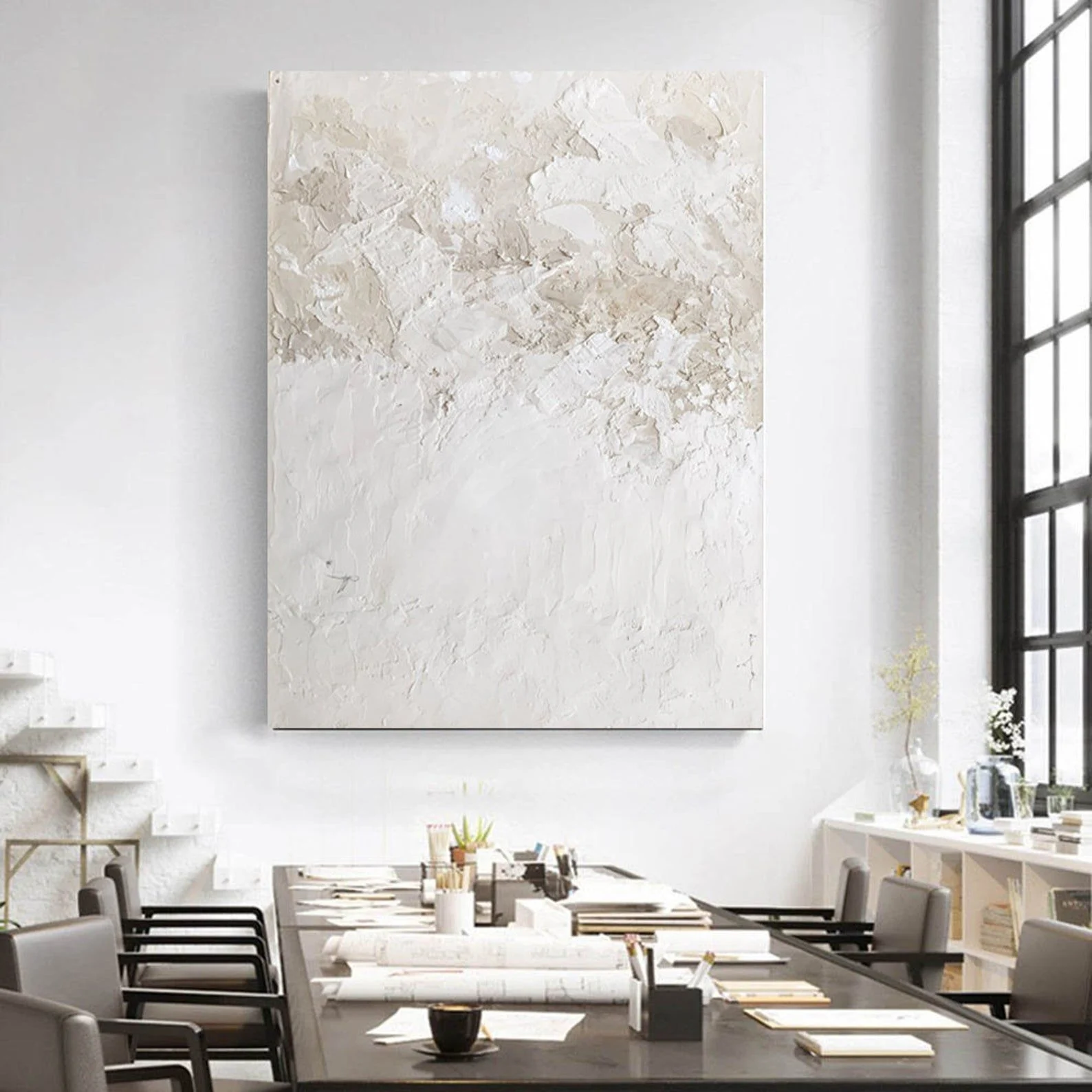
When it comes to creating a space that feels both sophisticated and welcoming, wall décor with neutral abstract art offers a versatile solution. The subtle interplay of muted tones, organic forms, and understated textures allows the artwork to blend seamlessly with a variety of interior styles—from sleek modern apartments to cozy country homes. Whether you’re a homeowner looking to refresh a single room or a renter seeking a non‑permanent yet impactful upgrade, incorporating neutral abstract pieces can elevate your environment without overwhelming it.
In this guide, we’ll explore why neutral abstract art works so well on walls, how to choose the right pieces, and practical ways to integrate them into living rooms, bedrooms, kitchens, and even compact apartments. You’ll also discover common pitfalls to avoid, quick actionable tips, and answers to frequently asked questions. By the end, you’ll have a clear roadmap for using wall décor with neutral abstract art to achieve a balanced, modern aesthetic that reflects your personal style.
Wall Décor with Neutral Abstract Art: Understanding Its Appeal
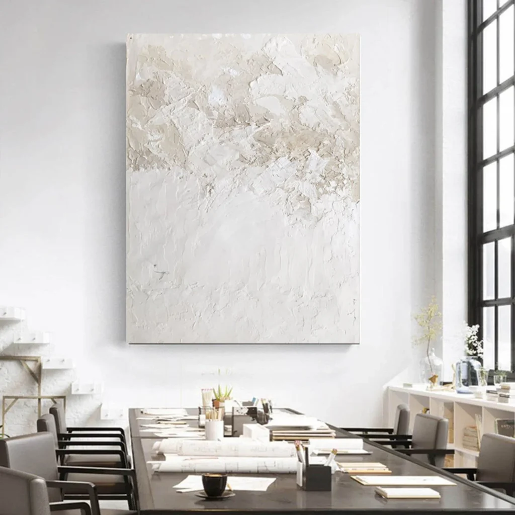
Neutral abstract art isn’t just a trend; it’s a design principle that leverages the power of color psychology and visual balance. By focusing on shades like ivory, taupe, soft greys, and muted earth tones, these artworks create a calming backdrop that encourages other design elements to shine. The abstract nature means there are no explicit narratives or busy scenes—just shapes, lines, and textures that invite interpretation and conversation.
Because the palette stays within the neutral spectrum, the pieces are incredibly adaptable. They can complement bold furniture, serve as a quiet anchor for a minimalist room, or add depth to a space that otherwise feels flat. The versatility of wall décor with neutral abstract art makes it an ideal choice for anyone wanting to maintain flexibility in their décor decisions, especially when considering future changes or seasonal updates.
What Defines Neutral Abstract Art?
- Color Palette: Dominated by whites, beiges, greys, and soft muted tones.
- Form & Composition: Emphasis on geometric or fluid shapes without representational subject matter.
- Texture: Often incorporates subtle brushwork, layering, or mixed‑media techniques that add tactile interest.
- Scale: Available in a range of sizes, from small accent pieces to large statement canvases.
Choosing the Right Color Palette for Neutral Abstract Pieces
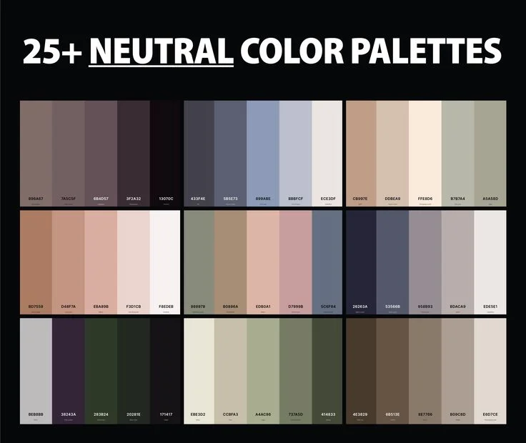
The first step in selecting wall décor with neutral abstract art is understanding the underlying color scheme of your room. If your living area features warm wood flooring and creamy walls, opt for art that leans toward warm neutrals—think caramel, soft ochre, or muted terracotta. Conversely, a space dominated by cool concrete or steel accents will benefit from cooler greys, slate blues, or soft charcoal tones.
One effective strategy is to sample a small portion of the artwork against your wall before committing. Hold the piece up at eye level to see how the hues interact with existing furniture and lighting. Remember that natural light can shift the perception of neutrals throughout the day, so consider both daytime and evening ambiance when making your decision.
Balancing Warm and Cool Neutrals
When you blend warm and cool neutrals, you create a dynamic equilibrium that adds depth without causing visual chaos. Pair a warm beige abstract canvas with a cool grey sofa, and introduce a metallic accent like a brushed nickel lamp to bridge the gap. This technique allows each element to retain its individuality while contributing to a cohesive whole.
For those who enjoy a monochromatic feel, stick to varying shades of a single neutral family. A series of three abstract prints ranging from light ivory to deep charcoal can provide a subtle progression that guides the eye across the wall. This layered approach is especially effective in hallways or narrow rooms where a single large piece might feel overpowering.
Placement Strategies for Living Rooms
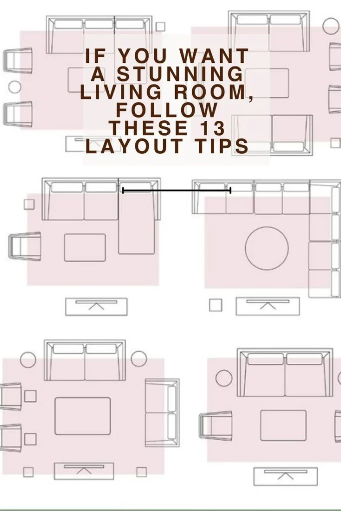
The living room is often the focal point of a home, making it the perfect canvas for wall décor with neutral abstract art. A large, horizontally oriented abstract piece can anchor a seating arrangement, while a vertically stacked trio can draw attention upward, emphasizing ceiling height. Position the artwork at eye level—typically 57 to 60 inches from the floor—to ensure comfortable viewing.
When arranging furniture around your chosen piece, consider the concept of “negative space.” Leaving ample wall area around the artwork prevents a cluttered look and lets the abstract forms breathe. If you have a sectional sofa, center the art on the wall directly opposite to create a balanced visual dialogue.
Focal Points and Scale
Scale matters: a small 12‑inch abstract print may get lost on a vast wall, while an oversized 8‑by‑10‑foot canvas could dominate a modest room. Use painter’s tape to outline the intended dimensions on the floor before hanging, giving you a tangible sense of proportion. For an eclectic touch, pair a sizable neutral abstract canvas with a cluster of smaller framed prints that share a complementary color scheme.
Integrating other decorative elements—such as a sleek console table or a low-profile media console—can further enhance the visual hierarchy. Keep the surrounding décor simple and let the neutral abstract art remain the star of the room.
Enhancing Bedrooms with Subtle Abstract Walls
Bedrooms thrive on tranquility, and wall décor with neutral abstract art can set a soothing tone that encourages restful sleep. Choose pieces that feature soft gradients or gentle brushstrokes rather than sharp, high‑contrast lines. The muted palette works well with bedding in similar hues, reinforcing a cohesive, serene atmosphere.
Consider placing the artwork above the headboard, where it becomes a natural extension of the bed’s design. If you have a low ceiling, a horizontal abstract piece can create the illusion of width, making the room feel more spacious. Pair the artwork with a simple nightstand and a textured throw to add layers of comfort without compromising the minimalist aesthetic.
Creating a Calm Sanctuary
Layering textures is key to achieving a calming bedroom retreat. A neutral abstract canvas paired with a plush area rug, linen curtains, and a woven blanket can introduce tactile variety while staying within the same color family. This approach adds warmth and depth, turning the space into a sanctuary that feels both curated and lived‑in.
For those who love a touch of nature, incorporate a small potted plant on a side table. The greenery provides a subtle pop of color that complements the neutral tones, enhancing the overall sense of well‑being.
Kitchen and Dining Areas – When Less Is More
In kitchens and dining rooms, wall décor with neutral abstract art can soften the often‑sterile feel of appliances and countertops. Choose pieces that echo the natural materials in the space—think marble, wood, or stone tones. A modestly sized abstract canvas placed above a kitchen island or on a dining wall can act as a visual break without interfering with functionality.
Since kitchens are high‑traffic zones, consider artworks printed on durable materials like canvas with a protective coating, or opt for framed prints behind glass. This ensures longevity while maintaining the refined look that neutral abstract art provides.
Using Art to Tie In Textures
One effective method is to match the abstract artwork’s subtle texture with the tactile qualities of your cabinetry or countertop. For instance, a canvas featuring a light, linen‑like texture can complement a wooden table or a brushed stainless‑steel backsplash. The harmony between visual and tactile elements creates a cohesive design language throughout the space.
When dining, keep the art proportionate to the table size. A piece that stretches the length of a rectangular table can act as a centerpiece, drawing guests’ eyes upward and fostering conversation. Pair it with simple table settings and a neutral runner to maintain an elegant, uncluttered feel.
Small Spaces and Apartments – Maximizing Impact
Limited square footage doesn’t mean you have to sacrifice style. Neutral abstract art is particularly effective in small spaces because it can amplify light, add depth, and create focal points without overwhelming the room. Choose a single, bold statement piece for a compact living area, or create a gallery wall with several smaller prints that share a unified color palette.
In studio apartments, consider mounting a neutral abstract canvas above the bed or sofa to delineate zones. This visual separation helps define functional areas while maintaining an open‑plan feel.
Visual Expansion Tricks
Mirrored surfaces paired with neutral abstract art can double the perceived size of a room. Hang a reflective piece or place a large abstract canvas opposite a mirror to bounce light and color across the space. Additionally, using a vertical composition can draw the eye upward, making low ceilings appear higher.
For narrow hallways, a tall, slim abstract piece can serve as an elongated visual anchor, breaking up the length and adding interest. Keep the surrounding walls a light neutral shade to enhance the effect and avoid a cramped sensation.
Quick Tips for Integrating Neutral Abstract Art
- Start with one statement piece and build around it; you can always add more later.
- Match the undertone of the artwork with existing décor elements to ensure harmony.
- Use lighting—track lights or picture lights—to highlight texture and depth.
- Consider modular frames that allow you to swap out prints as your style evolves.
- Combine abstract art with natural materials like wood, stone, or woven textiles for added warmth.
Common Mistakes and How to Avoid Them
Even seasoned decorators can stumble when incorporating wall décor with neutral abstract art. Below are typical errors and practical solutions:
- Choosing the Wrong Scale: Overly large pieces in small rooms feel oppressive. Measure your wall space and use painter’s tape to mock‑up dimensions before hanging.
- Ignoring Lighting: Insufficient light can mute the subtle tones of neutral abstracts. Add accent lighting to enhance color nuances.
- Clashing Color Temperatures: Pairing cool greys with warm wood tones can create visual dissonance. Balance by selecting artwork with a mixed temperature or using bridging accessories.
- Overcrowding the Wall: Too many pieces can lead to visual clutter. Embrace negative space and let each artwork breathe.
- Neglecting Frame Style: Frames should complement, not compete with, the artwork. Simple, thin frames in metal or wood usually work best with neutral abstracts.
Frequently Asked Questions
Can neutral abstract art work in a colorful room?
Absolutely. The neutral palette acts as a calming backdrop that allows brighter furnishings and accessories to pop without creating visual overload. By anchoring the space with subtle art, you give vibrant elements room to shine.
How do I determine the right size of abstract artwork for my wall?
A good rule of thumb is to choose a piece that occupies about two‑thirds the width of the furniture it’s positioned above. For larger walls, consider a series of coordinated prints to fill space proportionally.
Is it okay to mix different neutral abstract pieces together?
Yes, mixing works well as long as the color undertones and texture styles complement each other. A cohesive gallery wall can feature varying sizes and frames, provided the overall palette remains harmonious.
What lighting options best showcase neutral abstract art?
Adjustable track lighting, recessed spotlights, or picture lights positioned a few inches above the artwork highlight texture and subtle color shifts. Soft, warm LED bulbs tend to enhance the gentle tones of neutral abstracts.
Can I use neutral abstract art in a home office?
Definitely. A calming abstract piece can reduce visual stress and improve focus. Pair it with a sleek desk and ergonomic chair for a balanced, productive environment.
How often should I rotate my wall décor?
Rotating artwork every six to twelve months keeps your space fresh. Neutral abstract pieces are versatile, making it easy to swap them with seasonal décor or new color schemes.
Putting It All Together: A Real‑World Example
Imagine a modest one‑bedroom apartment with a light‑grey living room, a wooden coffee table, and a navy sofa. By selecting a large canvas featuring soft beige swirls and subtle charcoal lines, you introduce a warm focal point that complements both the wooden tones and the navy accent. Hang the piece above the sofa at eye level, add a slim black metal frame for a contemporary touch, and install a picture light to emphasize texture.
In the bedroom, choose a smaller, vertically oriented abstract print in muted taupe and soft white, placed above the headboard. Pair it with linen curtains and a plush beige rug to create a cohesive, soothing palette. Finally, in the kitchen, a modest abstract print echoing the living room’s beige hues can be positioned above the island, tying the entire apartment together through a unified color story.
These coordinated choices illustrate how wall décor with neutral abstract art can weave a consistent narrative throughout diverse spaces, enhancing both aesthetic appeal and functional flow.
For more inspiration, see our guide on Wall Décor with Beige Framed Prints – Timeless Style for Any Room or explore Minimalist Wall Décor Ideas for a Serene Bedroom. If you’re curious about how lighting affects art, the article on Best Light Bulb for Garage Door Opener – Bright, Efficient Choice offers useful insights.
By thoughtfully selecting and placing wall décor with neutral abstract art, you can transform any room into a refined, inviting space that reflects your personal taste while remaining adaptable to future design changes.
Take the ideas shared here, experiment with scale, color, and placement, and watch as your home’s atmosphere shifts from ordinary to effortlessly elegant. The subtle power of neutral abstract art lies in its ability to unite diverse elements into a harmonious whole—making it a timeless addition to any interior.
[ TITLE ]: Wall Décor with Neutral Abstract Art: Timeless Style for Every Room
[ META_DESC ]: Discover how wall décor with neutral abstract art can transform living rooms, bedrooms, and kitchens. Learn tips, placement tricks, and FAQs for modern home styling.
[ TAGS ]: wall décor, neutral abstract art, interior design, modern home styling, living room décor
[ CATEGORY ]: Home Decor Ideas