Table of Contents
- Understanding Warm Neutral Interior Design
- Core Color Palette of Warm Neutral Interior Design
- Choosing Materials and Textures that Complement Warm Neutral Tones
- Applying Warm Neutral Interior Design in Living Spaces
- Small Space Solutions with Warm Neutral Interior Design
- Layering Light and Warmth for a Cohesive Look
- Quick Tips for Instantly Elevating Warm Neutral Interior Design
- Common Mistakes to Avoid When Working with Warm Neutral Interior Design
- Frequently Asked Questions
- Putting It All Together: A Real‑World Example
- Final Thoughts on Warm Neutral Interior Design
Warm Neutral Interior Design: Timeless Style for Modern Homes
Creating a space that feels both sophisticated and welcoming is the holy grail of interior design. Warm neutral interior design offers exactly that balance, blending soft, earthy tones with subtle textures to produce an environment that is at once calm and full of personality. Whether you are a homeowner looking to refresh a single room or a renter eager to personalize a compact apartment, the principles of warm neutral interior design can be adapted to suit any scale and budget.
In this guide we will explore why the warm neutral palette continues to dominate modern décor, how to select the right colors and materials, and which design tricks make the style work in living rooms, bedrooms, kitchens, and even small‑space layouts. By the end of the article you’ll have a toolbox of actionable ideas, common pitfalls to avoid, and a quick‑reference FAQ that will help you apply warm neutral interior design with confidence.
Understanding Warm Neutral Interior Design

Warm neutral interior design is built around a color spectrum that leans toward beige, soft taupe, muted terracotta, and gentle ivory. These shades are “neutral” because they pair easily with virtually any accent hue, yet they retain a warm undertone that prevents the space from feeling sterile or overly cool. The result is a backdrop that feels inviting, allowing furniture, artwork, and accessories to become the stars without competing for attention.
One of the greatest strengths of warm neutral interior design is its versatility. The palette works beautifully in sun‑filled coastal homes, urban lofts with industrial elements, and even in traditional suburban houses looking for a modern refresh. Because the colors are inherently calming, they also contribute to a sense of wellbeing—a subtle psychological benefit that many homeowners value as much as aesthetic appeal.
Core Color Palette of Warm Neutral Interior Design
- Soft Ivory: A creamy base that brightens a room without the starkness of pure white.
- Warm Taupe: Adds depth and a hint of earthiness, perfect for larger walls.
- Muted Terracotta: Introduces a gentle pop of color while staying within the neutral family.
- Sandstone Beige: Works well for flooring, rugs, and upholstered pieces.
- Smoky Greige: The bridge between gray and beige, ideal for modern accents.
When layering these hues, start with the lightest shade on the walls and introduce richer tones through furniture, textiles, and décor. This progression creates visual interest while keeping the overall feel cohesive.
Choosing Materials and Textures that Complement Warm Neutral Tones
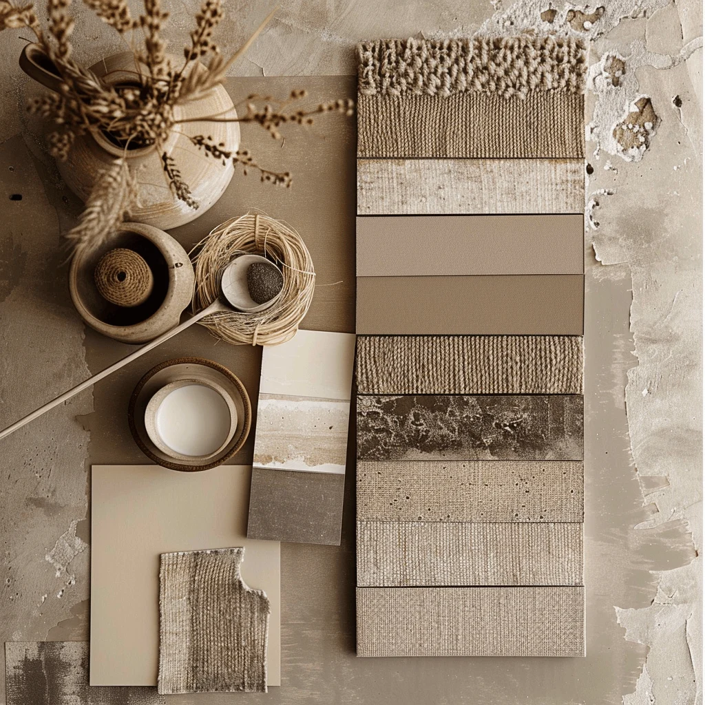
Materials play a pivotal role in reinforcing the warmth of a neutral palette. Natural fibers such as linen, cotton, and wool soften the look and add tactile richness. Wood, especially in medium‑tone finishes like oak or walnut, mirrors the earthy qualities of the color scheme and brings a subtle organic rhythm to the space.
For a more contemporary edge, consider incorporating matte metal accents—brushed brass or oil‑rubbed bronze work particularly well against warm neutrals. These metals reflect light gently, enhancing the room’s glow without overwhelming the subdued palette. When selecting fabrics, look for woven textures, boucle, or boucle‑like finishes; they create depth that flat, smooth surfaces cannot achieve.
Don’t forget the power of natural stone. A light marble countertop or a slate accent wall can anchor a kitchen or bathroom while staying true to the warm neutral interior design ethos. The key is to balance smooth surfaces with tactile ones, ensuring the room feels layered and inviting.
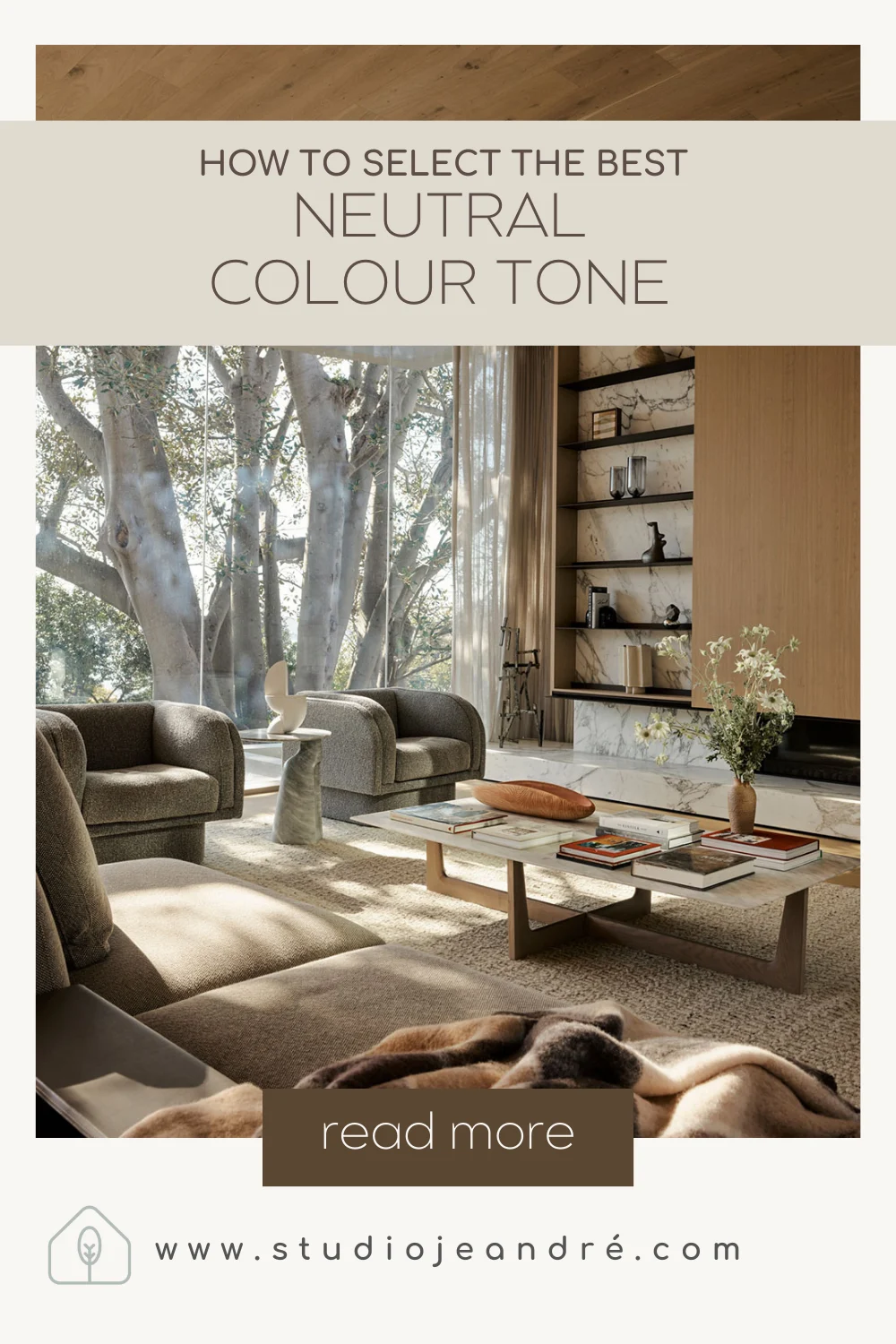
Applying Warm Neutral Interior Design in Living Spaces
The living room is often the centerpiece of a home, making it an ideal canvas for warm neutral interior design. Begin with walls painted in a soft ivory or warm taupe, then layer furniture in neutral fabrics—think a plush sofa in sand‑colored linen paired with a terracotta accent chair. Add a rug that incorporates several of the palette’s hues to tie everything together.
When you need a splash of color, reach for accessories like throw pillows, artwork, or a statement lamp in deep rust or muted olive. Because the base is neutral, these accents become focal points without feeling out of place. For lighting, choose fixtures with warm metallic finishes or soft fabric shades; they reinforce the overall warmth while providing a cozy ambience.
In bedrooms, the same principles apply but with a greater emphasis on serenity. Choose a warm taupe headboard, layer with ivory bedding, and add texture through a woven throw and a plush rug. If you’re working with a smaller bedroom, a small living room makeover guide can inspire clever furniture placement that maximizes space without compromising style.
Small Space Solutions with Warm Neutral Interior Design
Compact apartments and tiny homes can benefit immensely from warm neutral interior design because the palette naturally expands visual space. Light, warm neutrals reflect natural light, making rooms feel larger than they are. Pairing these hues with strategic storage solutions—such as built‑in shelving painted in the same shade as the walls—creates a seamless look that eliminates visual clutter.
Consider using multi‑functional furniture, like a sofa with hidden storage or a coffee table that doubles as a desk. When the furniture’s color matches the walls, it recedes into the background, allowing the eye to travel farther across the room. For decorative accents, choose a few well‑placed pieces rather than many small items; this prevents the space from feeling overloaded.
If you’re dealing with a tiny bathroom, the small bathroom shelf décor ideas article offers clever styling tips that pair beautifully with warm neutral interior design, ensuring even the smallest wet areas feel elegant and functional.
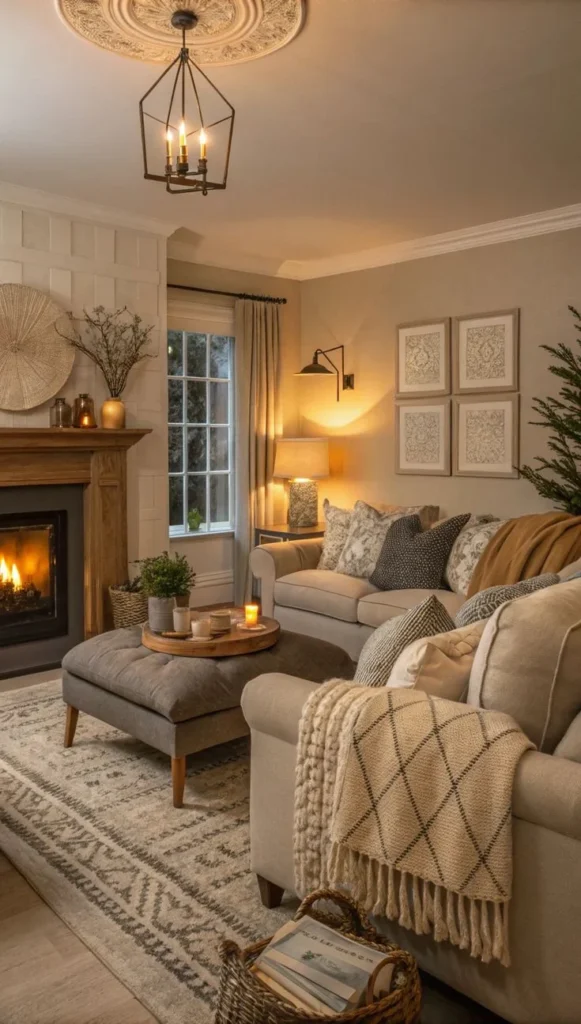
Layering Light and Warmth for a Cohesive Look
Lighting is often the missing link that turns a good design into a great one. Warm neutral interior design thrives on soft, diffused illumination that highlights texture without creating harsh shadows. Aim for a layered lighting plan: ambient ceiling fixtures, task lighting (like table lamps or under‑cabinet lights), and accent lighting (such as wall sconces or LED strips behind shelving).
Choose bulbs with a color temperature of 2700–3000K; this range emits a gentle, warm glow that complements the beige‑based palette. For an extra touch of elegance, incorporate dimmable fixtures so you can adjust the intensity based on time of day or activity. A well‑lit room feels welcoming, and the warmth of the light reinforces the natural hues of your warm neutral interior design.
Quick Tips for Instantly Elevating Warm Neutral Interior Design
- Start with a single warm neutral wall as a backdrop; paint the remaining walls in a lighter shade for depth.
- Mix textures—linen, wool, wood, and matte metal—to prevent the space from feeling flat.
- Introduce one bold accent color (such as deep teal or mustard) through accessories, not permanent fixtures.
- Use mirrors strategically to bounce light and visually expand the room.
- Keep window treatments light and airy; sheer curtains in ivory or soft beige let natural light filter gently.
Common Mistakes to Avoid When Working with Warm Neutral Interior Design
Even seasoned decorators can stumble when applying warm neutral interior design. One frequent error is over‑relying on a single shade, which can make a room feel monotone and dull. To avoid this, incorporate a range of hues from the palette and layer different textures.
Another pitfall is neglecting the importance of contrast. While the goal is a harmonious look, subtle contrasts—such as a darker wood floor against a light wall—create visual interest. Finally, avoid excessive décor clutter. Warm neutral interiors shine when the space is allowed to breathe; keep accessories purposeful and curated.
Frequently Asked Questions
Can warm neutral interior design work in a modern, minimalist home?
Absolutely. The soft palette adds warmth to minimalist spaces without compromising the clean lines and uncluttered aesthetic that define modern minimalism. Pair the neutrals with sleek furniture and simple geometric décor for a balanced look.
What are the best flooring options for a warm neutral interior design?
Light to medium‑tone hardwood, natural stone tiles, and woven rugs in sandy beige or muted terracotta all complement the palette. Choose flooring that reflects light and adds subtle texture to reinforce the overall warmth.
How do I incorporate patterns without breaking the neutral harmony?
Select patterns that echo the color family—think subtle stripes, chevrons, or tonal florals in soft ivory, taupe, and muted terracotta. Keep the scale of the pattern modest; large, bold prints can overpower the tranquil vibe of warm neutral interior design.
Is it okay to mix warm neutrals with cooler colors?
Yes, when done thoughtfully. A cool accent such as a deep navy cushion or a charcoal lamp can provide contrast while still allowing the warm neutrals to dominate the space. The key is to keep the cool tones limited to accessories or accent walls.
What lighting temperature best enhances warm neutral interior design?
A color temperature of 2700–3000K (warm white) best enhances the earthy tones, creating a cohesive, inviting atmosphere. Avoid cool daylight bulbs, which can make the warm neutrals appear stark.
Putting It All Together: A Real‑World Example
Imagine a mid‑century modern loft with exposed brick. Start by painting the brick a soft ivory to mute its industrial edge. Add a walnut coffee table and a sofa upholstered in sand‑colored linen. On the wall behind the sofa, hang a large abstract painting that incorporates muted terracotta and deep olive—tying back to the warm neutral interior design palette. Finish with brass floor lamps, a woven rug featuring shades of beige and taupe, and a few decorative bowls in warm metal finishes. The result is a space that feels both contemporary and comforting, proving that warm neutral interior design can bridge the gap between style and coziness.
For readers interested in exploring how warm neutrals blend with other trends, our guide on minimalist home décor inspiration offers additional perspectives on achieving a streamlined yet inviting look.
Final Thoughts on Warm Neutral Interior Design
Warm neutral interior design is more than a color scheme; it’s a philosophy of balance, comfort, and timeless elegance. By choosing the right hues, mixing textures, and applying thoughtful lighting, you can create spaces that feel both modern and deeply welcoming. Whether you’re decorating a sprawling family home or a compact city apartment, the principles outlined here will help you harness the power of warm neutrals to transform any environment.
Take the ideas you’ve gathered, experiment with materials that speak to you, and remember that the most successful interiors are those that reflect the personalities of the people who live in them. For further inspiration and practical tips, continue exploring The Homara’s extensive library of design articles. Happy styling!