
Table of Contents
- Why Home Décor with Soft Neutral Colors Works Wonders
- Choosing the Right Palette for Home Décor with Soft Neutral Colors
- Living Room Strategies: Creating a Cozy Neutral Retreat
- Bedroom Bliss: Soft Neutrals for Restful Retreats
- Kitchen Calm: Neutral Hues that Highlight Functionality
- Small Space Solutions: Maximizing Impact with Neutral Design
- Layering Textures: Adding Depth Without Color Overload
- Color Psychology: How Soft Neutrals Influence Mood
- Quick Tips for Using Soft Neutrals
- Common Mistakes to Avoid with Soft Neutral Décor
- Frequently Asked Questions
Transform Your Space with Home Décor with Soft Neutral Colors
Soft neutral tones have become the quiet powerhouse of modern interior design. Whether you live in a compact city apartment or a sprawling suburban home, a palette of gentle beiges, muted greys, and warm off‑whites can instantly elevate any room without overwhelming the senses. These hues act like a sophisticated backdrop, allowing furniture, artwork, and personal accessories to shine while maintaining a cohesive, soothing atmosphere.
In this guide we’ll explore why home décor with soft neutral colors works so well, how to choose the perfect shade combinations, and practical ways to apply them in living rooms, bedrooms, kitchens, and small spaces. You’ll walk away with actionable tips, common pitfalls to avoid, and answers to the most frequently asked questions, empowering you to create a serene, stylish home that feels both modern and inviting.
Why Home Décor with Soft Neutral Colors Works Wonders
Neutral palettes are celebrated for their flexibility. A room dressed in soft neutrals can feel airy and spacious, a quality especially valuable in small apartments or rooms with limited natural light. These colors also serve as a timeless canvas; trends come and go, but a well‑executed neutral scheme remains elegant for years. Moreover, soft neutrals reflect light gently, enhancing the perceived brightness without the glare that stark whites can produce.
From a psychological standpoint, muted tones promote calmness and reduce visual clutter, making them ideal for relaxation spaces like bedrooms and home offices. By grounding your design in home décor with soft neutral colors, you create a harmonious environment that encourages wellbeing while still leaving room for bold accents and textures that add personality.
Choosing the Right Palette for Home Décor with Soft Neutral Colors
When selecting shades, consider the natural light the room receives. East‑facing rooms benefit from cooler greys and pale taupes that balance morning light, while west‑facing spaces can handle warmer beiges that complement the evening glow. A good rule of thumb is to mix at least three layers:
- Base tone: The dominant wall color, such as a soft dove grey.
- Secondary tone: Complementary hues on larger furniture pieces, like a warm oatmeal sofa.
- Accent tone: Subtle contrasts through textiles, rugs, or décor items in muted sage or blush.
By layering these tones, you maintain visual interest while preserving the serene vibe central to home décor with soft neutral colors.
Living Room Strategies: Creating a Cozy Neutral Retreat

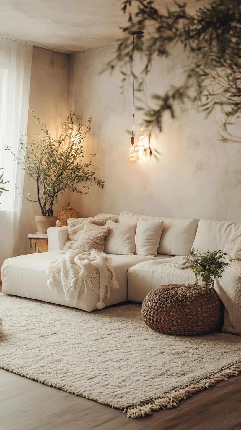
The living room is often the focal point of a home, making it the perfect canvas for soft neutral décor. Begin with walls painted in a light greige—a blend of grey and beige—that offers warmth without dominance. Pair this backdrop with a plush, low‑profile sofa in a warm ivory fabric, then introduce texture through a woven jute rug and linen curtains.
Accessories are where you can subtly inject personality. Consider a set of matte‑finished metal side tables, a handcrafted wooden coffee table, and a few strategically placed greenery pots. The key is to keep the color palette consistent while allowing natural materials to add depth. For further inspiration on lighting, check out our small living room lighting ideas guide, which demonstrates how warm LED fixtures enhance neutral tones.
Bedroom Bliss: Soft Neutrals for Restful Retreats

A bedroom should feel like a sanctuary, and soft neutral colors are ideal for fostering that sense of peace. Start with a muted stone wall, then layer bedding in off‑white linen and a light taupe duvet. Adding a textured throw pillow in a whisper of sage green introduces a gentle pop without breaking the tranquil mood.
Furniture choices matter: opt for sleek, low‑profile nightstands in light wood and a simple platform bed. Soft lighting—think dimmable wall sconces or a fabric‑draped floor lamp—complements the calm palette. If you need further guidance on minimal bedroom styling, our minimalist bedroom décor with minimal wall shelves article offers practical ideas that pair beautifully with neutral tones.
Kitchen Calm: Neutral Hues that Highlight Functionality
In the kitchen, soft neutrals can make the space feel larger and more inviting. Light, warm greys on cabinetry paired with creamy quartz countertops create a seamless flow. To avoid a sterile look, incorporate natural wood handles and open shelving in light oak, which introduces warmth and texture.
Backsplashes in subtle marble patterns—think soft veining in beige and cream—add visual interest without overwhelming the palette. When selecting appliances, choose brushed stainless steel; its muted shine harmonizes with neutral tones while still standing out as a functional accent.
Small Space Solutions: Maximizing Impact with Neutral Design
Compact rooms benefit greatly from home décor with soft neutral colors because the palette visually expands the space. Paint walls in a pale ivory that reflects natural light, and keep furniture low‑profile to maintain an open feel. Mirrors framed in light wood amplify the neutral scheme and add depth.
Multi‑functional furniture—like a storage ottoman in a soft beige suede—offers practicality without adding visual clutter. Layering different textures, such as a chunky knit throw over a sleek sofa, creates a sense of richness despite the limited square footage. For a deeper dive into modern styling across all rooms, explore our aampi home decor – Modern Styling Ideas for Every Room article.
Layering Textures: Adding Depth Without Color Overload
Neutral colors thrive on texture. When the palette is restrained, tactile elements become the star. Consider incorporating the following layers:
- Soft textiles: Linen curtains, wool throws, and cotton rugs.
- Natural materials: Rattan chairs, reclaimed wood side tables, and stone accents.
- Metallic touches: Brushed brass lamp bases, matte black hardware, or subtle gold picture frames.
These textures create visual interest and invite touch, making the space feel lived‑in and welcoming. Even a single piece—like a hand‑woven wall hanging—can become a focal point while staying true to the understated elegance of home décor with soft neutral colors.
Color Psychology: How Soft Neutrals Influence Mood
Neutral shades are more than aesthetic choices; they carry psychological benefits. Light greys and beiges are known to reduce stress, promote concentration, and foster a sense of order. This is why many professionals choose neutral‑based home décor for home offices and study areas.
When combined with natural light, these tones can make a room feel airy, encouraging a positive mindset. Adding occasional muted accent colors—such as a soft sage or dusty rose—can enhance emotional warmth without disrupting the calming effect.
Quick Tips for Using Soft Neutrals
- Start with a single neutral base and build layers of texture to avoid monotony.
- Use varied shades of the same hue to create depth without introducing strong contrast.
- Incorporate natural materials like wood, stone, and linen to keep the space feeling organic.
- Introduce subtle accent colors through accessories like pillows, artwork, or a statement rug.
- Maintain consistent lighting—both natural and artificial—to keep the neutral palette cohesive.
Common Mistakes to Avoid with Soft Neutral Décor
While soft neutrals are forgiving, certain pitfalls can diminish their impact:
- Over‑matching: Using the exact same shade on walls, furniture, and décor can make the room feel flat. Introduce at least two complementary tones.
- Neglecting texture: A purely smooth surface palette looks sterile. Mix fabrics, finishes, and materials to add richness.
- Insufficient lighting: Low‑light rooms can appear gloomy. Pair neutrals with ample lighting—natural, ambient, and task.
- Choosing the wrong undertone: Warm neutrals in a cool‑lit space can clash, and vice versa. Test paint swatches at different times of day.
Frequently Asked Questions
Can I use bold colors with a soft neutral palette?
Yes. Bold colors work best as accent pieces—think a deep navy pillow, an emerald vase, or a striking artwork—while the dominant neutral base keeps the overall feel balanced.
Are soft neutrals suitable for high‑traffic areas?
Absolutely. Neutral tones hide wear and tear better than stark whites. Choose durable finishes like matte paints and fabrics that are easy to clean.
How do I prevent a neutral room from feeling cold?
Layer warm textures (wool, wood, soft linens) and incorporate warm undertones in your neutrals (e.g., a beige with a hint of caramel). Warm lighting also adds coziness.
What flooring works best with soft neutral walls?
Light hardwood, bamboo, or polished concrete in warm tones complement soft neutrals. If you prefer carpet, opt for low‑pile rugs in muted greys or beiges.
Can I use soft neutrals in a small bathroom?
Yes, a light greige or soft cream can make a bathroom feel larger and spa‑like. Pair with natural stone tiles and brushed nickel fixtures for a cohesive look.
By answering these common queries, you can confidently apply home décor with soft neutral colors across any space.
Embracing soft neutral colors in your home décor offers a timeless, versatile foundation that can adapt to changing trends and personal tastes. Whether you’re redesigning a living room, bedroom, kitchen, or a compact studio, the principles outlined above—thoughtful palette selection, texture layering, and mindful lighting—will guide you toward a harmonious, inviting environment. Remember to avoid common mistakes, use quick actionable tips, and experiment with subtle accents to keep the space feeling fresh.
Now that you have a roadmap, start by choosing your base neutral, gather a few textured pieces, and watch your home transform into a calm, modern retreat. For more inspiration, browse additional articles on our site, and let your creativity flourish while staying grounded in the soothing elegance of soft neutrals.