
Table of Contents
- Snowfall White vs Simply White: Core Characteristics
- Why the Undertone Matters in Snowfall White vs Simply White
- Choosing the Right Shade for Different Rooms
- Living Room: Balancing Light and Comfort
- Bedroom: Creating a Restful Sanctuary
- Kitchen: Managing Cleanliness and Shine
- Bathroom: Light, Fresh, and Hygienic
- Testing Paint Samples: A Practical Approach
- Step‑by‑Step Sample Test
- Complementary Colours and Materials
- Colour Pairings That Shine
- Quick Home Décor Tips
- Common Mistakes When Choosing Between Snowfall White and Simply White
- Relying Solely on Store Lighting
- Ignoring Existing Undertones
- Overpainting Large Areas with a Single White
- Frequently Asked Questions
- Is Snowfall White better for small spaces?
- Can I use Simply White in a high‑ceilinged living room?
- How does lighting affect the look of Snowfall White vs Simply White?
- Do I need a primer when switching between Snowfall White and Simply White?
- What finishes work best with Snowfall White?
- Is Simply White a good choice for exterior trims?
- Putting It All Together: A Sample Room Design
Snowfall White vs Simply White: Choosing the Perfect Shade for Your Home
When it comes to painting a space, the choice of white can feel surprisingly complex. Two of the most popular options on the market—Snowfall White and Simply White—often sit side by side in paint stores, each promising a bright, clean backdrop. Yet the subtle differences in undertone, reflectivity, and how they interact with natural light can dramatically shape the mood of a room. Understanding these nuances helps homeowners, renters, and design enthusiasts make a confident decision that aligns with their style and functional needs.
In this article we’ll explore Snowfall White vs Simply White in depth, compare performance across common interior settings, and provide actionable guidance for selecting, testing, and pairing the right shade. Whether you’re refreshing a living room, creating a serene bedroom sanctuary, or looking for a versatile kitchen hue, you’ll walk away with a clear plan that eliminates guesswork.
Beyond the color comparison, we’ll sprinkle in practical design tips, common pitfalls to avoid, and quick‑action ideas you can implement right away. Let’s dive in and see how the right white can become the silent star of your home décor.
Snowfall White vs Simply White: Core Characteristics
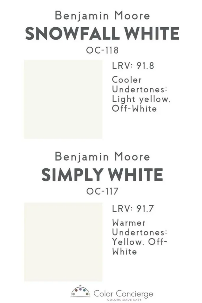
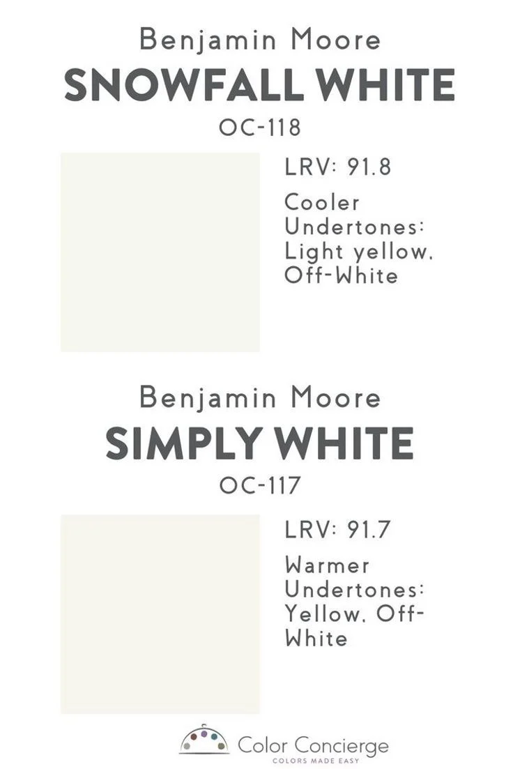
Both Snowfall White and Simply White belong to the family of “true whites,” but each carries a distinct personality. Snowfall White leans toward a cooler, slightly bluish cast, which makes it especially flattering in spaces with abundant daylight or cool‑toned furnishings. Simply White, on the other hand, carries a warm, creamy undertone that softens harsh lighting and pairs beautifully with wood tones and earth‑derived accents.
When you compare Snowfall White vs Simply White side by side, you’ll notice that Snowfall White tends to reflect more light, creating a crisp, almost studio‑like atmosphere. Simply White absorbs just enough light to feel welcoming without feeling flat. This difference becomes more pronounced in rooms that receive indirect natural light or are illuminated primarily by artificial fixtures.
Why the Undertone Matters in Snowfall White vs Simply White
- Cool vs warm balance: Snowfall White’s cooler undertone can counteract warm wall finishes, while Simply White’s warmth can tone down stark, modern surfaces.
- Impact on furnishings: Cool whites highlight metallic finishes and glass, whereas warm whites enhance wood grain and textiles.
- Perceived space: The reflective quality of Snowfall White can make small rooms feel larger, while Simply White creates a cozier, enveloping feel.
Choosing the Right Shade for Different Rooms

The decision of Snowfall White vs Simply White should start with the room’s function and lighting conditions. Below we break down how each hue performs in the most common living areas.
Living Room: Balancing Light and Comfort
A living room often serves as the social hub, requiring a balance between brightness and comfort. If the space enjoys large windows and plenty of daylight, Snowfall White can amplify the natural glow, making the area feel airy and modern. Conversely, in a living room with limited windows or heavy curtains, Simply White offers a softer backdrop that prevents the space from feeling overly sterile.
Pair Snowfall White walls with charcoal or navy furniture for a high‑contrast look, or opt for a mix of natural wood and muted textiles when you choose Simply White. The result is a living room that feels both inviting and intentionally styled.
Bedroom: Creating a Restful Sanctuary
Bedrooms benefit from a calming palette. Simply White’s warm undertone lends itself well to creating a soothing environment, especially when paired with soft linens and pastel accents. If your bedroom is a light‑filled retreat, Snowfall White can enhance the sense of serenity while still providing enough contrast for artwork and decorative pieces.
Consider using a feature wall in Snowfall White behind the bed, while the remaining walls stay in Simply White for a gentle transition. This technique adds visual interest without overwhelming the space.
Kitchen: Managing Cleanliness and Shine
Kitchens are high‑traffic zones where the perception of cleanliness matters. Snowfall White’s bright, cool tone highlights sparkling countertops and stainless‑steel appliances, giving the room a professional, pristine look. Simply White, meanwhile, can soften the glare from under‑cabinet lighting and make warm wood cabinets feel more integrated.
If you enjoy a monochromatic kitchen, use Snowfall White on the upper cabinets and walls, and reserve Simply White for the backsplash to add subtle depth.
Bathroom: Light, Fresh, and Hygienic
In a bathroom, the choice between Snowfall White vs Simply White often hinges on natural light. Snowfall White works wonderfully in smaller bathrooms with limited windows, reflecting what little light is available to create a brighter feel. For larger bathrooms with skylights or ample daylight, Simply White offers a spa‑like warmth that complements stone tiles and organic accessories.
To explore storage ideas that keep your bathroom organized while maintaining a clean look, check out our guide on how to store lush bath bombs for long‑lasting luxury. The tips there pair nicely with either white shade, ensuring functional elegance.
Testing Paint Samples: A Practical Approach

Before committing to Snowfall White vs Simply White across an entire wall, testing is essential. A small sample reveals how the color interacts with your specific lighting at different times of day.
Step‑by‑Step Sample Test
- Purchase two 2‑inch sample pots—one Snowfall White and one Simply White.
- Apply each color to a 1‑ft square on opposite sides of the same wall.
- Observe the squares in morning, noon, and evening light, noting any color shifts.
- Live with the painted squares for at least 48 hours to see how they age with your lighting.
Take note of how each hue looks next to your existing furniture and décor. If you notice the Snowfall White sample appearing too stark against warm wood, consider Simply White, and vice versa.
Complementary Colours and Materials
Choosing Snowfall White vs Simply White is only the first step; the surrounding colour palette determines the overall aesthetic.
Colour Pairings That Shine
- Snowfall White + Charcoal Grey: Creates a sleek, modern look perfect for urban apartments.
- Simply White + Soft Sage Green: Evokes a calm, nature‑inspired vibe suitable for bedrooms.
- Snowfall White + Navy Blue Accents: Adds depth and drama without overpowering the space.
- Simply White + Warm Wood Tones: Enhances a cozy, inviting atmosphere in living rooms and kitchens.
When selecting décor pieces, think about texture as well. A matte finish on furniture will absorb light, balancing Snowfall White’s reflectivity, while glossy surfaces will amplify Simply White’s warmth.
Quick Home Décor Tips
- Use Snowfall White on ceilings to boost the perception of height, especially in rooms with low ceilings.
- Apply Simply White on lower wall sections or wainscoting to create a layered, grounded feel.
- Introduce a single accent wall in Snowfall White to add drama without overwhelming the space.
- Mix metal finishes: brushed nickel pairs nicely with Snowfall White, while oil‑rubbed bronze complements Simply White.
Common Mistakes When Choosing Between Snowfall White and Simply White
Even seasoned decorators can stumble when selecting a white paint. Below are frequent errors and how to avoid them.
Relying Solely on Store Lighting
Paint stores often use bright, cool lighting that can make all whites appear similar. Always test the paint on your own walls under your home’s lighting conditions before finalizing the choice.
Ignoring Existing Undertones
If your furniture or flooring has a strong warm or cool undertone, picking Snowfall White vs Simply White that clashes can create visual discord. Match the paint’s undertone to the dominant tones in the room for cohesion.
Overpainting Large Areas with a Single White
While a uniform white can look clean, it may also feel flat. Incorporate subtle variations—such as a trim in the opposite white hue—to add dimension.
Frequently Asked Questions
Is Snowfall White better for small spaces?
Yes, Snowfall White’s higher reflectivity can make compact rooms feel larger by bouncing more light around the space. Pair it with minimal décor to maintain an open feel.
Can I use Simply White in a high‑ceilinged living room?
Absolutely. Simply White adds warmth without darkening the room, making high ceilings feel inviting rather than cavernous. Consider a light‑colored rug or artwork to complement the hue.
How does lighting affect the look of Snowfall White vs Simply White?
Natural daylight emphasizes Snowfall White’s cool undertones, while artificial warm lighting can shift it toward a slightly gray hue. Simply White maintains a warm appearance under most lighting types, making it more forgiving in mixed‑light environments.
Do I need a primer when switching between Snowfall White and Simply White?
If you’re covering a dark colour or a previous white with a different undertone, a high‑quality primer helps ensure even colour coverage and prevents bleed‑through.
What finishes work best with Snowfall White?
Eggshell or satin finishes balance the crispness of Snowfall White while providing a slight texture that reduces glare. For high‑traffic areas, consider a low‑sheen semi‑gloss to improve durability.
Is Simply White a good choice for exterior trims?
Simply White’s warm undertone can complement natural wood siding and stone exteriors, but for coastal homes exposed to salty air, a more weather‑resistant formulation may be advisable.
For a fresh perspective on how colour interacts with exterior elements, our article on Will Concrete Bird Baths Crack? Expert Guide to Prevention and Design offers insights that can inspire your interior‑exterior harmony.
Putting It All Together: A Sample Room Design
Imagine a mid‑size bedroom with a south‑facing window, a wooden headboard, and a mix of vintage and modern décor. Here’s how Snowfall White vs Simply White can shape the final look:
- Walls: Paint three walls in Simply White to create a warm, restful backdrop. Use Snowfall White on the accent wall behind the headboard to add a subtle pop of brightness that draws the eye.
- Trim & Ceiling: Apply Snowfall White to crown moulding and ceiling to lift the space and create a crisp separation between the two wall tones.
- Bedding & Textiles: Choose a duvet in soft gray with pastel teal pillows, allowing both whites to complement the colour palette.
- Accessories: Add a woven tray on the nightstand for storage and style—see our guide on Bathroom Décor with Woven Trays – Stylish Storage & Style for ideas on integrating similar pieces in the bedroom.
This layered approach showcases how both Snowfall White and Simply White can coexist, delivering depth and visual interest while maintaining a cohesive aesthetic.
By understanding the subtle differences between Snowfall White vs Simply White and applying thoughtful design principles, you can transform any space into a polished, welcoming environment that reflects your personal style.
Ready to experiment? Grab a sample, test it in your own lighting, and let the perfect shade guide your next home makeover.