

Table of Contents
- Understanding Pearly White vs Alabaster: Color Characteristics
- How Light Affects Pearly White and Alabaster
- Choosing the Right Shade for Specific Rooms
- Pearly White vs Alabaster in Small Spaces
- Pairing Pearly White and Alabaster with Materials and Textures
- Quick Home Décor Tips
- Common Mistakes and How to Avoid Them
- Frequently Asked Questions
- Putting It All Together: A Step‑by‑Step Decision Guide
Pearly White vs Alabaster: Choosing the Perfect Shade for Your Home
When it comes to creating a fresh, inviting atmosphere, the subtle nuances of neutral whites can make a world of difference. Two of the most popular options—pearly white and alabaster—are often confused, yet each brings its own personality to a room. Understanding their undertones, reflectivity, and how they interact with light helps you decide which hue best supports your design vision.
Whether you’re refreshing a bedroom, updating a bathroom, or styling a compact apartment, the right shade of white can amplify space, highlight textures, and set the mood. In this guide we’ll explore the practical and aesthetic implications of pearly white vs alabaster, compare their performance in various settings, and provide actionable tips you can apply today.
By the end of the article you’ll have a clear roadmap for selecting the ideal white, avoiding common pitfalls, and pairing each shade with complementary décor elements to achieve a cohesive, modern look.
Understanding Pearly White vs Alabaster: Color Characteristics

Pearly white is celebrated for its luminous, almost metallic sheen. The name comes from the way light reflects off its fine, pearl‑like particles, creating a soft glow that shifts with the time of day. This shade leans toward cool undertones—think hints of blue or gray—that keep spaces feeling crisp and contemporary.
Alabaster, on the other hand, carries a warmer, creamier vibe. It mimics the natural stone of the same name, delivering subtle yellow or beige undertones that add warmth without overwhelming a palette. Alabaster’s matte finish absorbs light, making it ideal for rooms that need a gentle, comforting backdrop.
Both colors are versatile, but the decision often hinges on the amount of natural light, the existing colour scheme, and the emotional tone you wish to convey.
How Light Affects Pearly White and Alabaster
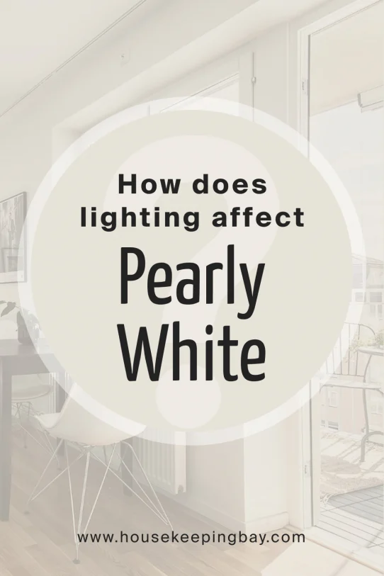
Lighting is the silent partner in any colour decision. Pearly white thrives under abundant daylight, as its reflective quality enhances brightness and can make a small room appear larger. In spaces with limited natural light, pairing pearly white with layered artificial lighting—such as recessed LEDs or pendant fixtures—helps maintain its radiant feel.
Alabaster, with its softer reflectivity, works well in both bright and low‑light environments. It absorbs a bit of the surrounding illumination, creating a cozy ambiance that is especially welcoming in bedrooms and living rooms where you might want a more relaxed atmosphere.
For a practical comparison, see how frosted glass vs clear glass lighting fixtures influence the perception of these whites, and adjust your lighting plan accordingly.
Choosing the Right Shade for Specific Rooms
Each room has its own functional and aesthetic demands. Below is a quick guide to help you match the shade to the space:
- Living Room: Pearly white works beautifully behind large windows, reflecting outdoor views and creating a gallery‑like backdrop for artwork. Alabaster offers a softer canvas for plush sofas and layered textiles.
- Bedroom: Alabaster’s warm undertones promote relaxation, making it a favorite for sleeping areas. If you love a crisp, hotel‑style look, pearly white can be paired with dark accent walls for contrast.
- Bathroom: Pearly white amplifies the sparkle of tiles and chrome fixtures, while alabaster pairs nicely with natural stone and wood accents for a spa‑like feel.
- Kitchen: Consider how cabinetry and countertops will interact. Pearly white highlights sleek, high‑gloss finishes; alabaster complements matte surfaces and warm wood tones.
Pearly White vs Alabaster in Small Spaces
When square footage is limited, colour selection becomes a strategic tool for visual expansion. Pearly white’s high reflectivity can make a studio apartment feel airy, especially when paired with minimalistic furniture and strategic mirror placement. However, too much glare may feel clinical if not balanced with texture.
Alabaster, with its warm, inviting quality, can prevent a cramped space from feeling stark. Using alabaster on walls while keeping the ceiling a true white maintains a sense of height. Add pops of colour through accessories—think cushions, rugs, or art—to keep the room lively.
For small‑space inspiration, explore our Apartment Interior Styling Ideas article, which demonstrates how subtle colour choices transform compact living areas.
Pairing Pearly White and Alabaster with Materials and Textures
Both shades serve as neutral foundations, but they respond differently to surrounding materials:
- Wood: Warm hardwoods (walnut, oak) harmonize with alabaster, while cooler tones (maple, ash) complement pearly white.
- Metal: Brushed nickel and chrome shine against pearly white, emphasizing its reflective nature. Brass or aged copper adds depth to alabaster walls.
- Fabric: Soft linen in muted greys or muted blues pairs elegantly with pearly white. Rich velvet in deep jewel tones creates a striking contrast against alabaster.
Incorporating natural elements like stone or woven baskets can soften the overall look. For creative ideas, see our piece on Wall Décor with Hanging Woven Baskets.
Quick Home Décor Tips
- Test paint samples on multiple walls—light changes throughout the day, and you’ll see how pearly white vs alabaster behaves.
- Use a high‑gloss finish for pearly white to amplify its shine; choose a satin or matte finish for alabaster for a softer feel.
- Introduce contrast with dark trim or accent walls to prevent a monochrome look.
- Layer lighting: combine ambient, task, and accent lights to balance the reflective qualities of each shade.
- Complement with natural textures—linen, jute, or reclaimed wood—to add warmth regardless of the white you choose.
Common Mistakes and How to Avoid Them
Even seasoned decorators can slip up when working with neutrals. Here are a few pitfalls to watch for:
- Over‑matching: Using only one shade of white from floor to ceiling can feel sterile. Break up the space with contrasting trims, ceilings, or ceiling mouldings.
- Ignoring undertones: Pairing pearly white with warm wood can create a disjointed look. Always consider the undertone of surrounding materials.
- Neglecting lighting: A room with limited daylight may make pearly white appear too stark. Balance with warm LED bulbs or floor lamps.
- Choosing the wrong finish: High‑gloss on high‑traffic walls can show fingerprints. Opt for satin or eggshell in such areas.
Frequently Asked Questions
Is pearly white or alabaster better for a modern aesthetic?
Both can fit a modern aesthetic, but pearly white’s cool, reflective quality leans toward sleek, contemporary designs, while alabaster provides a softer, warmer backdrop that works well with modern minimalism when paired with bold accents.
Can I use both shades in the same room?
Absolutely. Using pearly white on the ceiling and alabaster on the walls creates depth and visual interest without overwhelming the space.
How do I choose the right finish for each shade?
Pearly white looks striking in a satin or semi‑gloss finish that enhances its shine. Alabaster is typically best in matte or low‑sheen finishes to preserve its warm, inviting feel.
What colour palettes complement alabaster?
Earthy tones like terracotta, muted greens, and deep blues pair nicely, as do soft pastel hues such as blush pink or sage.
Will pearly white show dirt more easily than alabaster?
Because pearly white reflects more light, it can highlight smudges and dust more readily. Regular cleaning and choosing a washable paint formula can mitigate this issue.
Putting It All Together: A Step‑by‑Step Decision Guide
1. Assess natural light: Bright rooms favor pearly white; dimmer rooms benefit from alabaster.
2. Identify undertone preferences: Cool‑leaning décor aligns with pearly white; warm‑leaning décor aligns with alabaster.
3. Consider room function: Use pearly white for high‑energy spaces (kitchen, office) and alabaster for relaxing zones (bedroom, bathroom).
4. Test and observe: Paint large swatches, live with them for a few days, and note how they interact with your furnishings and lighting.
Following this process ensures you make an informed choice that enhances both aesthetics and functionality.
Ready to transform your home with the perfect shade? Dive into our other guides for more inspiration, such as Cozy Kitchen Styling Ideas or explore the subtle differences in GU10C vs GU10 lighting to complete your look.
Choosing between pearly white and alabaster doesn’t have to be a gamble. By understanding their distinct qualities, matching them to your space’s lighting, and pairing them with the right textures, you’ll create a timeless, inviting environment that reflects your personal style.