
Table of Contents
- Understanding the Color Difference: off white vs cream
- off white vs cream – How Light Affects Them
- Choosing the Right Shade for Living Spaces
- off white vs cream in Living Rooms
- Bedroom Bliss: off white vs Cream
- off white vs cream for Cozy Bedrooms
- Kitchen and Bathroom Applications
- off white vs cream in Kitchen Cabinets
- Pairing with Other Colors and Textures
- off white vs cream with Bold Accents
- Quick Home Décor Tips
- Common Mistakes and How to Avoid Them
- Frequently Asked Questions
Off White vs Cream: The Definitive Guide for Modern Home Styling
When it comes to creating a serene, sophisticated backdrop, few color debates are as nuanced as off white vs cream. Both shades sit comfortably on the neutral spectrum, yet each carries its own personality, reflecting light and texture in distinct ways. Understanding these subtleties can transform a simple room into a curated sanctuary.
Homeowners, renters, and design enthusiasts alike often wonder which hue will best complement their furniture, lighting, and overall aesthetic. In this article we’ll unpack the visual qualities of off white vs cream, explore how each performs in different spaces, and provide actionable tips that help you make confident decisions for living rooms, bedrooms, kitchens, and bathrooms.
Understanding the Color Difference: off white vs cream

At first glance, off white and cream appear nearly identical, but their undertones set them apart. Off white typically leans toward a cooler, almost grayish tone, while cream embraces a warmer, buttery undertone with hints of yellow or beige. This distinction influences how the colors interact with natural and artificial light, affecting perceived warmth and depth.
Choosing between these hues isn’t just a matter of personal preference; it’s also about the mood you wish to create. A cooler off white can evoke a sleek, modern vibe, whereas a soft cream often feels inviting and cozy. Both are versatile, but knowing their inherent qualities makes it easier to pair them with other décor elements.
off white vs cream – How Light Affects Them
- Natural light: Sunlight amplifies warm undertones, making cream appear brighter in east‑facing rooms. Off white, with its cooler base, tends to stay neutral even under direct sun.
- Artificial lighting: Warm LED bulbs can push an off white towards a subtle pink hue, while cool fluorescent lighting can mute cream’s warmth, giving it a more subdued look.
- Room size perception: Off white often recedes, making large spaces feel more expansive. Cream can add a gentle visual weight, which is useful in sprawling areas that need a hint of intimacy.
Understanding these lighting dynamics helps you decide whether off white vs cream will enhance or detract from the ambience you aim for.
Choosing the Right Shade for Living Spaces
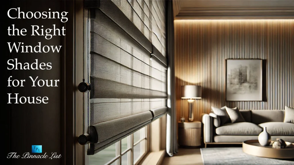
The living room is the heart of a home, where style meets comfort. Here, the off white vs cream debate often hinges on the existing furniture palette and the amount of natural light. If your sofa is a deep charcoal or navy, a cooler off white can create a striking contrast that feels contemporary. Conversely, if your furnishings feature warm woods or earthy tones, cream can harmonize the space, adding a layer of softness.
Consider the scale of the room as well. In a modest living area, a light off white can visually expand the walls, while a gentle cream can prevent the space from feeling overly sterile, maintaining a welcoming vibe.
off white vs cream in Living Rooms
Here are three quick scenarios:
- Minimalist loft: Paint the walls off white, add a cream-colored rug to soften the floor, and let sleek metal accents shine.
- Cozy family room: Choose a warm cream for the walls, pair with deep teal cushions, and incorporate natural wood coffee tables for balance.
- Eclectic space: Use off white as a neutral canvas, then layer colorful artwork and patterned throws that pick up both cool and warm tones.
For more inspiration, see our guide on small bedroom reading nook décor ideas, which demonstrates how subtle color choices can transform intimate corners.
Bedroom Bliss: off white vs Cream
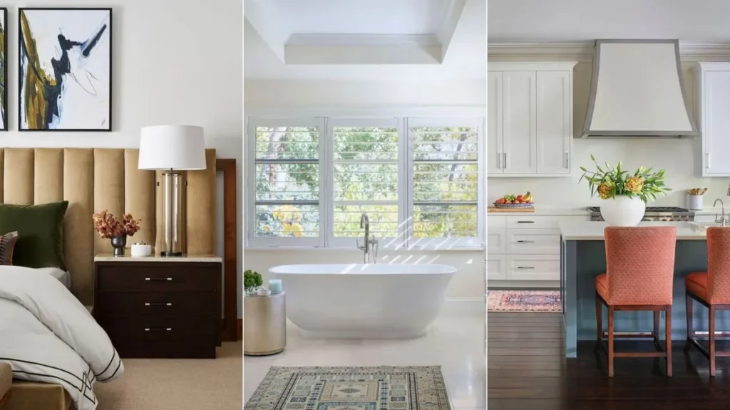
Bedrooms thrive on tranquility, and the choice between off white and cream can set the tone for restfulness. Off white tends to create a crisp, spa‑like environment that feels fresh and airy. Cream, on the other hand, adds a gentle warmth that can make a bedroom feel like a comforting nest.
Layering textiles—think linens, throws, and pillows—allows you to play with both shades without committing the entire wall to one tone. A wall painted off white can be balanced with cream-colored bedding, while a cream wall pairs beautifully with off‑white accent pieces.
off white vs cream for Cozy Bedrooms
- Soft contrast: Paint the headboard wall off white, then drape a cream duvet to create a subtle yet effective contrast.
- Monochrome harmony: Use cream on all walls and introduce off‑white nightstands and lamps for a layered, tonal look.
- Accent focus: Incorporate a bold, dark accent wall in a deep navy or emerald to break the neutral field, letting off white vs cream serve as a calming backdrop.
Need more ideas? Check out minimal bedroom window décor ideas for ways to blend neutrals with natural light.
Kitchen and Bathroom Applications
In kitchens and bathrooms, durability and cleanliness are paramount, but aesthetics remain essential. Off white works well with stainless steel appliances, delivering a sleek, contemporary feel. Cream can complement warm wood cabinets or marble countertops, adding a touch of elegance.
Both hues are forgiving when it comes to minor stains, but cream may show water spots more readily than a cooler off white. Selecting the right finish—matte, satin, or semi‑gloss—can further influence how the color performs in high‑traffic, moisture‑prone areas.
off white vs cream in Kitchen Cabinets
Here’s how you might decide:
- Modern minimalism: Choose off white cabinets with brushed metal hardware; pair with a cream backsplash for subtle warmth.
- Traditional charm: Opt for cream cabinets, add off white countertop islands, and incorporate vintage brass fixtures.
- Mixed material look: Paint upper cabinets off white, lower cabinets cream, and use natural wood flooring to unify the palette.
For a practical perspective on fixtures, read our guide on the best esthetician chair, which highlights how neutral tones affect perceived cleanliness.
Pairing with Other Colors and Textures
Off white vs cream serve as excellent foundations for both bold and muted palettes. Because they sit close to the neutral spectrum, they allow vibrant colors—such as emerald green, mustard yellow, or deep navy—to pop without overwhelming the eye. Textures, too, play a crucial role; a plush cream sofa paired with a sleek off‑white glass coffee table creates a balanced, multi‑sensory experience.
When mixing metals, consider the undertone of your chosen shade. Cool off white aligns nicely with chrome or brushed nickel, while warm cream complements gold, brass, or aged copper.
off white vs cream with Bold Accents
Three pairing strategies:
- Monochrome with a splash: Use off white on walls, cream on furnishings, and introduce a single bright accent—like a ruby red rug.
- Earthy harmony: Cream walls, off‑white ceiling, and natural stone countertops create a grounded, organic feel.
- High‑contrast drama: Dark charcoal furniture against an off‑white backdrop, with cream throw pillows to soften the intensity.
Want to know how to install complementary window treatments? Our step‑by‑step guide on installing faux wood blinds offers practical tips that work beautifully with both off white and cream schemes.
Quick Home Décor Tips
- Test paint samples on multiple walls to see how off white vs cream reacts to morning, midday, and evening light.
- Use a mix of textures—linen, velvet, wood—to prevent a neutral palette from feeling flat.
- Introduce subtle metallic accents that echo the undertone of your chosen shade for cohesive elegance.
- Layer rugs: a cream area rug over an off‑white floor can add depth without clutter.
- Refresh cabinets with a new hardware finish; brass pairs beautifully with cream, while matte black complements off white.
Common Mistakes and How to Avoid Them
Even seasoned designers can slip when working with neutrals. Below are frequent pitfalls and corrective measures:
- Choosing the wrong undertone for the room’s lighting: Always view paint swatches under the room’s actual lighting conditions before committing.
- Over‑matching: Using only off white or cream throughout can make a space feel monotonous. Introduce contrasting textures or a pop of color.
- Ignoring finish: Matte finishes hide imperfections but can appear dull in low‑light areas; semi‑gloss adds subtle reflectivity that enhances both shades.
- Neglecting trim and ceiling color: Painting ceilings off white while keeping walls cream can unintentionally lower ceiling height. Keep consistent tones for a seamless look.
Frequently Asked Questions
Which shade is better for small rooms, off white or cream?
Both work well, but off white often makes a space feel larger because its cooler undertone recedes visually. Cream adds warmth, which can be cozy but may slightly reduce the perception of size if the room lacks natural light.
Can I mix off white and cream in the same room?
Absolutely. Use one as the primary wall color and the other for trim, ceilings, or accent walls. This creates depth while maintaining a cohesive neutral palette.
How do I keep cream walls looking fresh?
Choose a washable, low‑sheen paint finish, and incorporate regular cleaning with a mild detergent. Adding a subtle off‑white crown molding can also break up the surface, reducing the appearance of wear.
Is off white suitable for a farmhouse style?
Yes. Pair off white walls with reclaimed wood furniture and cream linens for a modern farmhouse feel. The cool tone balances the rustic warmth of natural wood.
What flooring works best with off white vs cream?
Light hardwood or gray‑tone tile complement off white, while warm oak or honey‑toned tile enhances cream. Consider the overall temperature you want the room to convey.
Choosing between off white and cream is less about a right or wrong answer and more about aligning the shade with your lifestyle, lighting, and design aspirations. By understanding their unique qualities, you can harness the power of neutral tones to craft spaces that feel both timeless and personally resonant.
Ready to experiment? Grab a few paint samples, play with lighting, and let the subtle dance between off white vs cream guide your next home makeover. For more design inspiration, explore our other articles and keep your interiors fresh, functional, and fabulous.