
Table of Contents
- 1. Earthy Neutrals with a Warm Twist
- Living room color trends: How to integrate warm neutrals
- 2. Bold Jewel Tones as Accents
- 3. Soft Pastel Revival for Calm Living
- 4. Moody Darks for Sophisticated Spaces
- 5. Nature‑Inspired Greens and Blues
- 6. Monochromatic Schemes with Textural Play
- Quick Home Décor Tips
- Common Mistakes to Avoid
- Frequently Asked Questions
Every year, interior designers, paint manufacturers, and style influencers converge on a fresh set of palettes that shape how we experience our most‑used gathering space: the living room. In 2024, the dialogue around color is moving beyond fleeting fads and toward a more nuanced, mood‑centric approach that balances comfort with visual excitement. Whether you’re refreshing a compact apartment lounge or redefining a sprawling family room, understanding the current living room color trends can save you time, money, and endless swatches.
Why do these trends matter? A well‑chosen hue does more than just coat the walls; it sets the tone for furniture, textiles, and accessories, influencing how a room feels throughout the day. Moreover, color choices affect resale value and can make a space feel larger, cozier, or more vibrant, depending on the goal. This article walks you through the most compelling living room color trends of the year, offers practical styling tips, highlights common pitfalls, and answers the questions homeowners ask most often.
Living Room Color Trends 2024: Fresh Hues & Timeless Palettes
1. Earthy Neutrals with a Warm Twist
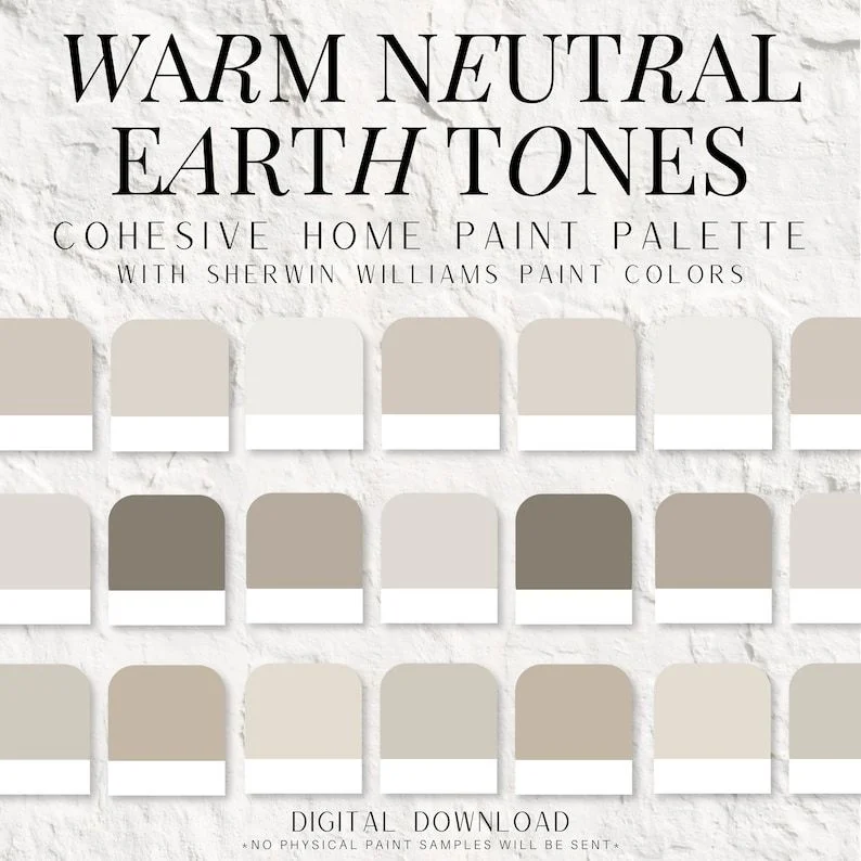
Neutral palettes have long been the backbone of living room design, but 2024 injects them with subtle warmth. Think soft taupes, muted ochres, and gentle terracotta undertones that echo natural materials like stone and clay. These shades create a soothing backdrop while allowing bold décor pieces—such as a patterned rug or a statement sofa—to shine without clashing.
Living room color trends: How to integrate warm neutrals
Start with a base coat of a warm beige on the larger walls. Then, add depth with an accent wall painted in a richer terracotta. Pair the palette with natural wood furniture and layered textiles in ivory, rust, or deep olive. For a cohesive look, consider the Pale Oak vs Alabaster guide to select the right undertone for your lighting conditions.
- Use warm neutrals on ceilings to reflect light upward.
- Introduce texture through woven baskets or reclaimed wood accents.
- Balance with metallic finishes like brushed brass for a modern edge.
2. Bold Jewel Tones as Accents
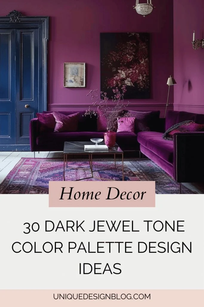
Jewel tones—emerald, sapphire, amethyst—have resurfaced as daring accent colors. When applied sparingly, they add drama without overwhelming the space. A single emerald armchair, a sapphire side table, or an amethyst‑hued throw pillow can become a focal point that energizes the room.
Because these colors are intense, they work best against a muted backdrop. Pair a deep emerald wall with light gray upholstery, or use a sapphire ceiling in a room with white trim. The contrast amplifies the richness of the jewel tones while keeping the overall atmosphere balanced.
- Choose one dominant jewel accent per room to avoid visual chaos.
- Layer different textures—velvet, silk, and matte—to add dimension.
- Complement with metallic accessories in gold or copper.
3. Soft Pastel Revival for Calm Living
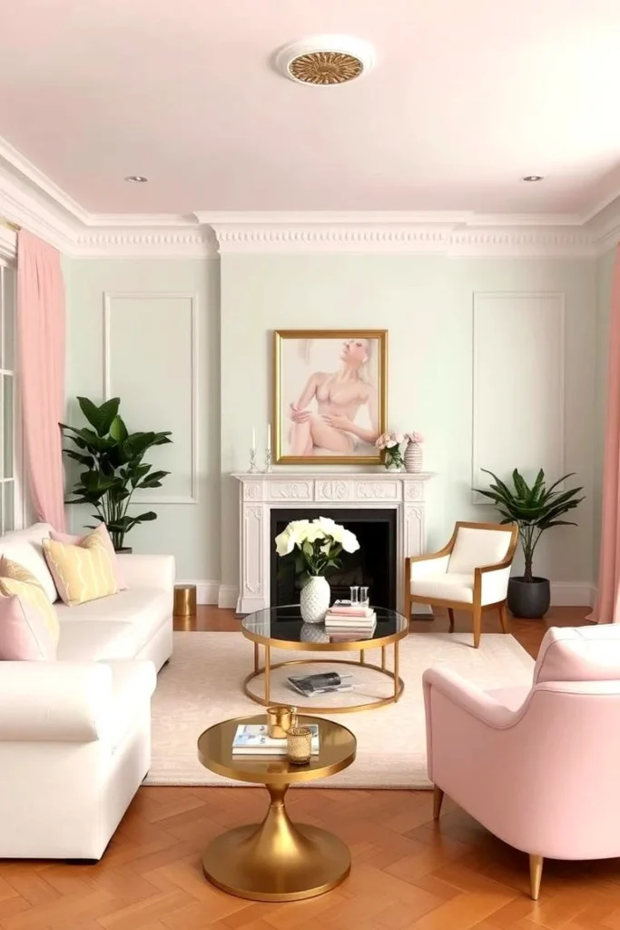
Pastels are no longer limited to nurseries. Soft blues, blush pinks, and muted mint have earned a place in contemporary living rooms, especially when paired with organic materials. These gentle hues foster a calm environment, ideal for spaces dedicated to relaxation or mindfulness.
To incorporate pastel living room color trends, paint the main walls a light sky‑blue and introduce a blush pink sofa or a mint‑green ottoman. Accent with natural fibers—linen curtains, jute rugs, and rattan chairs—to keep the vibe airy and fresh. For a coordinated look, explore the article on how to decorate curtains at home for pastel‑friendly window treatments.
- Mix pastel walls with white or light wood flooring for continuity.
- Use pastel accessories sparingly to maintain a sophisticated look.
- Incorporate greenery to enhance the serene atmosphere.
4. Moody Darks for Sophisticated Spaces
Dark, saturated colors are a hallmark of luxury living rooms. Deep charcoal, navy, and forest green create intimate, cocoon‑like settings that feel both modern and timeless. When balanced with strategic lighting and reflective surfaces, moody darks can make a room feel larger rather than smaller.
Implementing moody living room color trends starts with a dark feature wall or a ceiling painted in navy. Counterbalance the darkness with light‑colored furniture, glass coffee tables, and ample layered lighting—floor lamps, table lamps, and sconces. This approach prevents the room from feeling oppressive while preserving the dramatic effect.
- Opt for matte finishes on dark walls to reduce glare.
- Introduce a statement light fixture to become the room’s centerpiece.
- Use light‑colored flooring or area rugs to break up the darkness.
5. Nature‑Inspired Greens and Blues
Colors drawn directly from the outdoors continue to dominate living room color trends. Soft sage, sea‑foam green, and tranquil teal evoke a connection to nature, promoting wellness and relaxation. These hues work beautifully in spaces that incorporate biophilic design elements such as indoor plants, natural wood, and stone.
Start with a pale sage wall and layer in deeper teal accents through cushions, artwork, or a statement armchair. Pair with natural textures—bamboo blinds, stone countertops, and wooden shelving—to reinforce the nature‑inspired theme. For inspiration on integrating greenery, read our guide on small living room plant corner décor.
- Use varying shades of green to create depth without clutter.
- Incorporate water features or blue accessories for a balanced palette.
- Maintain good lighting to keep the colors from appearing dull.
6. Monochromatic Schemes with Textural Play
Monochrome isn’t just black and white; it can be any single hue rendered in multiple tones and textures. This year’s living room color trends celebrate the elegance of a single‑color palette enriched by material variety. For example, a room bathed in layers of gray—from soft dove to charcoal—can feel both cohesive and dynamic.
To achieve a successful monochromatic look, select a base color and then introduce lighter and darker shades through paint, upholstery, and accessories. Mix textures—smooth leather, plush velvet, rough linen—to keep the visual interest alive. The result is a sophisticated space that feels curated rather than flat.
- Layer three to four tones of the same color for depth.
- Play with reflective surfaces—mirrors, metallic frames—to add sparkle.
- Include a contrasting element, such as a patterned rug, to prevent monotony.
Quick Home Décor Tips
- Test paint samples on large wall sections before committing; colors shift with natural light.
- Use a single bold accent color throughout the room—on pillows, artwork, and décor—to create harmony.
- Incorporate reflective surfaces to amplify light, especially in rooms painted with darker living room color trends.
- Balance saturated hues with neutrals to maintain visual comfort.
- Refresh the room annually by swapping small accessories instead of repainting entirely.
Common Mistakes to Avoid
Even the most enthusiastic homeowners can stumble when applying living room color trends. One frequent error is over‑matching—using the same shade on walls, furniture, and accessories, which can make the space feel flat. Another is ignoring the room’s natural lighting; a color that looks vibrant in a showroom may appear dull under limited daylight.
Lastly, many people underestimate the impact of ceiling color. A bright ceiling can lift a room, while a dark ceiling can add intimacy. Choose a ceiling hue that complements, not competes with, your wall colors.
Frequently Asked Questions
What are the safest living room color trends for resale?
Neutral tones with warm undertones, such as soft greige or warm taupe, are widely appealing to buyers. They provide a blank canvas that allows future owners to personalize without major repainting.
Can I combine two living room color trends in the same space?
Yes. Pairing a bold jewel accent with a pastel backdrop, for example, creates a balanced contrast. The key is to let one trend dominate while using the second as a subtle accent.
How do I choose a paint finish for different living room color trends?
Matte finishes work well with dark or moody hues, reducing glare. Satin or eggshell finishes are ideal for neutrals and pastels, offering a soft sheen that highlights texture without being too glossy.
Is it okay to paint a ceiling a different color than the walls?
Absolutely. A contrasting ceiling—such as a light sky‑blue over warm neutrals—adds visual interest and can make a room feel taller. Just ensure the color complements the overall palette.
How often should I update my living room colors?
Trends evolve every few years, but you can refresh the look more frequently by swapping accessories, textiles, or an accent wall. Full repainting is typically recommended every 5‑7 years unless you’re chasing a specific trend.
Living room color trends are more than a fleeting Instagram feed; they reflect evolving lifestyles, technological advances in paint, and a growing desire for spaces that nurture well‑being. By understanding the palette options—earthy neutrals, bold jewel tones, calming pastels, moody darks, nature‑inspired greens, and monochromatic schemes—you can craft a living area that feels both current and timeless.
Take the insights from this guide, experiment with swatches, and let your personal taste lead the way. When you feel confident in your palette, you’ll notice how effortlessly furniture, décor, and lighting fall into place, creating a harmonious environment that welcomes family, friends, and yourself every day. For more inspiration, explore our articles on living room décor with woven baskets and discover additional styling ideas that complement the trends discussed.