
Table of Contents
- Why Home Styling with Light Colors Works
- Choosing the Right Light Color Palette for Home Styling with Light Colors
- Assess Natural Light
- Mix Warm and Cool Neutrals
- Use the 60‑30‑10 Rule
- Room‑by‑Room Guide to Home Styling with Light Colors
- Living Room: Light Colors for a Welcoming Hub
- Bedroom: Serenity Through Light Hues
- Kitchen: Bright and Functional
- Bathroom: Spa‑Like Lightness
- Home Office: Focused Yet Airy
- Mixing Textures and Accessories in Home Styling with Light Colors
- Lighting and Accents to Enhance Home Styling with Light Colors
- Layered Lighting Strategy
- Strategic Use of Color Accents
- Budget‑Friendly and Sustainable Approaches to Home Styling with Light Colors
- Quick Home Décor Tips
- Common Mistakes in Home Styling with Light Colors—and How to Avoid Them
- Frequently Asked Questions
- Conclusion
Home Styling with Light Colors: A Complete Guide for Modern Spaces
Light colors have a unique ability to open up a space, creating an airy atmosphere that feels both welcoming and sophisticated. Whether you live in a compact apartment or a spacious family home, incorporating light hues into your décor can amplify natural light, make rooms appear larger, and set a calming backdrop for your personal style. This article explores the why and how of home styling with light colors, offering actionable tips, room‑by‑room ideas, and expert insights that will help you achieve a cohesive, modern look.
Throughout the guide, you’ll learn how to select the right palette, balance textures, and choose accessories that complement rather than overwhelm the subtle elegance of light tones. We’ll also address common mistakes, answer frequently asked questions, and point you toward additional resources for deeper inspiration. By the end, you’ll feel confident turning any corner of your home into a bright, thoughtfully designed sanctuary.
Why Home Styling with Light Colors Works
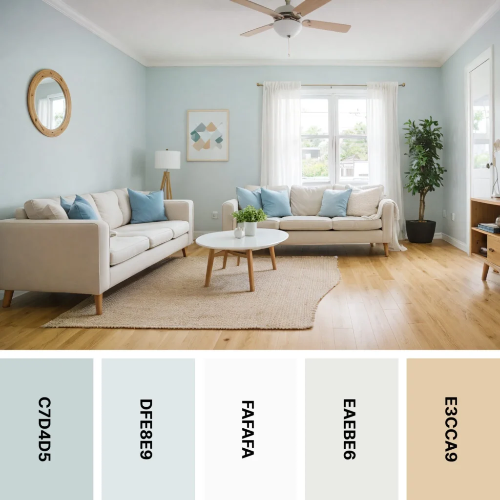
Light colors such as soft whites, muted grays, pastel blues, and gentle beiges reflect more light than darker hues, instantly brightening a room. This reflective quality can make modest spaces feel expansive, an essential advantage for urban dwellers and renters with limited square footage. Moreover, light palettes serve as a neutral canvas, allowing you to layer personal touches—artwork, textiles, and décor—without clashing.
From a psychological standpoint, lighter shades are associated with calmness, cleanliness, and simplicity, which aligns perfectly with contemporary design trends that favor minimalism and functionality. When you embrace home styling with light colors, you also gain flexibility; a neutral base can be easily updated with seasonal accessories or bold accent pieces, keeping your interiors fresh without a full remodel.
Choosing the Right Light Color Palette for Home Styling with Light Colors
Not all light colors are created equal. The key is to select hues that complement your home’s natural lighting, architectural details, and personal taste. Here are some guidelines to help you craft a harmonious palette:
Assess Natural Light
- North‑facing rooms benefit from warmer light neutrals (cream, soft ivory) to counteract cooler daylight.
- South‑facing spaces can handle cooler tones (pale gray, dove blue) without feeling chilly.
- East‑ and west‑facing rooms are versatile; experiment with both warm and cool light colors.
Mix Warm and Cool Neutrals
Combining warm and cool neutrals creates depth while maintaining the airy feel of home styling with light colors. Pair a warm off‑white on the walls with cool gray furniture, or vice versa, to achieve a balanced look.
Use the 60‑30‑10 Rule
Apply the classic design principle: 60% dominant light color (walls), 30% secondary light shade (large furniture), and 10% accent (cushions, artwork). This ratio ensures cohesion and prevents the space from feeling flat.
Room‑by‑Room Guide to Home Styling with Light Colors

Each area of your home presents unique opportunities for light color integration. Below, we break down practical strategies for the most common rooms.
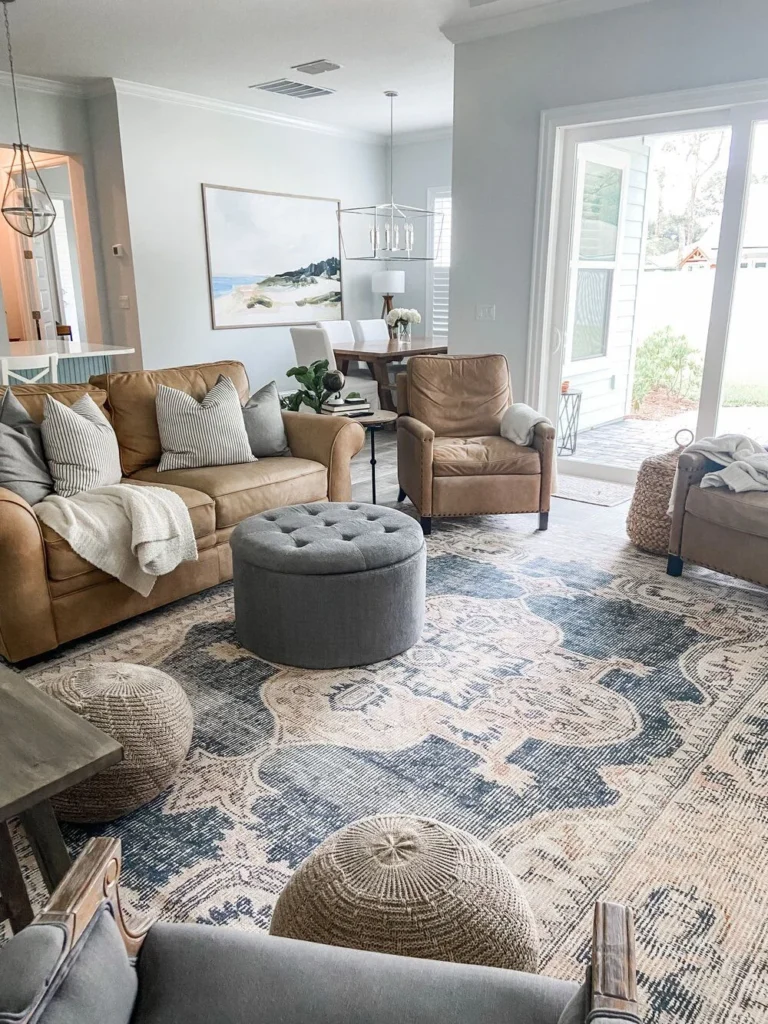
Living Room: Light Colors for a Welcoming Hub
Start with a soft ivory or pale greige on the walls to create a bright backdrop. Choose a sofa in a muted taupe or light gray, then add cushions in pastel shades like sage green or dusty rose for subtle contrast. A modern wall frame in a light wood finish can serve as an eye‑catching focal point without disrupting the palette.
- Flooring: Light oak or natural bamboo enhances the airy feel.
- Rugs: Choose low‑pile rugs in ivory or soft cream to maintain openness.
- Lighting: Incorporate layered lighting—overhead recessed fixtures paired with floor lamps featuring white shades.
Bedroom: Serenity Through Light Hues
Bedrooms thrive on calmness. Paint the walls in a soothing sky blue or gentle lilac, then dress the bed in crisp white linens. Add a light wood nightstand and a woven throw in a complementary pastel for texture. If you’re looking for a quick upgrade, try DIY neutral candle décor to introduce soft, ambient glow.
- Headboard: Opt for an upholstered headboard in light beige.
- Window Treatments: Sheer curtains in off‑white let natural light filter gently.
- Accent Wall: Consider a subtle wallpaper with a delicate pattern in muted tones.
Kitchen: Bright and Functional
A kitchen painted in a warm, pale yellow or light sage can feel fresh and energizing. Pair the walls with white cabinetry and quartz countertops in a light marble look. For an unexpected pop, install open shelving in natural wood and display white ceramic dishes—a nod to the ceramic décor accents guide.
- Backsplash: Choose a glossy white subway tile for a timeless look.
- Appliances: Stainless steel finishes blend well with light color palettes.
- Lighting: Under‑cabinet LED strips brighten workspaces without harsh glare.
Bathroom: Spa‑Like Lightness
Transform your bathroom into a spa‑like retreat by using pale stone tones—soft gray or warm sand. Light-colored tiles on the floor and walls reflect moisture and keep the space feeling clean. Add plush white towels, a light wood vanity, and a few green plants for a touch of nature.
- Shower Enclosure: Clear glass maintains openness.
- Mirror: Choose a large, frameless mirror to double the sense of space.
- Accessories: Matte gold or brushed nickel fixtures complement light tones elegantly.
Home Office: Focused Yet Airy
Productivity thrives in environments that are both bright and uncluttered. Paint your home office walls in a muted mint or soft dove gray, then select a light wood desk and a comfortable ergonomic chair in neutral fabric. Keep the décor minimal—perhaps a single piece of art or a small shelf of books.
- Storage: White floating shelves keep the floor clear.
- Lighting: A daylight‑simulating desk lamp reduces eye strain.
- Plants: A small succulent adds life without distraction.
Mixing Textures and Accessories in Home Styling with Light Colors
One challenge of light color schemes is avoiding a sterile or overly uniform look. Introducing varied textures creates visual interest while preserving the airy vibe. Here’s how to layer texture effectively:
- Natural Fibers: Linen cushions, jute rugs, and woven baskets add organic warmth.
- Metallic Accents: Brushed brass or matte black hardware provides subtle contrast.
- Glass and Lucite: Transparent or frosted pieces keep the eye moving without adding weight.
- Wood Grain: Light oak or maple furniture introduces depth while staying within the light palette.
When choosing décor pieces, ask yourself whether each item contributes to the overall light, airy atmosphere. A well‑placed hallway décor idea, such as a slim console table in white lacquer with a simple vase of fresh flowers, can tie the entire home together.
Lighting and Accents to Enhance Home Styling with Light Colors
Lighting is the secret weapon that makes home styling with light colors truly shine. Natural light should be maximized, but artificial lighting plays a pivotal role after sunset.
Layered Lighting Strategy
Combine three layers:
- Ambient: Overhead recessed lights or a central chandelier in a light finish.
- Task: Desk lamps, under‑cabinet lights, or pendant lights where focused illumination is needed.
- Accent: Wall sconces, LED strip lighting behind shelving, or candles to create mood.
Choosing fixtures in white, brushed nickel, or pastel tones ensures they blend seamlessly with the surrounding light palette.
Strategic Use of Color Accents
While the base remains light, a splash of color can energize a room. Consider a single piece of artwork featuring deep navy, emerald, or coral, or a set of throw pillows in richer shades. This approach maintains the soothing foundation of home styling with light colors while allowing personal expression.
Budget‑Friendly and Sustainable Approaches to Home Styling with Light Colors
Achieving a sophisticated light‑color aesthetic doesn’t have to break the bank. Here are sustainable, cost‑effective methods to consider:
- Paint Refresh: A fresh coat of low‑VOC paint in a soft neutral can transform any room for under $100 per gallon.
- Secondhand Finds: Look for lightly colored vintage furniture at thrift stores; a simple sand‑papering or re‑upholstering can give it new life.
- DIY Projects: Follow our guide on DIY home décor projects for beginners to create your own light‑toned wall art or decorative trays.
- Eco‑Friendly Materials: Choose bamboo flooring, reclaimed light‑stained wood, or recycled glass accessories that align with a sustainable lifestyle.
Quick Home Décor Tips
- Start with a light base and add one bold accent piece per room.
- Use mirrors strategically to bounce light and enlarge the space.
- Incorporate greenery; plants in white pots keep the palette airy.
- Keep window treatments sheer to maximize daylight.
- Opt for low‑profile furniture to maintain the sense of openness.
Common Mistakes in Home Styling with Light Colors—and How to Avoid Them
Over‑matching: Using the same exact shade on walls, furniture, and accessories can feel flat. Introduce subtle tonal variations—different shades of the same hue or complementary neutrals—to add depth.
Insufficient Contrast: Light rooms can appear washed out if there’s no contrast. Add texture, darker hardware, or a single piece of artwork with richer colors to create visual interest.
Neglecting Light Sources: Relying only on natural light may leave evenings feeling dim. Plan for layered artificial lighting to keep the space vibrant after dark.
Choosing the Wrong Finish: Matte finishes can absorb light, while semi‑gloss reflects. For walls, a low‑sheen finish balances durability and brightness.
Frequently Asked Questions
Can I use light colors in a small bedroom without making it feel cold?
Yes. Pair cool light tones like pale blue with warm accessories such as a wooden headboard, soft textiles, and warm lighting. The contrast adds comfort while keeping the room bright.
What are the best light colors for high‑traffic areas?
Soft greiges, warm whites, and light taupes are forgiving of dirt and wear. Choose durable finishes like washable low‑VOC paint to maintain freshness over time.
How do I transition from a dark color scheme to home styling with light colors?
Start by painting one wall or a focal area in a light hue, then gradually introduce light‑colored furniture and accessories. This phased approach reduces overwhelm and lets you adjust as needed.
Is it okay to use bold patterns with a light color palette?
Absolutely—use patterns sparingly, such as in a rug or a single set of curtains. Choose designs with a light background and subtle accents to keep the overall feel airy.
Do light colors affect energy efficiency?
Light‑colored walls reflect more sunlight, helping to keep rooms cooler in summer and reducing reliance on air conditioning. In colder months, they can also improve the distribution of artificial lighting.
Can I incorporate dark furniture in a room styled with light colors?
Dark furniture can create striking contrast when balanced with plenty of light walls and accessories. Ensure there’s enough lighting to prevent the space from feeling heavy.
Conclusion
Home styling with light colors offers a timeless, versatile foundation that can adapt to evolving trends and personal tastes. By thoughtfully selecting palettes, balancing textures, and layering lighting, you can craft interiors that feel spacious, serene, and uniquely yours. Remember to avoid common pitfalls, embrace small accent pieces, and consider sustainable options to keep your design both beautiful and responsible. Ready to transform your living environment? Dive into more inspiration, experiment with the ideas shared here, and let the light guide your next home makeover.