Table of Contents
- Chantilly Lace vs White Dove: Understanding the Core Differences
- Chantilly Lace vs White Dove: Visual Performance in Different Light
- Best Rooms for Chantilly Lace
- Design Tips for Using Chantilly Lace
- Best Rooms for White Dove
- Styling Ideas with White Dove
- How to Test the Shades Before Committing
- Chantilly Lace vs White Dove: Cost, Availability, and Finish Options
- Quick Tips for Using White Paint Effectively
- Common Mistakes When Choosing Between Chantilly Lace vs White Dove
- Frequently Asked Questions
- Bringing It All Together: Making the Final Decision
When it comes to selecting the perfect white paint for a home, two names dominate the conversation: Chantilly Lace and White Dove. Both are celebrated for their clean, crisp appearance, yet each brings its own personality to a space. Understanding the nuances between these shades can make the difference between a room that feels airy and one that feels flat. This guide dives deep into the characteristics, best‑use scenarios, and practical tips for each hue, helping homeowners, renters, and design enthusiasts make an informed decision.
Whether you’re refreshing a living room, updating a bedroom, or creating a sleek kitchen backdrop, the choice of white can influence lighting, mood, and the overall aesthetic. In the following sections, we’ll compare Chantilly Lace vs White Dove across several design dimensions, explore real‑world applications, and provide actionable advice so you can confidently select the right shade for your next project.
Chantilly Lace vs White Dove: Understanding the Core Differences
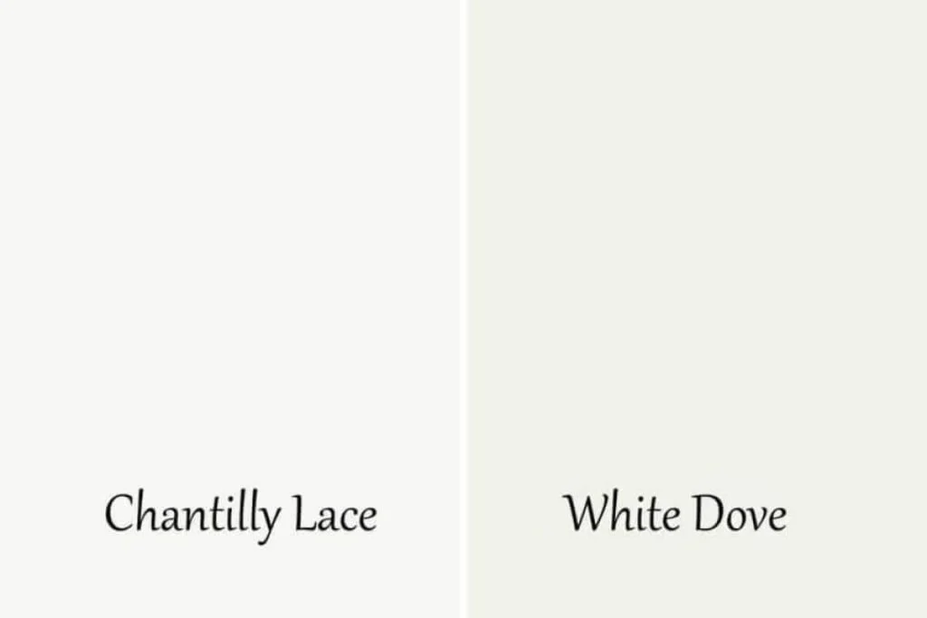
At first glance, Chantilly Lace and White Dove appear nearly identical, but their undertones and performance under different lighting conditions set them apart. Chantilly Lace, a Benjamin Moore classic, leans toward a pure, neutral white with minimal yellow or gray hints. White Dove, also from Benjamin Moore, carries a subtle warm undertone that can soften a space without veering into creamy territory.
These undertones affect how each color interacts with natural light, artificial fixtures, and surrounding décor. In bright, sun‑lit rooms, Chantilly Lace maintains a crisp, almost studio‑like quality, while White Dove adds a gentle warmth that can make a large, stark area feel more inviting. When comparing Chantilly Lace vs White Dove, consider the room’s orientation, the size of the space, and the existing color palette.
Chantilly Lace vs White Dove: Visual Performance in Different Light
- North‑facing rooms: Chantilly Lace tends to stay bright, preventing the space from feeling too cool.
- South‑facing rooms: White Dove’s soft warmth balances the abundance of sunlight, reducing glare.
- Artificial lighting: LED lights with a cooler temperature highlight Chantilly Lace’s neutrality, whereas warm‑tone bulbs complement White Dove’s subtle warmth.
Best Rooms for Chantilly Lace
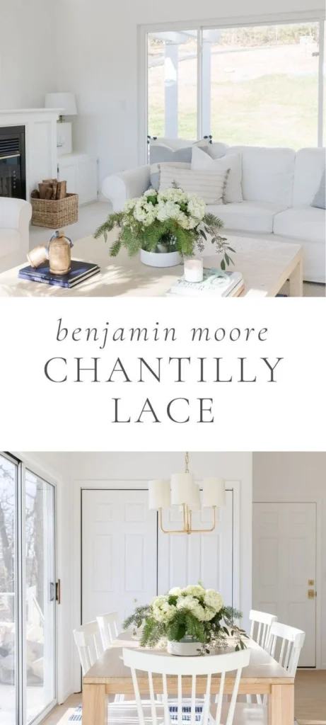
Chantilly Lace shines in environments where a clean, contemporary look is desired. Its neutral base makes it a favorite for modern kitchens, minimalist bathrooms, and open‑plan living areas that rely on architectural details rather than color to create interest.
In a kitchen, for example, the starkness of Chantilly Lace can make stainless‑steel appliances and quartz countertops pop, lending a high‑end feel. Pair it with dark cabinetry for contrast, or with light wood tones for a balanced, Scandinavian vibe. For more inspiration on kitchen styling, check out our comprehensive comparison of kitchen brands to see how paint choice complements hardware finishes.
Design Tips for Using Chantilly Lace
- Combine with matte black fixtures for a striking modern contrast.
- Use textured wallcoverings or subtle geometric wallpapers to add depth without compromising the clean look.
- In small apartments, keep trim and baseboards the same shade to create a seamless, expansive feel.
Best Rooms for White Dove
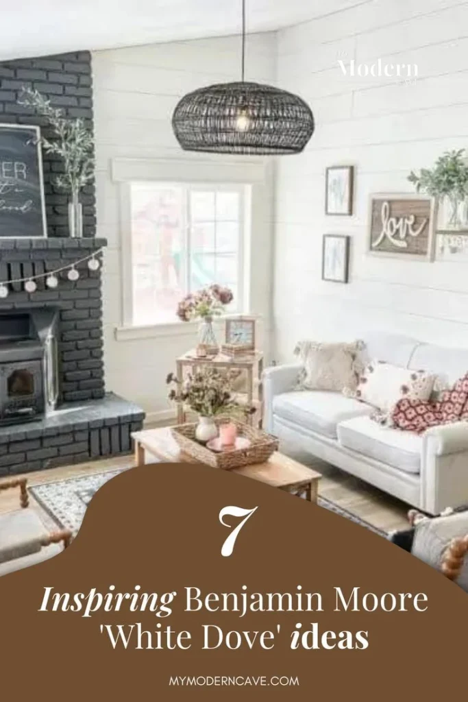
White Dove’s gentle warmth makes it a versatile choice for bedrooms, living rooms, and traditional bathrooms where comfort and coziness are priorities. The hue works especially well with wood tones, soft textiles, and earthy accents, creating an environment that feels both fresh and inviting.
In a bedroom, White Dove can serve as a neutral backdrop that allows bedding, artwork, and decorative pillows to become the focal points. It also pairs beautifully with pastel walls or darker accent walls, offering flexibility for layered color schemes. If you’re considering a bathroom makeover, see how White Dove compares to other options in our bathroom vanity comparison guide, where paint selection can dramatically affect perceived space.
Styling Ideas with White Dove
- Layer with natural linen curtains for a soft, airy ambience.
- Introduce brass or gold hardware to accentuate the warm undertone.
- Pair with muted greens or blues for a serene, spa‑like feel.
How to Test the Shades Before Committing
Choosing between Chantilly Lace vs White Dove should involve real‑world testing. Paint swatches on large poster board pieces and place them on different walls to observe how each reacts to morning, noon, and evening light. Pay special attention to shadowed corners, as these will reveal any unexpected undertones.
Another effective method is to apply a small sample strip (about 12 × 12 inches) on the wall, then step back after 24 hours. The color may appear different once the paint dries fully, and you’ll get a better sense of its true character. Don’t forget to view the sample with the room’s furnishings in place; the surrounding colors can shift perception dramatically.
Chantilly Lace vs White Dove: Cost, Availability, and Finish Options
Both shades are part of Benjamin Moore’s extensive line, making them widely available at major paint retailers. The price point is comparable, typically ranging from $45 to $55 per gallon for the standard interior paint. However, specialty finishes—such as matte, eggshell, or satin—may affect the final cost.
When selecting a finish, consider the room’s traffic level. Satin or semi‑gloss is ideal for high‑moisture areas like kitchens and bathrooms, providing durability and easy cleaning. Matte finishes work well in living rooms and bedrooms where a soft, velvety look is desired. Both Chantilly Lace and White Dove perform well across these finishes, but the subtle warmth of White Dove can appear slightly richer in a satin sheen.
Quick Tips for Using White Paint Effectively
- Use a quality primer to ensure true color representation, especially when covering dark or saturated paints.
- Combine white walls with a single bold accent wall to avoid a washed‑out feel.
- In open‑plan homes, keep a consistent white (either Chantilly Lace or White Dove) on all walls to maintain visual flow.
- Pair white ceilings with a slightly warmer or cooler tone on the walls to add dimension.
- Consider low‑VOC options for healthier indoor air quality.
Common Mistakes When Choosing Between Chantilly Lace vs White Dove
Even seasoned designers can fall into traps when selecting a white paint. One frequent error is overlooking the influence of existing flooring. Dark hardwood can make a pure white like Chantilly Lace feel stark, while a light‑toned floor may cause White Dove to appear too warm. Another mistake is ignoring the effect of ceiling height; a very high ceiling painted with Chantilly Lace can feel overly bright, whereas White Dove can add a subtle grounding effect.
Lastly, many homeowners forget to test the paint under the room’s specific lighting conditions. A sample that looks perfect under showroom lighting may appear dull or yellowish at home. To avoid these pitfalls, always test, compare, and consider the entire design ecosystem before finalizing your choice.
Frequently Asked Questions
Is Chantilly Lace better for small spaces?
Chantilly Lace’s crisp neutrality can make a small room feel larger by reflecting more light. However, if the space receives limited natural light, White Dove’s warm undertone may prevent it from feeling too stark.
Can I mix Chantilly Lace and White Dove in the same home?
Absolutely. Using both shades can create visual interest and delineate zones—Chantilly Lace for high‑traffic areas like kitchens, and White Dove for relaxing spaces such as bedrooms.
How do these whites look with dark cabinets?
Both work well with dark cabinetry. Chantilly Lace provides high contrast for a modern look, while White Dove offers a softer backdrop that still highlights the cabinetry without harsh glare.
Do I need a special primer for these whites?
A high‑quality primer is recommended for any fresh paint job, especially if covering bold colors or stains. It ensures even coverage and true color fidelity for both Chantilly Lace and White Dove.
Which shade is more forgiving with imperfect walls?
White Dove’s subtle warmth can mask minor imperfections better than the ultra‑neutral Chantilly Lace, which tends to reveal uneven textures.
Bringing It All Together: Making the Final Decision
When weighing Chantilly Lace vs White Dove, consider the room’s purpose, lighting, existing materials, and the emotional tone you wish to set. Chantilly Lace is ideal for sleek, contemporary environments that demand a clean canvas. White Dove, on the other hand, excels in spaces where a touch of warmth enhances comfort and invites lingering.
Think about the overall flow of your home. If you prefer a unified look, choose one shade and repeat it throughout the main living areas, using accent walls or décor to introduce variation. If you enjoy contrast, blend the two—perhaps Chantilly Lace in the kitchen and White Dove in adjoining dining or lounge areas—to subtly shift the atmosphere while maintaining cohesion.
Remember that paint is just one component of a larger design story. Pair your chosen white with appropriate furnishings, textures, and lighting to achieve the desired effect. For outdoor inspiration, explore our guide on balcony décor with wooden chairs, where the right shade of white can elevate even an exterior space.
Ultimately, both Chantilly Lace and White Dove are excellent options; the “best” choice hinges on your personal style and the specific context of each room. By testing, visualizing, and considering the factors outlined above, you’ll be equipped to select the perfect white that enhances your home’s beauty and functionality.
Feel inspired to experiment, trust your instincts, and enjoy the transformative power of a thoughtfully chosen paint color. Happy decorating!