
Table of Contents
- Building a Calm Neutral Bedroom Color Palette from Scratch
- How to Balance Tones in a Calm Neutral Bedroom Color Palette
- Choosing the Right Paint Finish for a Calm Neutral Bedroom Color Palette
- Best Paint Brands for Neutral Shades
- Integrating Furniture and Textiles into a Calm Neutral Bedroom Color Palette
- Textile Tips for a Serene Sleeping Space
- Lighting Strategies that Enhance a Calm Neutral Bedroom Color Palette
- Recommended Light Fixtures
- Accessorizing Without Disrupting the Calm Neutral Bedroom Color Palette
- Small Accessories That Make a Big Impact
- Quick Home Décor Tips for a Calm Neutral Bedroom Color Palette
- Common Mistakes to Avoid When Creating a Calm Neutral Bedroom Color Palette
- Frequently Asked Questions
- Putting It All Together: A Sample Room Walkthrough
- Final Thoughts on Crafting a Calm Neutral Bedroom Color Palette
Calm Neutral Bedroom Color Palette – A Complete Guide for Serene Spaces
When it comes to designing a personal sanctuary, the bedroom often takes center stage. A calm neutral bedroom color palette can transform a cluttered, overstimulating room into a soothing retreat that welcomes rest and reflection. Neutral tones—think soft beiges, warm greys, muted taupes, and whisper‑white whites—create a backdrop that feels both timeless and adaptable, allowing you to layer textures, patterns, and personal touches without overwhelming the senses.
Homeowners and renters alike are searching for ways to keep their sleeping quarters stylish yet understated. The right palette not only influences the mood but also affects how light interacts with the space, how furniture appears, and even how spacious the room feels. In this guide, you’ll learn the fundamentals of building a calm neutral bedroom color palette, explore practical tips for selecting finishes, avoid common pitfalls, and find answers to the most frequent questions that arise during the design process.
Building a Calm Neutral Bedroom Color Palette from Scratch
The first step toward a tranquil sanctuary is understanding the psychological impact of neutral hues. Soft, muted colors reduce visual noise, encouraging the brain to unwind. Start by choosing a base color that will dominate the largest surfaces—usually the walls. A warm greige (a blend of gray and beige) works beautifully because it balances cool and warm undertones, making it versatile for both natural and artificial lighting.
Next, select one or two accent colors that complement the base without breaking the serenity. Light sage, muted blush, or a gentle dove‑blue can add depth while preserving the calm atmosphere. The key is to keep contrast subtle; a high‑contrast pair (e.g., charcoal and ivory) can feel harsh in a bedroom setting. Once you have your primary and accent hues, incorporate them through bedding, curtains, and accessories.
How to Balance Tones in a Calm Neutral Bedroom Color Palette
- Start with a 60‑30‑10 rule: 60% of the room should be the base neutral, 30% the secondary neutral, and 10% an accent color.
- Layer textures: A plush rug, linen sheets, and a woven wall hanging add interest without adding visual clutter.
- Mind the lighting: Natural light will make cool neutrals appear brighter, while warm artificial light enhances earthier tones.
By adhering to these guidelines, you’ll achieve a harmonious balance that feels intentional and restful.
Choosing the Right Paint Finish for a Calm Neutral Bedroom Color Palette
Paint finish influences both the look and durability of your walls. For a calm neutral bedroom color palette, matte or low‑sheen finishes are preferred because they diffuse light softly, eliminating glare and creating a velvety backdrop. Eggshell offers a subtle sheen that can be easier to clean, making it a practical choice for high‑traffic homes.
When testing paint, always apply swatches on multiple walls. Observe how the hue shifts from morning sunlight to evening lamp light. This will prevent surprises after the full room is painted. Additionally, consider using a high‑quality primer to ensure color fidelity, especially if you’re covering a darker previous paint.
Best Paint Brands for Neutral Shades
- Benjamin Moore – “Balboa Mist” (OC‑27)
- Farrow & Ball – “Elephant’s Breath” (229)
- Behr – “Silver Drop” (790C-2)
These selections are celebrated for their true-to‑color coverage and smooth finish, making them reliable choices for a calm neutral bedroom color palette.
Integrating Furniture and Textiles into a Calm Neutral Bedroom Color Palette
Furniture pieces should echo the softness of your wall colors. Opt for wood tones that are light to medium, such as oak, maple, or walnut with a natural finish. Upholstered pieces—like an upholstered headboard or a bench—can be sourced in neutral fabrics such as linen or brushed cotton.
When selecting bedding, look for layers that incorporate the accent color in subtle ways: a duvet cover in muted sage, throw pillows in soft blush, or a blanket with a faint geometric pattern in dove‑blue. These accents tie the room together without breaking the overall calmness.
Textile Tips for a Serene Sleeping Space
- Choose 100% cotton or linen for breathability.
- Mix matte and slightly glossy textures to add depth.
- Keep patterns minimal—think tone‑on‑tone stripes or tiny botanical motifs.
These textile choices reinforce the calm neutral bedroom color palette while providing comfort and visual interest.
Lighting Strategies that Enhance a Calm Neutral Bedroom Color Palette
Lighting is the unsung hero of any bedroom design. A calm neutral bedroom color palette thrives under layered lighting that can be adjusted throughout the day. Begin with ambient lighting—soft overhead fixtures with dimmers allow you to control brightness. Add task lighting beside the bed—table lamps with linen shades diffuse light gently, reducing harsh shadows.
Accent lighting, such as LED strip lights behind a headboard, can subtly highlight the texture of a neutral wall without introducing a competing color. If you have large windows, sheer curtains in a neutral hue will filter daylight, preserving the softness of the palette while maintaining privacy.
Recommended Light Fixtures
- Modern pendant with brushed brass finish—adds a warm metallic touch.
- Wall sconces in matte black—provides sleek contrast without overpowering the palette.
- Floor lamp with a linen shade—perfect for reading corners.
These fixtures support the tranquil environment cultivated by your calm neutral bedroom color palette.
Accessorizing Without Disrupting the Calm Neutral Bedroom Color Palette
Accessories are the finishing touches that reflect personality. When working with a calm neutral bedroom color palette, opt for pieces that maintain the subdued mood. A large, monochrome piece of artwork—perhaps a black‑and‑white photograph or a subtle abstract canvas—can act as a focal point without adding vibrant color.
Plants are another excellent way to introduce life. A snake plant or a ZZ plant in a simple ceramic pot adds greenery that feels fresh but not flashy. For those who love metal accents, brushed gold or aged copper picture frames and lamp bases can provide a hint of luxury while staying within the neutral family.
Small Accessories That Make a Big Impact
- Hand‑woven baskets for storage—add texture and keep clutter hidden.
- Minimalist clocks with wooden faces—blend function with style.
- Neutral‑toned scented candles—enhance relaxation with subtle fragrance.
Each of these choices supports the overall harmony of a calm neutral bedroom color palette.
Quick Home Décor Tips for a Calm Neutral Bedroom Color Palette
- Stick to the 60‑30‑10 rule for color distribution.
- Use matte paint finishes to soften light reflection.
- Layer at least three textures (e.g., rug, linen bedding, woven wall hanging).
- Incorporate dimmable lighting for mood control.
- Choose accessories in natural materials like wood, ceramic, and metal.
Common Mistakes to Avoid When Creating a Calm Neutral Bedroom Color Palette
Even seasoned decorators can slip into habits that undermine the serene intent of a neutral scheme. Here are the most frequent errors and how to sidestep them:
- Over‑loading with white: Pure white on all walls can feel sterile. Introduce a warm undertone to keep the space inviting.
- Ignoring undertones: Selecting “gray” without checking whether it leans cool or warm can clash with wood furniture. Match undertones across paint, flooring, and furniture.
- Neglecting scale: Large patterns on a small bedroom can overwhelm. Choose small‑scale prints or keep patterns minimal.
- Forgetting about lighting: Harsh fluorescent lighting can make neutrals look dull. Opt for warm LED bulbs with a 2700‑3000 K range.
- Skipping a cohesive plan: Buying décor items on impulse leads to mismatched tones. Create a mood board before purchasing.
By being mindful of these pitfalls, your calm neutral bedroom color palette will remain cohesive and restful.
Frequently Asked Questions
Can I use a calm neutral bedroom color palette in a small room?
Absolutely. Neutral shades reflect light, making compact spaces feel larger. Pair them with strategic lighting and minimal furniture to maximize openness.
Is it okay to mix cool and warm neutrals together?
Yes, as long as the undertones complement each other. A cool greige wall with warm wood furniture creates a balanced, inviting environment.
How often should I refresh a calm neutral bedroom color palette?
Neutrals are timeless, but accessories like pillows or artwork can be updated seasonally. Changing textiles every 6‑12 months keeps the room feeling fresh without repainting.
What flooring works best with a neutral palette?
Light hardwood, bamboo, or large‑format porcelain tiles in soft beige or taupe work well. They reinforce the palette’s softness while providing durability.
Can I incorporate metallics without breaking the calm?
Yes. Subtle metallic accents—brushed brass lamp bases, copper picture frames, or gold hardware—add a touch of elegance without adding color intensity.
Putting It All Together: A Sample Room Walkthrough
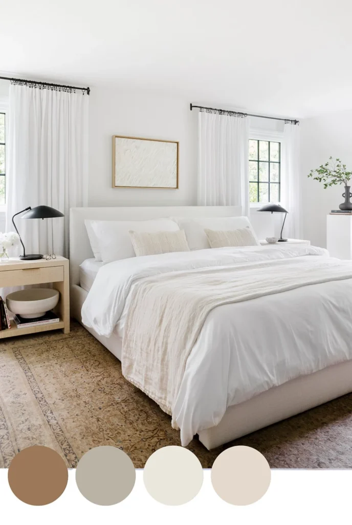
Imagine stepping into a bedroom where the walls are painted in “Balboa Mist” (a gentle greige). The flooring is light oak, its natural grain adding warmth. A simple upholstered headboard in linen‑gray anchors the space. Bedding features a crisp white duvet, a sage‑green throw, and a trio of blush‑toned pillows. On either side of the bed sit sleek nightstands in walnut, each topped with a matte black table lamp.
A large abstract canvas in muted blues hangs above the bed, providing a focal point without disrupting the calm. To the left, a tall snake plant in a matte white pot brings a hint of nature. Overhead, a dimmable recessed light casts a soft glow, while a pair of wall sconces add a warm amber accent during evenings. The final touch: a woven rug in ivory and light taupe that ties the floor to the neutral walls.
This cohesive arrangement illustrates how a calm neutral bedroom color palette can be both soothing and stylish, proving that restraint does not mean boring.
For more inspiration on integrating natural elements, see our guide on relaxing balcony design ideas for a serene outdoor retreat. If you’re curious about how window choices affect lighting, compare Sunrise Windows vs Andersen – In‑Depth Comparison for Modern Home Design. And for a fresh take on plant styling, read Minimal Desk Plant Styling: Clean, Calm, and Contemporary.
Final Thoughts on Crafting a Calm Neutral Bedroom Color Palette
Designing a calm neutral bedroom color palette is an exercise in thoughtful restraint. By selecting harmonious hues, pairing them with appropriate finishes, and layering textures, you create a space that feels both luxurious and restful. Remember to test paint under varying light, keep accessories minimal yet purposeful, and use lighting to enhance the serenity of your neutrals. With these principles in place, your bedroom will become a true retreat—one that welcomes you each night with the promise of calm and renewal.