
Table of Contents
- Understanding Color Temperature: Why It Matters for the Best Color Light for Reading
- How to Identify the Best Color Light for Reading in Your Home
- Brightness and Contrast: Pairing the Right Lumens with the Best Color Light for Reading
- Choosing Fixtures: Design Tips for Integrating the Best Color Light for Reading into Any Room
- Smart Lighting Solutions: Using Technology to Perfect the Best Color Light for Reading
- Placement and Positioning: Maximizing Effectiveness of the Best Color Light for Reading
- Quick Tips for Implementing the Best Color Light for Reading
- Common Mistakes When Selecting Lighting for Reading and How to Avoid Them
- Frequently Asked Questions
- What is the exact Kelvin range for the best color light for reading?
- Can I use warm‑white bulbs for bedtime reading?
- Are LED bulbs safe for long‑term reading?
- Do I need a separate lamp for each reading area?
- How does screen time affect lighting choices?
- Can I use colored bulbs for reading?
Best Color Light for Reading – A Complete Guide to Ideal Lighting
Finding the right illumination can transform a simple reading nook into a sanctuary of focus and comfort. Whether you’re curled up with a novel in the bedroom or tackling a research paper at a desk, the light you choose directly impacts eye strain, mood, and even comprehension. This article dives deep into the science and aesthetics behind the best color light for reading, offering actionable advice you can apply to any space.
We’ll explore how color temperature, brightness, and placement work together, and why certain hues are universally praised while others can hinder your concentration. By the end, you’ll be equipped with the knowledge to select lighting that not only looks great but also supports healthy visual habits.
Understanding Color Temperature: Why It Matters for the Best Color Light for Reading
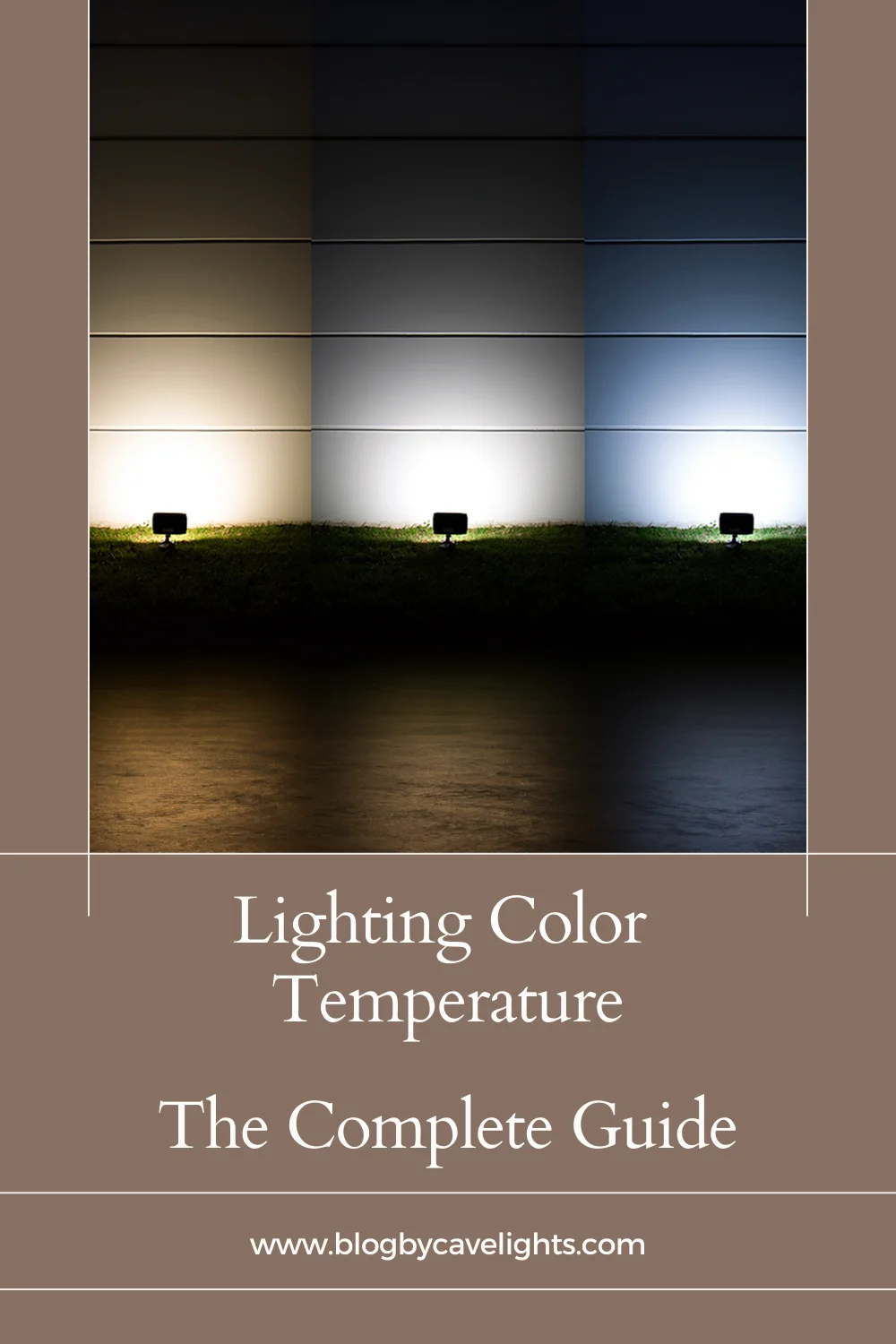
Color temperature is measured in Kelvin (K) and describes the hue of a light source, ranging from warm (yellowish) to cool (bluish). For the best color light for reading, experts typically recommend a range between 4,000 K and 5,000 K. This “neutral white” tone mimics natural daylight without the harshness of full daylight (≈6,500 K), creating a balanced environment that reduces eye fatigue.
Warm light (below 3,000 K) can feel cozy but may make fine text appear less sharp, especially in low‑contrast settings. Conversely, very cool light (above 6,000 K) can cause glare and increase the perception of harshness, leading to quicker eye strain. By staying within the 4,000‑5,000 K window, you achieve a crisp, clear view of the page while preserving a comfortable atmosphere.
How to Identify the Best Color Light for Reading in Your Home
- Check the bulb packaging for the Kelvin rating.
- Prefer LED fixtures with adjustable temperature if you like flexibility.
- Combine ambient and task lighting to avoid shadows and glare.
Brightness and Contrast: Pairing the Right Lumens with the Best Color Light for Reading
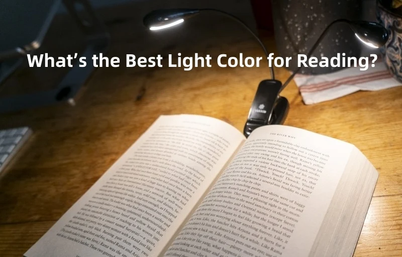
Brightness, measured in lumens, determines how much light a source emits. For reading, a light output of 400–600 lumens per lamp is generally sufficient for most adults, while seniors or those with vision challenges may benefit from 600–800 lumens. However, the key is not just total lumens but how that light is distributed across the reading surface.
Using a lamp with a focused beam, such as an adjustable desk lamp or a wall‑mounted swing arm, helps concentrate illumination exactly where you need it. This targeted approach enhances contrast, making text appear sharper against the background. When paired with the best color light for reading, the right brightness level ensures you can read for longer periods without discomfort.
Choosing Fixtures: Design Tips for Integrating the Best Color Light for Reading into Any Room
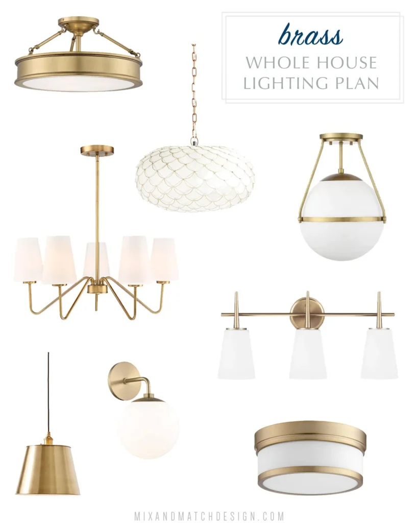
Beyond the bulb, the fixture itself influences how light is diffused and directed. For living rooms, floor lamps with wide shades soften the light while still delivering the appropriate color temperature. In bedrooms, bedside sconces with adjustable arms let you fine‑tune the angle, perfect for late‑night reading.
Modern interior design trends favor minimalist fixtures that blend seamlessly with décor. If you’re aiming for a cohesive look, consider fixtures finished in brushed metal or matte black that complement a warm beige home décor palette. The fixture’s shape and material can also affect glare; matte finishes reduce reflections, preserving the integrity of the best color light for reading.
Smart Lighting Solutions: Using Technology to Perfect the Best Color Light for Reading
Smart bulbs and lighting systems let you adjust both color temperature and brightness with a simple tap or voice command. Many apps feature “Reading” presets that automatically set the lamp to 4,500 K and a comfortable lumens level. This flexibility is especially useful in multipurpose spaces where you might shift from work to relaxation.
Integration with home automation platforms also allows you to schedule lighting changes based on the time of day. For example, you can start with a cooler hue in the morning to boost alertness, then transition to a slightly warmer tone in the evening to signal winding down—still staying within the best color light for reading range.
Placement and Positioning: Maximizing Effectiveness of the Best Color Light for Reading
Even the perfect color temperature can be undermined by poor placement. Position your light source to the side of the reading material, about 30–45 degrees off the page, to minimize shadows and glare. Avoid placing lights directly behind you, as this can cause the screen or book to appear washed out.
In a living room, a floor lamp placed behind a sofa can cast a gentle, even wash across a coffee table laden with magazines. In a home office, a desk lamp with an adjustable arm should sit just above the reading surface, ensuring the light falls directly on the page without creating hot spots. By respecting these placement principles, you fully leverage the benefits of the best color light for reading.
Quick Tips for Implementing the Best Color Light for Reading
- Choose bulbs labeled 4,000 K–5,000 K for optimal clarity.
- Use task lighting with 400–800 lumens, depending on personal needs.
- Prefer matte‑finished fixtures to reduce glare.
- Incorporate smart bulbs for easy temperature and brightness adjustments.
- Position the light source at a 30‑degree angle to your reading material.
Common Mistakes When Selecting Lighting for Reading and How to Avoid Them
Many homeowners make simple errors that diminish the effectiveness of their lighting. One frequent mistake is relying solely on ambient ceiling lights, which often provide insufficient direction and may be set too low in Kelvin, creating a warm, diffused glow that blurs text.
Another error is over‑lighting a space with high‑intensity bulbs, which can cause harsh glare and increase eye strain. The solution is to combine ambient light with a dedicated task lamp that offers the best color light for reading at the correct brightness.
Finally, neglecting the importance of dimming controls can limit flexibility. Installing dimmable drivers or using smart bulbs ensures you can fine‑tune illumination for various activities, from reading to watching TV, without compromising visual comfort.
Frequently Asked Questions
What is the exact Kelvin range for the best color light for reading?
The ideal range is typically 4,000 K to 5,000 K. This neutral white light replicates natural daylight without the harshness of full-spectrum daylight, providing clear visibility and reduced eye strain.
Can I use warm‑white bulbs for bedtime reading?
Warm‑white bulbs (2,700 K–3,000 K) are cozy but not optimal for detailed reading. If you prefer a softer ambiance before sleep, consider a dual‑temperature lamp that switches to a cooler 4,500 K setting for reading and a warm 2,700 K setting for relaxation.
Are LED bulbs safe for long‑term reading?
Yes. Modern LEDs emit stable light without flicker and are energy‑efficient. Look for LED bulbs with a high CRI (Color Rendering Index) of 90+ to ensure true color representation and minimize visual fatigue.
Do I need a separate lamp for each reading area?
While a single, well‑placed floor lamp can serve multiple zones, dedicated task lighting for each primary reading spot ensures consistent illumination and prevents shadows. This approach maximizes the benefits of the best color light for reading across your home.
How does screen time affect lighting choices?
When reading on electronic devices, a slightly cooler light (around 4,500 K) helps counteract blue light emitted by screens. Pairing this with a screen‑friendly filter or night mode can further protect your eyes.
Can I use colored bulbs for reading?
Colored bulbs (e.g., amber or pink) alter the color temperature and can distort text contrast, making reading harder. Stick to neutral white tones within the 4,000 K–5,000 K range for the best color light for reading.
Choosing the right lighting isn’t just about aesthetics; it’s a functional decision that impacts your comfort, productivity, and even your eye health. By understanding color temperature, lumens, fixture design, and placement, you can curate a reading environment that feels both inviting and efficient. Experiment with the suggestions above, and notice how a simple shift in hue can dramatically improve your reading experience.