
Table of Contents
- Antique White vs White: Understanding the Color Family
- Antique White vs White: Light Reflection and Mood
- Antique White vs White: Compatibility with Materials and Finishes
- Antique White vs White: Practical Considerations
- Antique White vs White: Choosing the Right Shade for Each Room
- Antique White vs White: Painting Techniques and Finishes
- Quick Tips for Working with Antique White vs White
- Common Mistakes When Deciding Between Antique White and White
- Frequently Asked Questions
- Putting It All Together: A Step‑by‑Step Plan
Antique White vs White: Choosing the Perfect Shade for Modern Homes
When it comes to painting a home, the decision between antique white and white can feel deceptively simple. Both colors belong to the neutral palette that designers swear by, yet the nuances between them are powerful enough to change a room’s atmosphere, its perceived size, and even the way furniture interacts with the walls. Understanding these subtleties is essential for anyone who wants a cohesive, inviting space without spending a fortune on a full redesign.
In this guide, we’ll explore the visual, psychological, and practical aspects of antique white vs white. You’ll learn how each hue behaves under different lighting conditions, which finishes pair best with each shade, and how to match them with the textures and accessories you already love. By the end, you’ll have a clear roadmap for selecting the right tone for every room in your home.
Antique White vs White: Understanding the Color Family

Both antique white and pure white sit at opposite ends of the neutral spectrum, but their origins are distinct. Antique white carries a warm, slightly creamy undertone, often hinting at aged parchment or weathered plaster. This warmth comes from subtle hints of yellow, beige, or even a whisper of pink, depending on the brand. Pure white, on the other hand, is a crisp, clean shade that reflects the most light possible, giving a stark, modern feel.
Choosing between antique white vs white begins with evaluating the existing color story in your home. If your furniture leans toward wood tones, warm metals, or earthy fabrics, antique white can act as a gentle bridge, softening the contrast. Conversely, a contemporary space filled with glass, steel, and monochrome accents often benefits from the high‑contrast clarity that white provides.
Antique White vs White: Light Reflection and Mood
The way paint reflects light dramatically influences mood. Antique white, with its warm undertones, tends to absorb a little more of the ambient light, creating a cozy, intimate ambiance. This makes it ideal for bedrooms, bathrooms, or any area where you desire a sense of calm. Pure white reflects the maximum amount of light, enlarging the visual space and fostering an energetic, airy feel—perfect for kitchens, living rooms, and open‑plan areas that crave brightness.
In small apartments, the choice between antique white vs white can be a strategic tool. A bright white wall can make a cramped studio feel expansive, while an antique white accent wall can add depth without overwhelming the limited square footage. Experimenting with sample swatches at different times of day will reveal how each shade interacts with natural and artificial lighting.
Antique White vs White: Compatibility with Materials and Finishes
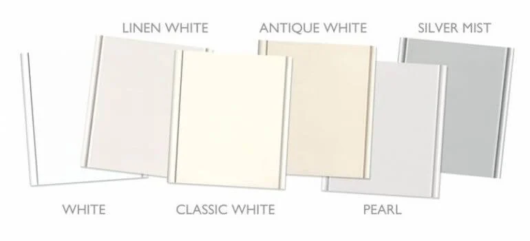
Materials dictate how paint behaves on a surface. Rough textures like reclaimed brick or textured plaster tend to mute the brightness of pure white, making antique white appear richer. Conversely, smooth, glossy finishes such as polished drywall or high‑gloss cabinets amplify the sharpness of white, sometimes to the point of starkness.
If you’re working with natural wood, antique white vs white can produce opposite effects. Antique white complements warm‑toned woods—think oak or walnut—by echoing their natural hues. Pure white, however, creates a striking contrast against darker woods, emphasizing the grain and making the wood stand out as a focal point. The same principle applies to metals: brass and copper glow beautifully against antique white, while stainless steel pops alongside pure white.
Antique White vs White: Practical Considerations
Beyond aesthetics, durability and maintenance matter. White walls reveal imperfections—scuffs, fingerprints, and dust—more readily than antique white. If you have children, pets, or a high‑traffic hallway, antique white vs white becomes a practical decision: the slightly warmer tone can camouflage minor marks, extending the time between touch‑ups.
Lighting fixtures also influence the decision. LED bulbs with a cooler temperature (4000‑5000K) will accentuate the crispness of white, while warmer bulbs (2700‑3000K) soften the edges, allowing antique white to blend seamlessly. When planning a renovation, consider installing dimmable lighting to adjust the mood throughout the day, giving you flexibility with either shade.
Antique White vs White: Choosing the Right Shade for Each Room

Below is a quick reference for applying antique white vs white across common spaces:
- Living Room: Use pure white on larger walls to amplify natural light and make the space feel open. Pair with an accent wall in antique white to add warmth.
- Bedroom: Antique white creates a soothing backdrop for soft textiles, while white can be reserved for ceilings and trim to maintain brightness.
- Kitchen: Pure white on cabinets and backsplashes enhances cleanliness and pairs well with stainless appliances. Consider antique white for island or pantry doors for a subtle contrast.
- Bathroom: Antique white on walls adds a spa‑like serenity; white on tiles and fixtures keeps the area crisp and hygienic.
- Home Office: White promotes focus and concentration, especially when combined with natural wood desks. Antique white works well for accent walls behind bookshelves.
For a deeper dive into bedroom styling, check out our guide on soft linen fabrics for modern bedroom décor. The gentle tones discussed there harmonize beautifully with antique white walls, creating a layered, inviting look.
Antique White vs White: Painting Techniques and Finishes
Choosing the right finish can elevate the impact of antique white vs white. Matte or flat finishes absorb light, muting the starkness of pure white and enhancing the subtle warmth of antique white. Satin or eggshell finishes strike a balance, offering a soft sheen that’s easy to clean—ideal for high‑traffic areas.
For accent walls, consider a semi‑gloss finish on antique white to bring out its depth while maintaining durability. In contrast, a high‑gloss pure white on trim can create a crisp, defined edge that frames the room. Remember to test a small patch before committing, as the same paint can appear dramatically different on walls versus ceilings.
Quick Tips for Working with Antique White vs White
- Test paint samples on both north‑ and south‑facing walls to see how antique white vs white reacts to varying light.
- Combine both shades in the same room: use white for the ceiling and trim, and antique white for the main wall.
- Pair antique white with warm wood tones and brass hardware for a cohesive, classic look.
- Use pure white on cabinets and fixtures to achieve a high‑contrast, modern aesthetic.
- In small spaces, keep the majority of walls white, reserving antique white for a single accent wall.
Common Mistakes When Deciding Between Antique White and White
Even seasoned decorators stumble over a few pitfalls when tackling antique white vs white. One frequent error is applying pure white in a room flooded with natural light, which can result in a washed‑out feeling that feels sterile rather than spacious. Counterbalance this by adding warm textiles, rugs, or artwork.
Another mistake is overlooking the undertones of adjacent rooms. A pure white hallway can clash with a neighboring antique white bedroom, creating an abrupt visual break. Consistency in undertone, or at least a gradual transition, keeps the flow harmonious. Lastly, neglecting proper surface preparation leads to uneven absorption, making the color appear patchy—especially noticeable with white paint.
For more ideas on coordinating finishes, our comparison of Superpaint vs Emerald offers insights into pigment quality and coverage, which can affect how antique white vs white appears once applied.
Frequently Asked Questions
What is the main visual difference between antique white and pure white?
Antique white carries warm undertones—often yellow, beige, or pink—giving it a softer, more vintage feel. Pure white is a neutral, high‑reflectivity shade that creates a crisp, modern look.
Can I use both antique white and white in the same room?
Absolutely. Using white for ceilings and trim while applying antique white on the main wall creates depth and visual interest without overwhelming the space.
How does lighting affect antique white vs white?
Natural light can warm up antique white, making it appear richer, while it can make pure white appear stark. Artificial lighting with cooler temperatures emphasizes the brightness of white, whereas warm LEDs soften both shades.
Is one shade more practical for high‑traffic areas?
Antique white tends to hide minor scuffs and fingerprints better than pure white, making it a practical choice for hallways, kids’ rooms, or pet‑friendly spaces.
Which finish works best with antique white?
Matte or flat finishes enhance the warmth of antique white, while satin or eggshell offers a subtle sheen that’s easier to clean in high‑use rooms.
Should I match my trim to the wall color?
A common strategy is to paint trim in pure white for a clean contrast, even when the walls are antique white. This delineates architectural details and adds a crisp finish.
Putting It All Together: A Step‑by‑Step Plan
Now that you understand the nuances of antique white vs white, follow this systematic approach:
- Assess the room’s function: Determine if you need warmth (antique white) or brightness (white).
- Check natural light: Observe how light shifts throughout the day; choose the shade that maintains balance.
- Sample strategically: Apply swatches on different walls and ceilings, live for at least 24 hours.
- Pick complementary finishes: Matte for antique white’s warmth, satin for white’s clarity.
- Finalize accessories: Tie in textiles, artwork, and hardware that echo the undertones of your chosen shade.
For a cohesive living‑room transformation, see our article on minimal living room décor with white walls. The principles discussed there align perfectly with the strategic use of antique white vs white to achieve a balanced, modern aesthetic.
Remember, the goal isn’t to pick a “better” color but to select the hue that serves the room’s purpose, lighting, and existing décor. By treating antique white vs white as complementary tools rather than opposing choices, you unlock endless possibilities for creating inviting, stylish environments.
Whether you’re repainting a single accent wall or undertaking a full‑home refresh, the decisions you make around antique white vs white will echo throughout your interior design narrative. Take the time to experiment, observe, and enjoy the transformation that these subtle yet powerful shades can bring.