
Table of Contents
- Understanding the Core Characteristics of Accessible Beige vs Edgecomb Gray
- Accessible Beige – Warm, Soft, and Inviting
- Edgecomb Gray – Subtle Depth with a Hint of Warmth
- Choosing the Right Shade for Different Spaces
- Living Rooms – Creating a Welcoming Anchor
- Bedrooms – Promoting Restful Ambiance
- Kitchens – Enhancing Cleanliness and Warmth
- Pairing Furniture and Accessories with Accessible Beige vs Edgecomb Gray
- Accessible Beige Pairings
- Edgecomb Gray Pairings
- Practical Tips for Applying Accessible Beige vs Edgecomb Gray
- Test Samples in Different Light Conditions
- Consider Sheen and Finish
- Use Trim to Define Spaces
- Quick Home Décor Tips
- Common Mistakes to Avoid When Choosing Between Accessible Beige vs Edgecomb Gray
- Frequently Asked Questions
- Is Accessible Beige or Edgecomb Gray better for high‑traffic areas?
- Can I use Accessible Beige vs Edgecomb Gray in a home office?
- How do these colors affect the perceived size of a room?
- Do these shades work with bold accent colors?
- What paint finish is recommended for bathrooms using these colors?
- Can I mix Accessible Beige and Edgecomb Gray in the same home?
Accessible Beige vs Edgecomb Gray – A Deep Dive into Two Beloved Neutrals
Choosing the right wall color can feel like a high‑stakes decision. A hue that looks perfect on a paint swatch might shift dramatically under different lighting, furnishings, or room functions. Two shades that consistently appear on designers’ shortlists are Accessible Beige and Edgecomb Gray. Both belong to the expansive family of warm neutrals, yet each brings a subtly different mood to a space. Understanding the nuances between these colors helps homeowners and renters create interiors that feel both timeless and personal.
In this article, we’ll explore the character, versatility, and practical applications of Accessible Beige vs Edgecomb Gray. From living rooms and bedrooms to kitchens and small apartments, you’ll discover where each paint truly shines, how to pair them with furniture and accessories, and common pitfalls to avoid. By the end, you’ll be equipped with the confidence to decide which neutral best matches your design vision.
Whether you’re repainting a single accent wall or tackling a whole‑home makeover, the insights below will guide you through the subtle science of color selection, ensuring your walls support—rather than dominate—the overall aesthetic.
Understanding the Core Characteristics of Accessible Beige vs Edgecomb Gray

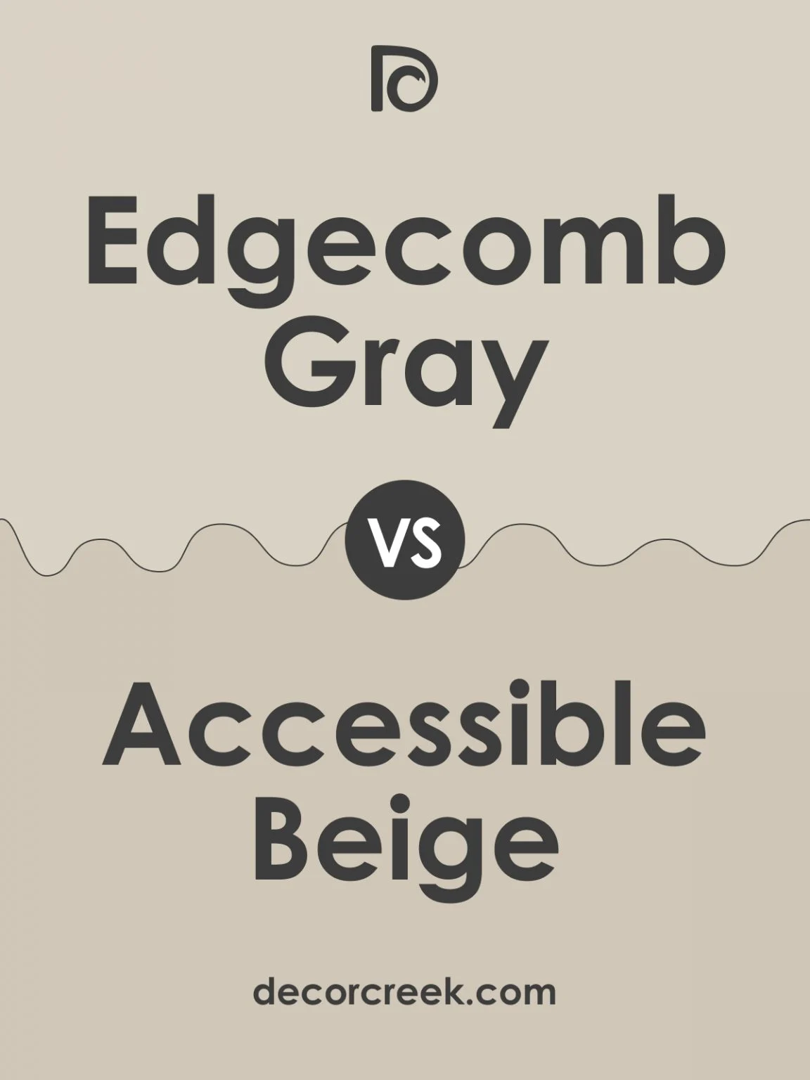
At first glance, Accessible Beige and Edgecomb Gray appear deceptively similar: both are warm, muted, and easily pair with a range of décor styles. However, a closer look reveals distinct undertones that influence how each reacts to light and surrounding elements.
Accessible Beige – Warm, Soft, and Inviting
Accessible Beige, a staple in many paint collections, leans toward a creamy, slightly golden undertone. Its warm base creates a cozy atmosphere that feels almost tactile, reminiscent of soft sand or lightly toasted almond. In bright daylight, the color can take on a buttery glow, while in dimmer rooms it gently recedes, offering a subtle backdrop that allows furniture and artwork to take center stage.
Edgecomb Gray – Subtle Depth with a Hint of Warmth
Edgecomb Gray, despite its name, is not a true gray; it carries a faint taupe quality with muted brown undertones. This blend yields a sophisticated, almost stone‑like appearance that works well in both modern and traditional settings. Edgecomb Gray tends to appear cooler than Accessible Beige under natural light, yet retains enough warmth to avoid the starkness often associated with pure grays.
When you compare Accessible Beige vs Edgecomb Gray side by side, the former feels more sun‑kissed and inviting, while the latter offers refined depth without overwhelming the room.
Choosing the Right Shade for Different Spaces
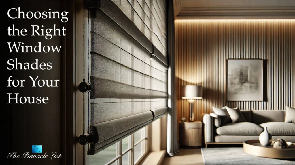
Room function and natural light are decisive factors in the Accessible Beige vs Edgecomb Gray debate. Below we break down how each hue performs in common living areas.
Living Rooms – Creating a Welcoming Anchor
- Accessible Beige works wonderfully in living rooms that receive abundant daylight. Its warm glow amplifies the comfort factor, especially when paired with earthy textiles, wooden coffee tables, and brass accents.
- Edgecomb Gray shines in living rooms with limited natural light. The subtle depth adds dimension without darkening the space, making it a perfect canvas for vibrant artwork or bold accent chairs.
For a balanced look, consider painting one wall in Accessible Beige and the opposite in Edgecomb Gray, creating a dynamic yet harmonious contrast.
Bedrooms – Promoting Restful Ambiance
Bedrooms benefit from calm, soothing colors. Accessible Beige’s softness can promote relaxation, especially when combined with soft linens and muted pastel décor. Edgecomb Gray, on the other hand, provides a grounding effect, ideal for bedrooms with a minimalist aesthetic or those featuring metal and glass furnishings.
Kitchens – Enhancing Cleanliness and Warmth
In kitchens, a neutral backdrop should complement both cabinetry and countertops. Accessible Beige works well with light wood cabinets and warm-toned countertops, reinforcing a homely vibe. Edgecomb Gray pairs nicely with darker cabinets, stainless steel appliances, and marble surfaces, delivering a sleek, contemporary feel.
For more inspiration on neutral kitchen styling, see our guide on neutral kitchen shelf styling. The principles there translate seamlessly to wall color choices.
Pairing Furniture and Accessories with Accessible Beige vs Edgecomb Gray

The success of any paint choice hinges on its relationship with furniture, textiles, and décor. Below are curated pairing suggestions that highlight the strengths of each hue.
Accessible Beige Pairings
- Wood Tones: Light oak, walnut, or reclaimed wood pieces echo the warm undertones of Accessible Beige, creating a cohesive, inviting environment.
- Metal Accents: Brass, copper, or gold hardware adds a subtle sparkle that complements the creamy backdrop without clashing.
- Textiles: Soft, natural fabrics such as linen or cotton in muted terracotta, sage green, or dusty rose reinforce the soothing atmosphere.
Edgecomb Gray Pairings
- Contrast Materials: Black, charcoal, or dark navy furniture creates striking contrast, allowing Edgecomb Gray to act as an elegant stage.
- Natural Elements: Stone, concrete, or matte ceramic accessories echo the stone‑like quality of Edgecomb Gray, reinforcing its sophisticated vibe.
- Color Pops: Bold hues like mustard yellow, deep teal, or ruby red can be introduced through cushions, rugs, or artwork to enliven the space.
If you’re redesigning a kitchen corner, the Modern Cozy Kitchen Corner Décor article offers practical ideas that align well with both Accessible Beige and Edgecomb Gray palettes.
Practical Tips for Applying Accessible Beige vs Edgecomb Gray
Even the most suitable color can fall short if not applied correctly. Follow these actionable steps to ensure a flawless finish.
Test Samples in Different Light Conditions
Paint a 12‑inch square of each color on opposite walls. Observe the swatches in morning, afternoon, and evening light to see how Accessible Beige vs Edgecomb Gray respond throughout the day.
Consider Sheen and Finish
A matte or flat finish can mute a color’s intensity, making Edgecomb Gray appear softer in high‑traffic areas. Conversely, a satin or eggshell sheen adds subtle depth to Accessible Beige, especially in rooms with ample natural light.
Use Trim to Define Spaces
Contrast the main wall color with crisp white or off‑white trim. This technique accentuates architectural details while allowing Accessible Beige vs Edgecomb Gray to remain the star of the room.
Quick Home Décor Tips
- Combine Accessible Beige with warm wood furniture for a cozy, lived‑in feel.
- Pair Edgecomb Gray with dark metal accents for a modern, edgy look.
- Use patterned rugs to introduce texture without overwhelming the neutral backdrop.
- In small apartments, keep the ceiling white to maintain an airy feel alongside either neutral.
- Layer lighting—ambient, task, and accent—to highlight the subtle nuances of both colors.
Common Mistakes to Avoid When Choosing Between Accessible Beige vs Edgecomb Gray
Even seasoned decorators can stumble. Here are pitfalls to watch for and how to sidestep them.
- Ignoring Existing Light: Selecting Edgecomb Gray for a dim room may make it feel cavernous. Instead, boost the space with additional lighting or opt for Accessible Beige.
- Overmatching Furniture: Using furniture that matches the wall color exactly can cause the room to look flat. Introduce contrasting tones or textures to keep the visual interest alive.
- Skipping a Test Patch: Relying solely on paint chips can mislead. Always test on the actual wall, as surrounding colors and finishes influence perception.
- Choosing the Wrong Sheen: A high‑gloss finish on Accessible Beige can create an unwanted shine, while a flat Edgecomb Gray may appear too muted in bright spaces.
Frequently Asked Questions
Is Accessible Beige or Edgecomb Gray better for high‑traffic areas?
Both colors work well in high‑traffic zones, but Edgecomb Gray’s slightly cooler tone can better conceal scuffs when paired with a low‑sheen finish. Accessible Beige, especially in satin, can hide minor marks due to its warm, diffused appearance.
Can I use Accessible Beige vs Edgecomb Gray in a home office?
Absolutely. Accessible Beige promotes a calming, inviting environment conducive to focus, while Edgecomb Gray offers a sophisticated backdrop that can enhance concentration, particularly when paired with ergonomic furniture and ample natural light.
How do these colors affect the perceived size of a room?
Both are neutrals, but Edgecomb Gray can create a slightly cozier feel in smaller rooms due to its subtle depth. Accessible Beige tends to open up a space, especially when complemented by light flooring and reflective surfaces.
Do these shades work with bold accent colors?
Yes. Accessible Beige supports earthy accents like terracotta or olive, while Edgecomb Gray shines alongside jewel tones such as emerald, sapphire, or deep mustard. The key is balance—use bold accents sparingly to avoid overpowering the neutral base.
What paint finish is recommended for bathrooms using these colors?
For moisture‑prone areas, a satin or semi‑gloss finish is ideal. It provides durability and resistance to mildew while preserving the subtle character of Accessible Beige or Edgecomb Gray.
Can I mix Accessible Beige and Edgecomb Gray in the same home?
Definitely. Using each color in different rooms or even within the same room (e.g., one wall in Accessible Beige, the opposite in Edgecomb Gray) can create visual interest while maintaining a cohesive neutral palette.
Choosing between Accessible Beige vs Edgecomb Gray ultimately depends on your lighting, furniture, and the mood you wish to cultivate. Both hues offer timeless elegance, but their subtle differences can dramatically shift a space’s personality. By testing samples, considering finishes, and pairing thoughtfully with furnishings, you’ll unlock the full potential of either neutral. As you embark on your next painting project, remember that color is a powerful tool—one that can transform ordinary rooms into personalized sanctuaries.
Ready to experiment? Grab a sample, set up a few test patches, and watch how Accessible Beige vs Edgecomb Gray evolve throughout the day. The right choice will feel instinctive, reflecting both your aesthetic preferences and the unique character of your home.