
Table of Contents
- Understanding the Power of Calm Neutral Palettes in Workspace Décor
- Choosing the Right Neutral Tones for Your Workspace
- Furniture and Layout Strategies that Complement Neutral Colors
- Adding Texture and Subtle Accents without Breaking Calmness
- Lighting Choices that Enhance Neutral Décor
- Small Space Solutions: Neutral Workspace in Apartments
- Maintaining a Balanced Look Over Time
- Quick Tips for a Serene Neutral Workspace
- Common Mistakes and How to Avoid Them
- Frequently Asked Questions
- Conclusion
Workspace décor with calm neutral colors – A Professional Guide
Creating a work environment that feels both inviting and focused is a central goal for many homeowners and renters. When the visual backdrop is calm and uncluttered, the mind can settle into productive rhythms without unnecessary distractions. This is where workspace décor with calm neutral colors becomes a powerful ally.
In this article we will explore why neutral tones work so well in a home office, how to choose the right shades, and which accessories keep the atmosphere serene while still reflecting personal style. Whether you are setting up a dedicated room, a corner in a living area, or a compact studio apartment, the principles outlined here will help you craft a space that supports both work and well‑being.
Read on for a step‑by‑step guide, quick actionable tips, common pitfalls to avoid, and answers to frequently asked questions about designing with neutral palettes.
Understanding the Power of Calm Neutral Palettes in Workspace Décor
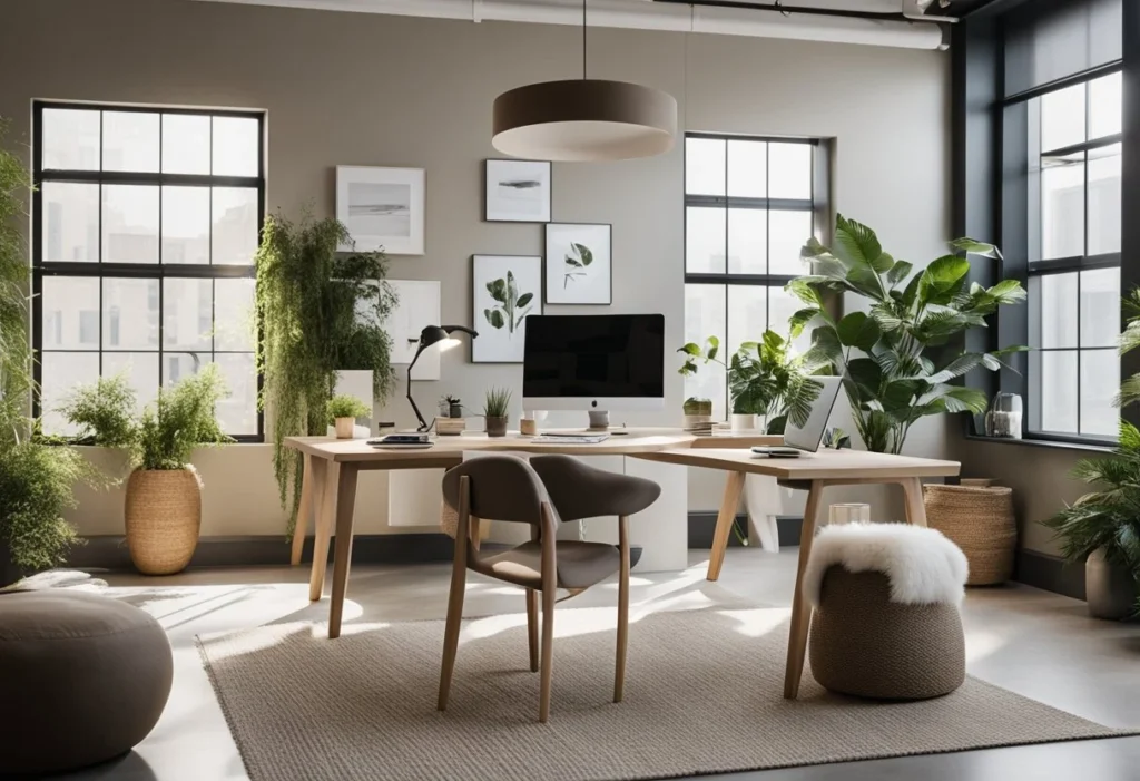
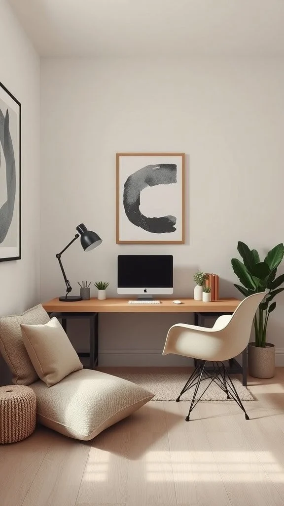
Neutral colors such as soft whites, warm beiges, gentle greys, and muted taupes create a visual baseline that encourages concentration. Unlike bold hues that can stimulate the nervous system, calm neutrals act as a soothing backdrop, allowing you to focus on tasks rather than on the walls themselves. The psychological benefit is supported by research indicating that low‑stimulus environments reduce eye strain and improve cognitive performance.
When you apply workspace décor with calm neutral colors, you also gain flexibility. A neutral foundation can easily adapt to seasonal changes, new furniture purchases, or evolving design trends without the need for a complete overhaul. This longevity makes neutral décor a cost‑effective choice for anyone looking to invest wisely in their home office.
Choosing the Right Neutral Tones for Your Workspace
Selecting the appropriate shade is more nuanced than simply picking “off‑white.” Consider the natural light the room receives:
- Bright, sunny spaces: Light greys or cool whites prevent the room from feeling washed out.
- North‑facing or low‑light areas: Warm beiges and soft creams add a subtle glow.
- Rooms with strong artificial lighting: Mid‑tone taupes balance the contrast between light sources.
When you combine these tones with a matte finish, you reduce glare on computer screens, which is essential for long working hours. For those who love a hint of depth, consider a two‑tone approach—one wall in a slightly darker shade, the remaining walls in a lighter neutral. This technique adds visual interest while maintaining the calming effect of workspace décor with calm neutral colors.
Furniture and Layout Strategies that Complement Neutral Colors
The furniture you choose should echo the softness of the neutral palette without overwhelming it. Opt for pieces with natural wood finishes, light metal frames, or upholstered items in muted fabrics. A desk in a light oak finish paired with a charcoal‑grey ergonomic chair creates a balanced contrast that feels intentional rather than jarring.
When arranging your furniture, follow these layout principles:
- Define zones: Use a rug in a slightly deeper neutral to demarcate the work area from relaxation corners.
- Maintain clear sightlines: Keep pathways free of visual clutter to preserve the sense of openness that neutral colors provide.
- Incorporate built‑in storage: Shelving painted in the same shade as the walls blends seamlessly, reinforcing the calm atmosphere.
For small apartments, see our guide on stylish small‑space ideas to learn how to maximize functionality without sacrificing style.
Adding Texture and Subtle Accents without Breaking Calmness
Pure flat neutrals can risk feeling sterile. Introducing texture adds depth while keeping the overall calmness intact. Consider the following options:
- Woven wall hangings in natural fibres.
- Rattan or cork desk accessories.
- Matte ceramic planters with low‑maintenance succulents.
Accents in soft pastel tones—like muted sage or dusty blush—can be sprinkled sparingly through cushions, artwork, or a single decorative vase. The key is restraint: each accent should enhance, not dominate, the workspace décor with calm neutral colors.
Lighting Choices that Enhance Neutral Décor
Lighting is the unsung hero of any neutral‑based workspace. It can either highlight the serenity of the palette or introduce unwanted harshness. Aim for layered lighting:
- Ambient: A ceiling fixture with a diffused shade distributes even light.
- Task: Adjustable desk lamps with a matte finish prevent glare.
- Accent: Soft LED strips behind shelving add a gentle glow without clashing with the neutral tones.
When selecting bulbs, choose a colour temperature of 3500‑4000 K. This range mimics natural daylight, reinforcing the tranquil vibe of workspace décor with calm neutral colors while supporting eye comfort during extended periods of screen work.
Small Space Solutions: Neutral Workspace in Apartments
Compact living situations demand clever design tricks. Neutral colours make small rooms appear larger because they reflect more light. Pair this visual expansion with multifunctional furniture—think a wall‑mounted desk in a light ash finish that folds away when not in use. Keep floor clutter to a minimum; a single low‑profile rug in a subtle sand hue can ground the area without consuming valuable square footage.
To see how neutral tones work in a living‑room‑turned‑home‑office, read our article on modern wall décor with neutral frames. The principles translate directly to a focused workspace.
Maintaining a Balanced Look Over Time
Even the most thoughtfully designed workspace décor with calm neutral colors can feel outdated if not cared for. Regularly assess the room for wear, especially on high‑traffic surfaces like desk tops and flooring. Refresh the look by swapping out small accessories—such as a new set of pastel‑coloured notebooks or a different texture rug—while keeping the core neutral palette intact.
Seasonal updates are also simple: introduce a lightweight throw in a soft autumnal hue during fall, then replace it with a breezy linen blanket in summer. These small changes keep the space feeling fresh without compromising the calm aesthetic you’ve cultivated.
Quick Tips for a Serene Neutral Workspace
- Start with a single neutral base colour and layer textures for depth.
- Use natural light as much as possible; position desks near windows.
- Choose furniture with clean lines and muted finishes.
- Incorporate greenery in neutral pots to add life without colour clash.
- Limit decorative items to three‑four statement pieces.
Common Mistakes and How to Avoid Them
Even seasoned decorators can slip into pitfalls when working with neutrals. Below are frequent errors and practical solutions:
- Over‑matching: Using the exact same shade on walls, furniture, and flooring can create a flat, lifeless space. Introduce subtle variations—different undertones or textures—to keep the room dynamic.
- Ignoring lighting: Dim rooms make neutrals look dull. Pair light‑reflective surfaces with adequate lighting to maintain brightness.
- Too many accents: Adding too many colourful objects overwhelms the calm feeling. Stick to a maximum of two accent colours, and keep them muted.
- Choosing the wrong finish: High‑gloss paints reflect light harshly and can cause glare on screens. Opt for matte or eggshell finishes for walls and furniture.
Frequently Asked Questions
Can I use dark neutrals in a small workspace?
Yes. Dark neutrals like charcoal or deep taupe can add sophistication, but balance them with lighter furnishings or ample lighting to prevent the space from feeling cramped.
How many shades of neutral should I use?
A good rule of thumb is three: a primary wall colour, a secondary tone for larger furniture, and a tertiary accent for textiles or accessories. This creates visual interest without overwhelming the calm palette.
Is it okay to mix warm and cool neutrals?
Mixing warm (beige, cream) and cool (grey, greige) neutrals can work if you anchor the room with one dominant undertone and use the other sparingly for contrast.
What flooring works best with neutral workspace décor?
Light‑colored hardwood, polished concrete, or low‑pile neutral rugs are ideal. They echo the palette and help reflect light, enhancing the overall serenity.
Should I display artwork in a neutral office?
Absolutely. Choose pieces with soft colour accents that complement the neutral background. A single large canvas with muted tones can become a focal point without disrupting the calm atmosphere.
How often should I refresh my neutral workspace?
Minor updates—like swapping cushions or adding a new plant—can be done seasonally. A more thorough refresh, such as repainting, is typically needed every 5‑7 years, depending on wear and personal taste.
Conclusion
Designing workspace décor with calm neutral colors is a strategic blend of psychology, practicality, and aesthetics. By selecting the right shades, layering texture, and paying attention to lighting, you create an environment that nurtures focus and well‑being. Avoid common missteps, stay flexible with accessories, and let your space evolve naturally over time. Ready to transform your home office? Apply these insights, experiment with subtle variations, and enjoy a workspace that feels both modern and effortlessly serene. For further inspiration, explore more articles on The Homara that celebrate contemporary home styling.