Table of Contents
- Why Simple Wall Décor with Neutral Prints Works Everywhere
- Choosing the Right Print: Materials, Scale, and Theme
- Simple Wall Décor with Neutral Prints: Material & Scale Checklist
- Strategic Placement Ideas for Every Room
- Living Room
- Bedroom
- Home Office or Study
- DIY Approaches: Crafting Your Own Neutral Prints
- DIY Tips for Neutral Prints
- Mixing Neutral Prints with Other Décor Elements
- Budget‑Friendly Ways to Refresh Neutral Prints
- Quick Refresh Ideas
- Common Mistakes to Avoid with Neutral Prints
- Frequently Asked Questions
- Can I use neutral prints in a colorful room?
- What size print works best for a small apartment?
- Are there specific frames that enhance neutral prints?
- How do I keep neutral prints from looking bland?
- Is it okay to mix different neutral prints together?
- What are the best maintenance tips for neutral prints?
Simple Wall Décor with Neutral Prints – Timeless Style Made Easy
When it comes to creating a calm, inviting atmosphere, the walls of a room often speak louder than any piece of furniture. A well‑chosen piece of art or a subtle pattern can anchor a space, guide the flow of light, and subtly influence mood. Simple wall décor with neutral prints offers a perfect blend of elegance and versatility, allowing homeowners and renters alike to experiment without overwhelming the room’s natural palette. Whether you’re styling a compact city apartment or a spacious suburban living area, neutral prints provide a canvas that adapts to changing trends, seasons, and personal tastes.
In this guide, we’ll explore why neutral prints are a smart choice for modern interiors, break down practical ways to incorporate them across different rooms, and share actionable tips that keep the look fresh yet effortless. By the end, you’ll have a toolbox of ideas—ranging from DIY projects to curated selections—that make simple wall décor with neutral prints a cornerstone of your home’s aesthetic.
Why Simple Wall Décor with Neutral Prints Works Everywhere
Neutral tones—think soft beiges, warm grays, muted taupes, and gentle ivory—carry an innate ability to harmonize with virtually any color scheme. When these hues appear as prints on canvas, paper, or fabric, they act as a visual bridge between bold furniture pieces and understated architectural details. This subtlety is especially valuable in open‑plan homes where different zones share the same wall surface; a single neutral print can delineate a reading nook from a dining area without harsh lines.
Beyond aesthetic cohesion, neutral prints also enhance the perception of space. Light-colored patterns reflect natural light, making a cramped room feel larger. They also provide a soothing backdrop for decorative objects, allowing items like plants, sculptures, or metallic accents to shine without competing for attention. For those who love to refresh their décor seasonally, swapping a single neutral print is far less disruptive—and more budget‑friendly—than repainting an entire wall.
Choosing the Right Print: Materials, Scale, and Theme

Not every neutral print will suit every wall. Start by assessing the material: canvas offers texture and depth, while paper or metal prints deliver sleek, modern finishes. Consider scale in relation to the wall’s dimensions; a large print can become a focal point in a spacious living room, whereas a series of smaller pieces works well in narrow hallways or above a bedroom headboard.
When selecting a theme, think about the room’s purpose. For a calming bedroom, opt for abstract, watercolor‑style prints that echo the softness of linens. In a high‑traffic kitchen, geometric patterns in muted tones add visual interest without clashing with cabinetry. The key is to let the print echo the room’s existing textures—think linen, wood grain, or concrete—and reinforce the overall design narrative.
Simple Wall Décor with Neutral Prints: Material & Scale Checklist
- Canvas: Adds depth; ideal for living rooms and bedrooms.
- Metal or Acrylic: Provides a glossy, contemporary look; perfect for kitchens and bathrooms.
- Paper Prints: Lightweight and easy to swap; great for rental spaces.
- Scale: Large single pieces for spacious walls; clustered series for narrow or low‑height areas.
- Theme Alignment: Match the print’s visual language to the room’s primary texture.
Strategic Placement Ideas for Every Room
Even with the perfect neutral print, placement determines impact. Below are curated suggestions for three key areas of the home, illustrating how simple wall décor with neutral prints can elevate each space while maintaining functional flow.
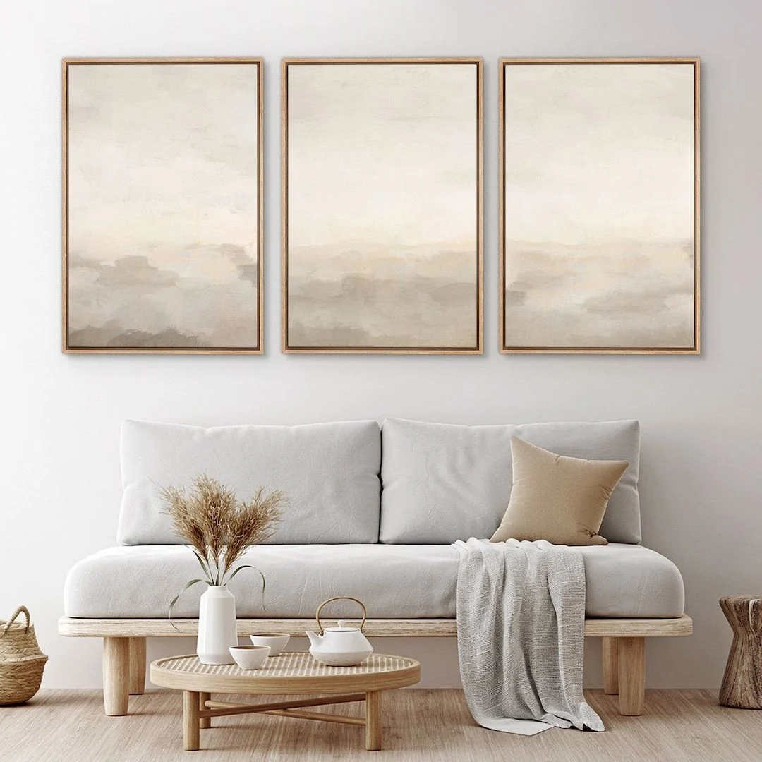
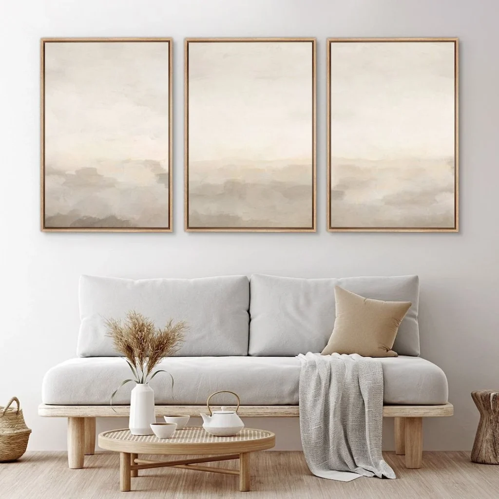
Living Room
A living room often serves as the social hub, making it an ideal canvas for a statement neutral print. Hang a large, soft‑gradient canvas above the sofa to draw eyes upward, creating a sense of height. Pair it with a few metallic side tables and a plush rug to keep the look balanced. If your sofa is low‑profile, consider a horizontal series of three medium‑sized prints that echo the sofa’s width, reinforcing proportion.
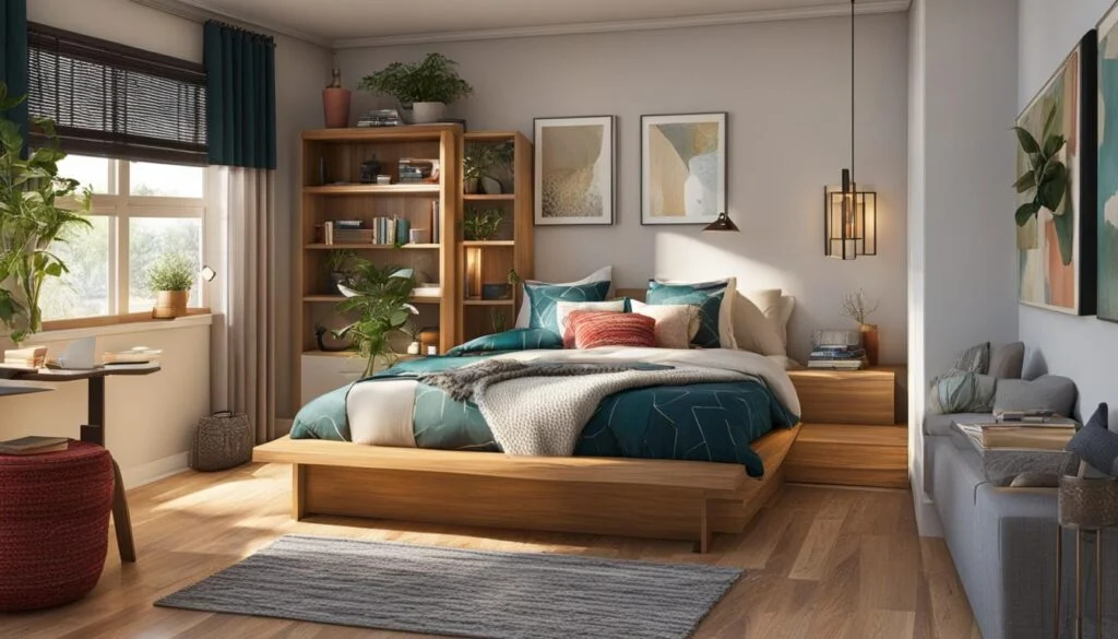
Bedroom
In the bedroom, serenity is paramount. Choose a muted, abstract print that mirrors the bedding’s color palette. Position it directly above the headboard for a cohesive visual anchor, or flank the bed with two narrow vertical prints to frame the space subtly. Adding a lightweight, linen‑wrapped frame can enhance the tactile experience, inviting relaxation each night.
Home Office or Study
Productivity thrives in environments that feel organized yet inspiring. A simple wall décor with neutral prints featuring subtle geometric lines can add just enough visual intrigue to keep the mind engaged without distraction. Mount the print at eye level above the desk, ensuring it doesn’t compete with your monitor. Complement the piece with a small plant—see our Entryway Décor with Plant Décor Accents guide for plant selection ideas.
DIY Approaches: Crafting Your Own Neutral Prints
Creating custom prints can be both rewarding and cost‑effective, especially when you have a specific size or motif in mind. Simple techniques like stamping, block printing, or even digital collage allow you to experiment with shades of ivory, gray, and sand without committing to expensive art. For a step‑by‑step tutorial, check out our How to Make Home Decor Items: A Complete DIY Guide, which walks you through selecting materials, mixing neutral pigments, and mounting your masterpiece.
When you craft your own piece, you gain full control over the print’s texture and scale, ensuring it aligns perfectly with your wall’s dimensions and the room’s lighting. Moreover, a handmade print adds a personal narrative to the space—something that mass‑produced art often lacks.
DIY Tips for Neutral Prints
- Start with a high‑quality, neutral‑toned canvas or heavyweight paper.
- Use acrylic paints mixed with a small amount of white to achieve subtle gradients.
- Experiment with masking tape to create clean, geometric lines.
- Allow each layer to dry completely before adding the next to avoid unwanted blending.
- Finish with a matte varnish to protect the print while maintaining a soft look.
Mixing Neutral Prints with Other Décor Elements
Neutral prints don’t have to exist in isolation. Pairing them with textured textiles, natural wood, or metallic accents creates a layered, sophisticated environment. In a living room, a neutral‑toned abstract print can sit above a reclaimed‑wood coffee table, linking the visual weight of the artwork with the tactile warmth of the wood. In a bathroom, a subtle gray print on a moisture‑resistant material can complement brushed nickel fixtures, delivering a spa‑like vibe.
When integrating other décor elements, keep the rule of “one‑to‑one” in mind: let the print be the focal point, and allow surrounding items to support rather than compete. For instance, a set of neutral cushions with a faint linear pattern can echo the lines in your wall décor, creating a cohesive visual rhythm throughout the room.
Budget‑Friendly Ways to Refresh Neutral Prints
Even the most carefully chosen print can feel stale after a season. Fortunately, updating simple wall décor with neutral prints doesn’t require a full redesign. One inexpensive method is to swap the frame—switching from a dark wood to a light natural finish instantly changes the mood. Another option is to add a removable overlay, such as a sheer fabric drape, which introduces a new texture without covering the artwork.
For renters, using adhesive picture rails or command strips allows you to reposition prints without damaging walls. If you love seasonal changes, consider creating a “gallery wall” of interchangeable neutral prints that can be rotated throughout the year—this keeps the space feeling fresh while preserving a cohesive aesthetic.
Quick Refresh Ideas
- Replace the frame with a different material or finish.
- Add a thin, neutral‑colored ledge beneath the print for a floating effect.
- Layer a semi‑transparent fabric over the artwork for a new texture.
- Swap out a single print in a gallery wall with a new design.
- Use magnetic mounting systems for effortless repositioning.
Common Mistakes to Avoid with Neutral Prints
Even seasoned decorators can stumble when incorporating neutral prints. One frequent error is choosing a print that blends too closely with the wall color, causing it to disappear into the background. While subtlety is a virtue, a print should still provide enough contrast to be noticed. Another pitfall is mismatching scale—an overly small print on a large wall can feel lost, while an oversized piece may dominate the room and clash with furniture proportions.
Finally, neglecting lighting can diminish the impact of neutral prints. Since neutrals rely on light to reveal their depth, inadequate illumination can make the artwork appear flat. Incorporate soft, directional lighting—such as picture lights or wall sconces—to highlight texture and bring out nuanced tones.
Frequently Asked Questions
Can I use neutral prints in a colorful room?
Absolutely. Neutral prints act as a visual anchor, allowing bold colors in furniture or accessories to stand out without creating chaos. The key is to balance the intensity—keep the prints understated while letting vibrant pieces provide the pop.
What size print works best for a small apartment?
For compact spaces, opt for medium‑sized prints (12‑18 inches) or a curated series of smaller frames. This creates interest without overwhelming the room. Position them at eye level to maximize visual impact.
Are there specific frames that enhance neutral prints?
Light wood or white frames often complement neutral tones, preserving the airy feel. For a more dramatic look, black or dark metal frames can provide contrast, but use them sparingly to avoid heavy visual weight.
How do I keep neutral prints from looking bland?
Introduce texture through the print’s material (canvas, linen, metal) and pair it with layered décor—think textured throw pillows, a sculptural vase, or a patterned rug. Proper lighting also brings out subtle details, preventing a flat appearance.
Is it okay to mix different neutral prints together?
Yes, mixing prints can add depth. Stick to a cohesive color palette and vary scale to maintain harmony. A common approach is a central larger print flanked by two smaller, complementary pieces.
What are the best maintenance tips for neutral prints?
Dust regularly with a soft brush or microfiber cloth. For canvas, avoid direct sunlight to prevent fading. Metal or acrylic prints can be wiped with a damp cloth; ensure the surface is dry before re‑hanging.
By thoughtfully selecting, placing, and caring for your artwork, simple wall décor with neutral prints becomes a timeless foundation for any interior.
Embrace the understated elegance of neutral prints and watch how a single piece can transform an entire room. Whether you’re curating a gallery wall, crafting a DIY masterpiece, or simply swapping frames for a fresh look, the possibilities are endless. Let the calm confidence of these subtle designs inspire your next home‑styling project and explore more ideas on The Homara for a truly personalized space.