
Table of Contents
- Choosing the Right Botanical Prints for Your Space
- Wall décor with botanical prints: Matching Prints to Your Colour Palette
- Creating Balanced Arrangements: Grid, Salon, and Asymmetrical Layouts
- Integrating Botanical Prints into Different Rooms
- Living Room
- Bedroom
- Kitchen
- Home Office
- Choosing Materials and Frames that Complement Botanical Themes
- Quick Tips for Styling Wall Décor with Botanical Prints
- Common Mistakes and How to Avoid Them
- Frequently Asked Questions
- Can I use botanical prints in a rental without damaging the walls?
- How do I choose the right size of botanical print for a small apartment?
- Should I match the botanical prints to my existing furniture colour?
- Are there eco‑friendly options for botanical wall décor?
- How often should I change my botanical wall décor?
- Blending Botanical Prints with Other Home Décor Trends
- Putting It All Together: A Step‑by‑Step Styling Guide
Transform Your Space with Wall Décor with Botanical Prints
Bringing nature indoors has never been easier than with wall décor featuring botanical prints. These artwork pieces capture the subtle elegance of leaves, flowers, and foliage, offering a refreshing visual pause in the hustle of everyday life. Whether you live in a compact city apartment or a spacious suburban home, botanical wall décor adds a calming, organic touch that blends seamlessly with modern design trends.
Homeowners and renters alike are turning to botanical prints to personalize their walls without committing to permanent changes. The versatility of these prints—available in everything from muted watercolor illustrations to bold, graphic botanicals—means they can complement a wide range of colour palettes and furniture styles. In this guide, you’ll learn how to select the right prints, arrange them for maximum impact, and avoid common pitfalls, all while keeping your space stylish and cohesive.
Ready to let nature inspire your interior? Let’s explore practical ideas, styling tips, and expert advice that will help you transform any room with wall décor with botanical prints.
Choosing the Right Botanical Prints for Your Space
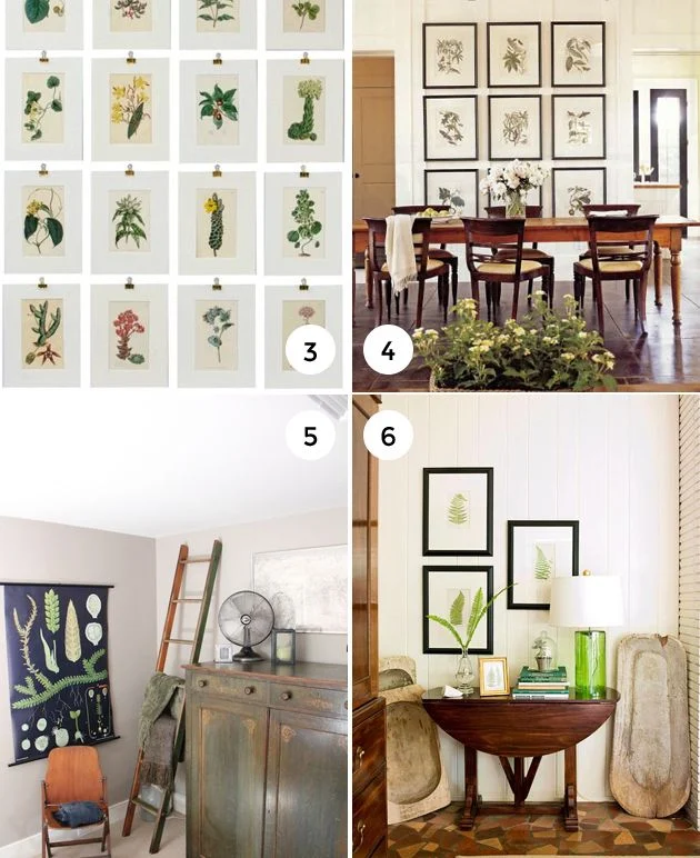
The first step in creating a captivating gallery wall is selecting prints that resonate with your personal aesthetic and the room’s purpose. Consider the scale, colour scheme, and artistic style of the botanical imagery. For a serene bedroom, opt for soft, pastel‑toned leaves or delicate flower sketches. In a lively living room, larger, graphic prints in rich greens or deep burgundy can serve as focal points.
When shopping, pay attention to the medium—paper, canvas, or metal—because each surface interacts differently with light. Canvas adds texture, while metal offers a sleek, contemporary feel. Don’t forget to match the framing style with existing décor; a minimalist black frame works well with modern furnishings, whereas a reclaimed wood frame pairs nicely with rustic interiors.
Wall décor with botanical prints: Matching Prints to Your Colour Palette
- Monochrome Scheme: Choose prints that feature a single colour (e.g., shades of grey) to maintain a cohesive look.
- Accent Colour: Use a bright botanical print to highlight a specific hue already present in your sofa, rug, or cushions.
- Neutral Base: Pair soft, earth‑tone prints with beige or taupe walls for a calm, organic atmosphere.
Creating Balanced Arrangements: Grid, Salon, and Asymmetrical Layouts
How you hang your botanical wall décor influences the room’s flow. Three classic layouts work well for most spaces:
- Grid: Align prints in a uniform grid for a clean, modern look. This works especially well in kitchens or home offices where orderliness is prized. For inspiration on coordinated spaces, check out our kitchen décor with cozy breakfast corner guide.
- Salon (Gallery) Style: Mix varying sizes and frame styles in a clustered arrangement. This creates visual intrigue and is perfect for living rooms that thrive on personality.
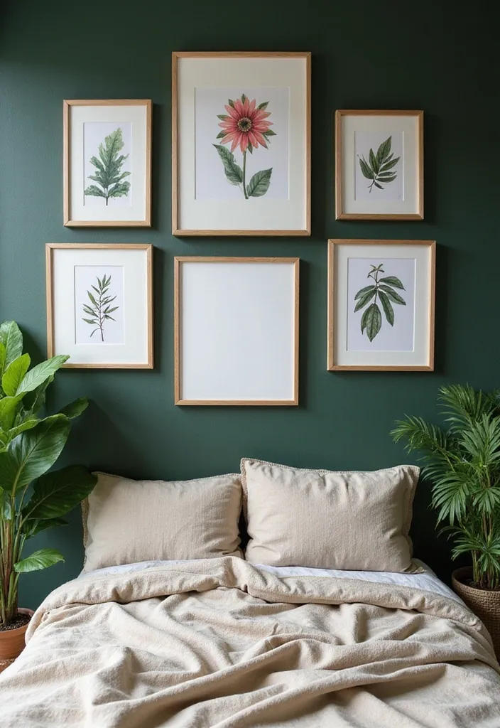
- Asymmetrical: Place larger pieces on one side and balance with smaller prints on the opposite side. This approach works nicely in bedrooms, allowing the eye to travel across the wall without feeling static.
Before committing to nails, lay the prints on the floor or use painter’s tape on the wall to experiment with spacing. Aim for 2–3 inches of breathing room between each frame to keep the composition airy.
Integrating Botanical Prints into Different Rooms
Each room has its own functional and aesthetic demands. Here’s how wall décor with botanical prints can enhance the most common spaces:
Living Room
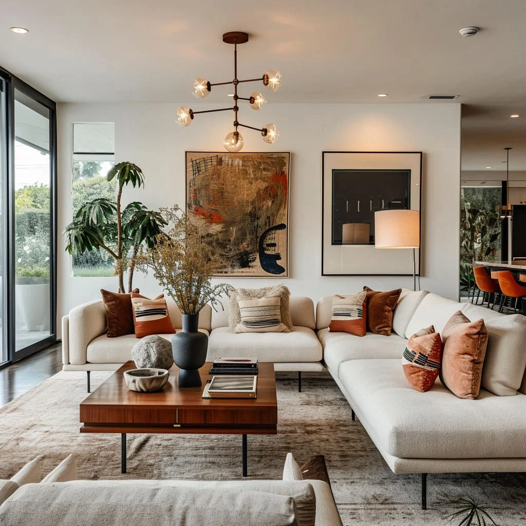
A living room is often the social hub, so choose prints that spark conversation. Large‑scale tropical leaves or vintage botanical illustrations can serve as a statement backdrop behind a sofa. Pair the artwork with natural textures—think jute rugs, linen cushions, and wooden coffee tables—to reinforce the organic theme.
Bedroom
In the bedroom, tranquility is key. Soft, muted botanicals—such as pale pink peonies or light‑green ferns—create a soothing environment conducive to rest. Position the prints opposite the bed for a balanced visual field. For a cohesive look, consider matching the colour of the prints with your bedding accents.
Kitchen
Even functional spaces benefit from a touch of nature. Small herb‑illustration prints near the pantry or above the dining nook can add charm without overwhelming the room. Choose moisture‑resistant frames or acrylic prints for durability. A quick look at home living room inspiration can give you ideas for extending this style throughout open‑plan areas.
Home Office
Productivity thrives in environments that feel inviting yet uncluttered. Minimalist line‑drawn botanical prints in black and white can add sophistication without distraction. Hang them at eye level to create a gentle visual break during long work sessions.
Choosing Materials and Frames that Complement Botanical Themes
The material of your botanical prints can dramatically affect the overall vibe. Here are three popular options and their best‑fit scenarios:
- Paper Prints: Ideal for budget‑friendly projects and easy swapping. Use archival‑quality paper to prevent yellowing.
- Canvas Wraps: Provide depth and texture. Great for living rooms and bedrooms where the artwork can act as a focal piece.
- Metal or Acrylic: Offer a sleek, contemporary finish that reflects light. Perfect for modern kitchens or home offices.
When selecting frames, coordinate the finish with existing hardware. Brushed nickel or matte black frames pair well with contemporary furniture, while distressed wood frames enhance a rustic or farmhouse aesthetic. Remember that the frame’s width should complement the print’s size; a narrow frame can make a large print feel delicate, whereas a thick frame adds weight to smaller illustrations.
Quick Tips for Styling Wall Décor with Botanical Prints
- Use a single colour palette across all prints to maintain harmony.
- Incorporate natural elements—like a small potted plant—near the artwork to reinforce the theme.
- Mix matte and glossy finishes for subtle contrast without clashing.
- Layer prints over neutral paint colors to let the botanical details stand out.
- Rotate seasonal prints (e.g., spring blossoms, autumn foliage) to keep the space feeling fresh.
Common Mistakes and How to Avoid Them
Even seasoned decorators can slip up when working with wall décor featuring botanical prints. Below are frequent errors and practical solutions:
- Overcrowding the Wall: Too many small prints can create visual noise. Stick to a curated selection—usually three to five pieces—for a clean look.
- Ignoring Scale: A tiny botanical sketch on a large wall feels lost. Balance the size of the artwork with the wall’s dimensions; larger walls welcome bigger prints or grouped arrangements.
- Mismatched Frames: Clashing frame styles pull attention away from the prints themselves. Choose frames that echo your existing décor style.
- Poor Lighting: Insufficient lighting can make the details of botanical prints fade into the background. Install directional spotlights or picture lights to highlight the artwork.
- Neglecting Colour Harmony: Using prints with colours that conflict with the room’s palette can feel jarring. Use a colour wheel or digital palette tool to ensure complementary hues.
Frequently Asked Questions
Can I use botanical prints in a rental without damaging the walls?
Yes. Opt for adhesive strips designed for picture hanging, which hold securely but remove cleanly. Choose lightweight frames or canvas wraps to reduce the need for heavy nails.
How do I choose the right size of botanical print for a small apartment?
In compact spaces, a single moderately‑sized print (12–18 inches wide) works best. It adds visual interest without overwhelming the room. Pair it with a simple frame to keep the focus on the artwork.
Should I match the botanical prints to my existing furniture colour?
Not necessarily. While colour coordination can create cohesion, contrasting the prints with furniture can also produce a dynamic, layered look. Use accent colours from the prints in smaller décor items like cushions or vases for balance.
Are there eco‑friendly options for botanical wall décor?
Look for prints made on recycled paper or sustainably sourced canvas. Many artists also offer digital downloads, allowing you to print on demand using eco‑conscious inks and materials.
How often should I change my botanical wall décor?
There’s no strict rule. Some homeowners refresh seasonally—switching to spring blossoms in March and autumn foliage in October—while others keep a permanent arrangement that evolves only when they move or redecorate.
Blending Botanical Prints with Other Home Décor Trends
Wall décor with botanical prints pairs effortlessly with several contemporary design movements. For instance, the rise of neutral home décor trends—think warm greys, soft beiges, and muted earth tones—provides an understated backdrop that lets the greenery of botanical art pop. Likewise, mixing botanicals with metallic accents (brass lamp bases, copper planters) adds a touch of glamour without sacrificing the organic feel.
When integrating multiple trends, maintain a single unifying element—such as a consistent frame finish or a shared colour accent—to avoid a cluttered appearance. This approach ensures each trend supports the other, creating a harmonious, well‑curated space.
Putting It All Together: A Step‑by‑Step Styling Guide
- Define Your Goal: Decide whether the prints will be a focal point or a subtle accent.
- Choose a Colour Scheme: Pick a palette that complements your existing furnishings.
- Select Prints: Choose 3–5 botanical images that vary in scale but share a stylistic thread.
- Pick Frames: Match frame material to your room’s overall design language.
- Plan Layout: Use paper templates on the floor or wall tape to experiment with spacing.
- Hang with Care: Use appropriate hardware—stud finders for heavy pieces, adhesive strips for light prints.
- Light It Up: Add picture lights or accent lamps to enhance details.
- Finish with Accessories: Place a small plant, decorative tray, or a scented candle nearby to reinforce the natural theme.
Following this roadmap ensures a cohesive, aesthetically pleasing result that feels intentional and effortless.
Incorporating wall décor with botanical prints is more than a decorative choice; it’s a lifestyle statement that celebrates nature’s timeless beauty within the comfort of your home. Whether you’re revamping a single room or reimagining your entire living space, the right botanical artwork can transform ordinary walls into inspiring canvases that uplift daily life.
Explore more ideas, experiment with layouts, and let the subtle power of botanical prints bring a breath of fresh air into every corner of your home.